
Got a few to choose from. I tried to incorporate an oak tree into the label for some local flavor (the nicest areas of Charlotte (dilworth) have tons of towering oaks which are beautiful). Tried to incorporate some beer (the barrels) into a few. Feel free to tell me which ones you like/hate/how you'd change them/etc. Please vote!
Image 1
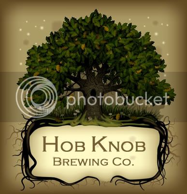
Image 2
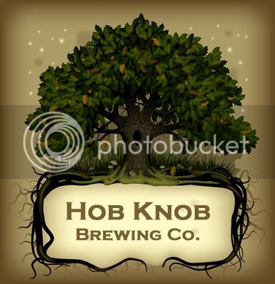
Image 3
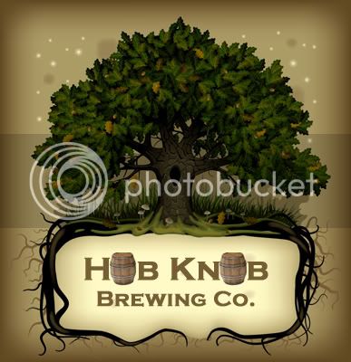
Image 4
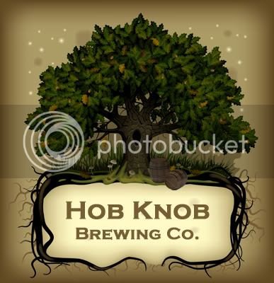
Image 5

LATE ENTRY!!!!
Image 1
Image 2
Image 3
Image 4
Image 5
LATE ENTRY!!!!

