Dragonfly Brewing Co. What do you think.

Homebrew Talk - Beer, Wine, Mead, & Cider Brewing Discussion Forum

Help Support Homebrew Talk - Beer, Wine, Mead, & Cider Brewing Discussion Forum:

This site may earn a commission from merchant affiliate links, including eBay, Amazon, and others.

yeqmaster

Well-Known Member
Joined
Jul 21, 2007
Messages
183
Reaction score
3
Location
Oakland, CA
So i just put together a pretty rough sketch of an idea that I had for my "brewing co." I'm very open to comments and suggestions. Any ideas? I think I'm going to do a revison pretty soon.

Here it is:
Dragonfly-1.jpg
 
yup it's there...

And I like it!

I really like the hand drawn type lables....very nice!

wish I could draw


Maybe make the stuff behind the wings hops?
 
yea thats what its intended to be but its just not very detailed at this point. I also think that they need to be less attached to the dragonfly and more coming out of the background. I will probably add some color as well.
 
I don't think I would add color....I really like the simple hand drawn black and white....

BUT it's your label!
 
That is very cool! If you keep it B&W you can do what my graphic artist friend did with mine. She scaned a piece of off white parchment with the specks in it and used it for the background. It gave the piece depth and made the B&W pop.

But that is a great drawing!

John
 
It's cool!! I likes just the way it is. But, if you do color it, maybe you could paint it in watercolors or something and scan again instead of just coloring it in the computer. Would make it look very artsy.

Allan
 
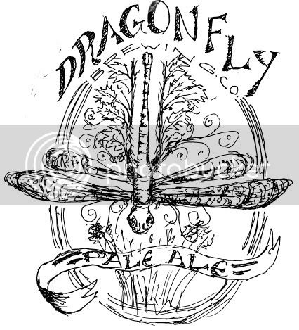
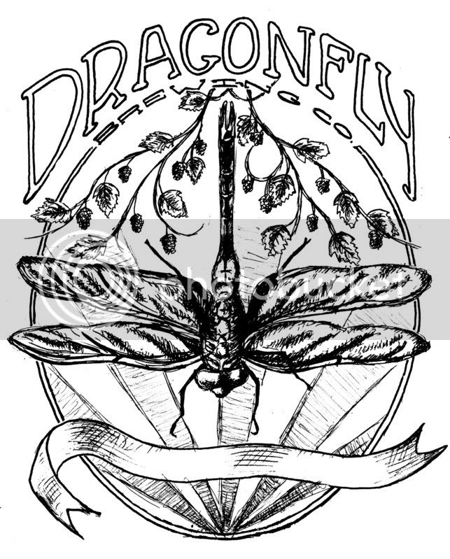
I like the rough/hand drawn look; it reminds me of a certain artist, whose name eludes me (actually, I think I don't know it at all--I just know his/her work).

If you colour it, definitely go with something very light--watercolours seem to be the wisest choice. Definitely don't go for a cleaned-up, typical computer-generated look--it'll rob the design of its spirit.

You might also, if you're -very- good, turn it into an Alphonse Mucha, art nouveau sort of thing--it seems to kinda sorta have that feel to me, for some reason.
 
really appreciate the hand-drawn style. maybe try flipping the dragonfly to face upwards, feels more natural to me. nice work!
 
Thanks!!! I've actually been working quite a bit on a revised version of it. Just a little more cleaned up and professional looking. I will post it soon.
Wheat King said:
maybe try flipping the dragonfly to face upwards, feels more natural to me.
I was sorta thinkin the same thing however I dont think taht the main "dragonfly" text would then be balanced with the wings. Any thoughts?
 
looks good great work on the type...couple things I noticed not sure if your going to color with this or if this is just a rough comp or what but the BG and the dragon fly kind of get lost together, quick transperecny adjustment would solve that.
 
I think it looks great, but I agree that it would seem more "natural" if it were facing up.
 
Awesome!!! I really appreciate the time you spent on doing that! it really opens up new ideas of the design to me and I like what you have done with it. I have some photoshop experience as well. I was kinda going with the more hand drawn look for this label but both look GREAT to me!! I was wondering how you did the background? how did you do the rays and the fade? I think that might be my favorite part!!! I might end up trying to put something together in the middle ground of yours and mine. Probably the hand drawn dragonfly, but like I said i really like the background and the color you used! So we'll see. maybe ill get to it soon and post it. thanks again for putting that together.
 

Latest posts

Back
Top