A new poster idea for HBT

Homebrew Talk - Beer, Wine, Mead, & Cider Brewing Discussion Forum

Help Support Homebrew Talk - Beer, Wine, Mead, & Cider Brewing Discussion Forum:

This site may earn a commission from merchant affiliate links, including eBay, Amazon, and others.
I would but I have nothing on my comp to do it. Sorry. I'll deff buy a shirt though, and I know someone else who is gonna want one.
 
Yuri_Rage said:
poster2.jpg


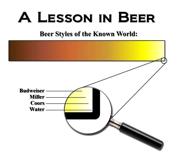
If you guys are interested, I can make this available on CafePress as a t-shirt or something (with Sir Hump's permission, as soon as we're done with the critiques and editing). I always keep the markup right at the minimum.

EDIT: Guess this'll do for my #6,000...
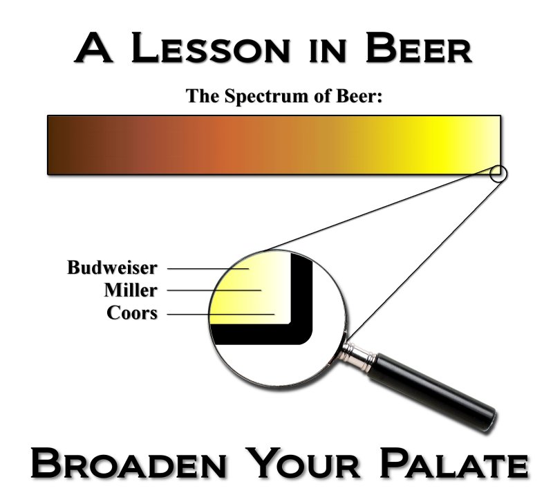

I think this is near perfect. I love the addition of the corner in the magnifying glass; however, water is not beer. I think it just questions the design when you say Beer Styles of the Known World.

I think without water, and maybe making the magnifying glass smaller, you can find somewhere to add "Expand Your Horizons"
 
I love the slogan and the play on words, but I do see it going right over most peoples heads. Remember, most people can't even point out Iraq on a map :D
 
deathweed said:
I love the slogan and the play on words, but I do see it going right over most peoples heads. Remember, most people can't even point out Iraq on a map :D
So, are you suggesting we lose the tagline?

IMHO, even if they don't quite put the pun together, the line still suggests that there's a lot more to beer than BMC.
 
I don't think "Fizzy yellow beer is for wussies" is trademarked. I did a TESS search, and it didn't turn up. Still, it seems like a cheap move to steal that line for a t-shirt. Any more ideas for the shirt front?

EDIT: Jester...no offense meant. Those glasses rock!
 
Yuri thats awesome! Lookin good!

For the "broaden you're horizons" or whatever...I was thinking that could be the on the front of the T-shirt, like a small logo on the breast, and the image you've made could be on the back.

Just an idea
 
I'm with you, bird...even if you take the very last pixel in the gradient, it's still more brown than black. Lemme work on the gradient. It's kind of choppy anyway, even after some attempts at smoothing it.
 
Yuri_Rage said:
IMHO, even if they don't quite put the pun together, the line still suggests that there's a lot more to beer than BMC.


I'm with you on this. but I thought the play on words would mean that you would use palette (as in the art definition) implying palate (the mouth definition)

+1 on the color being darker, but it looks sooo damn good right now. You really doing are an awesome job.

I think fizzy yellow beer is for wussies would be perfect for the front.
 
I like having the water in it. Even though it's beer styles of the world putting water in there gives it some perspective. After all, it's meant to be funny not a serious chart.
 
poster3_smooth_grad.jpg


Better gradient, don't you think? Also, everything is perfectly centered now, and the original is 2000x2000 at 200 dpi...the recommended resolution for CafePress.

Fingers, I see where you're coming from...but for now, by majority, water is out.

I'm partial to "palate." Anybody else wanna make a pitch for "palette?"

Still seeking opinions for the shirt front - HBT logo, "Fizzy beer," "Broaden your palate/palette," etc...

I'll make some command decisions and have this available as a shirt later today or tomorrow. I just noticed that CP has a poster option, too!
 
Let's be fair.

There's Munich Helles and Pilsners, which are legit styles. Let's move the little circle about a half an inch to the left... because BMC isn't TOTALLY colorless.

Also, by moving the circle a little, we can get "water" out of the magnifying glass and, instead, place it at the far right as if the "0" on the X axis.
 
I think the HBT logo on the front would be a great cross marketing tool and maybe Tx can give shirts to those that upgrade to Lifetime Supporter or something
 
Denny's Evil Concoctions said:
Where does Apfelwein fit on here?

I know, I know, Apfelwein isn't beer. ;)


Can BMC drinkers even read?


haha. well, i'm sure most of us were BMC drinkers at one point. At least for a little while. But who knows maybe we've been enlightened since then and learned how to read
 
Sir Humpsalot said:
Let's be fair.

There's Munich Helles and Pilsners, which are legit styles. Let's move the little circle about a half an inch to the left... because BMC isn't TOTALLY colorless.

Also, by moving the circle a little, we can get "water" out of the magnifying glass and, instead, place it at the far right as if the "0" on the X axis.


I thought I'd bump this if people are talking about "nailing down a final design"... I thought it might get lost a page back... :eek:
 
Sir Humps, I kinda like the comedic value of putting BMC right in the corner. But I'm aiming to please, so here's what your idea looks like.

Also, I changed the spelling of palette, just to see what it looks like.

poster4.jpg


I think I'm gonna start a poll to get this finalized.
 
I wish there was a way to show flavor on this rather than just color. I true pilsner isn't going to show up much different than the American lagers.

By moving the mag glass to the left you have now lost some of the impact of what you are trying to convey.
 
Yuri... I'm coming around to your way of thinking....

What about Denny's "more flavor, less flavor" arrows?

Maybe even make the spectrum taller to make the "more flavor, less flavor" more dramatic.

I'm just thinking out loud here... (and trying to keep you busy. ;) )
 
I see merit to the flavor scale, but I also think it's going to make the design a bit busy. Though color and flavor can be very independent, the visual impact works to get the point across. I'll give the idea a shot a little later and see if I can make it look nice.

So far, the poll's in a dead heat for nearly every design aspect. Hopefully it draws some more attention.

If there's overwhelming support for the FYB tagline, I'll e-mail Stone with a sample image and see if they mind us borrowing it.
 
Yuri_Rage said:
If there's overwhelming support for the FYB tagline, I'll e-mail Stone with a sample image and see if they mind us borrowing it.

Do it dot jpg.

Do it dot jpg.

Do it dot jpg.

They might say "We don't own that" and they might say "We don't care" and they might say "Whoa thats cool, how much for 50 T shirts".

But if you don't ask...
 
I just got a response from Stone. They love the Beer Spectrum humor and might be willing to let us use their tag line. My e-mail is now in the CEO's inbox for final approval! Because the shirt could be construed as somewhat derogatory toward other breweries, I won't be too surprised if we get shot down...more to follow!
 
I just got a response from Stone. They love the Beer Spectrum humor and might be willing to let us use their tag line. My e-mail is now in the CEO's inbox for final approval! Because the shirt could be construed as somewhat derogatory toward other breweries, I won't be too surprised if we get shot down...more to follow!

If he doesn't get back to you, I'll beermail him on Beeradvocate. He has always answered me on there...

http://beeradvocate.com/user/profile/1arrogantbastard
 
I'm on the page for ordering the tshirt right now. I'm guessing its not a good idea to order the shirt in any color other than white? I'll order white, I just know I'll be staining it at some point...
 
I just noticed that there are some transparency issues with the HBT logo if you order in a color other than white. I'll fix that in the next 15 mins. I doubt the shirt would look good in a bright/pastel color, but any of the neutral colors should be fine.

EDIT: The settings appear to be correct. The logo should print with white "ink" rather than showing the shirt color through any white areas. I'm not sure if the more vibrant colored fabrics will adversely affect the print quality.

Ok thanks!
 
Stone Brewing Promotions Dept said:
I spoke to the CEO about your desire to use the phrase “Fizzy Yellow Beer is for Wussies” on your snazzy T-shirts. He’s all for it. Be sure, however, to simply attribute the line to Arrogant Bastard Ale, rather than to Stone Brewing Co., as we like to keep the branding of the two entities separate. Best of luck to you. Oh…and send a file of the final mock up along if you can. We’d like to see it! Cheers!
Stay tuned! Another design is forthcoming!!!

I can't believe they're giving us the go-ahead!
 
Back
Top