New Brewery Logos--NEED INPUT

Homebrew Talk - Beer, Wine, Mead, & Cider Brewing Discussion Forum

Help Support Homebrew Talk - Beer, Wine, Mead, & Cider Brewing Discussion Forum:

This site may earn a commission from merchant affiliate links, including eBay, Amazon, and others.

Biermann

Reinvented Biermann
HBT Supporter
Joined
Mar 24, 2006
Messages
1,462
Reaction score
32
Location
East Peoria, IL
OK, so I put SWMBO to work trying to help me design a logo for my brewery. So she came up with 3 designs and a label.

She put them on my desk this AM, and didn't give me the digital files, so I had to scan them in, so the colors, etc look a little washed out.

I need everyone's input on which is their favorites, what mods to make, etc. . . . THanks!!
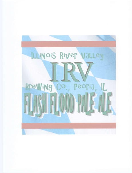
3548-IRV5.jpg

Sample label

3548-IRV4.jpg

I think this would make a good coaster or a nice round tin sign

3548-IRV2.jpg

For some reason, this one got cock-eyed during the scan. . .I like the hops. . .

3548-IRV1.jpg

This would be good on a menu or something. . .
 
IRV # 3 has a Cheap Trick font and crooked type.
I like that part of the concept.

I'd look into other alternatives to the hops as the main focal point.
 
I like #3 but try #2 with a different color fill (if possible) on the bars in the font. the gray on gray there washes out the text and makes it hard to read.
 
olllllo said:
IRV # 3 has a Cheap Trick font and crooked type.
I like that part of the concept.

I'd look into other alternatives to the hops as the main focal point.

yeah, the 3rd is probably my favorite. . .Its simple, and has a good concept. Are you suggesting ditching the hops, or just moving from the focal point??
 
Nealie said:
I like #3 but try #2 with a different color fill (if possible) on the bars in the font. the gray on gray there washes out the text and makes it hard to read.

I agree with you. . . I'll work on that. .

I was thinking that #2 would make a good coaster or Pint glass logo. . . or neon sign. . .(sorry, thinking big here).
 
homebrewer_99 said:
I like the first one better, but I am biased by the Bavarian State flag...jawohl!!:rockin:

She used my pale ale as the example for the label--not at all a German beer . . I would have chosen my Breznsalzer Maerzen. . .

Oh well. Its the concept that counts!
 
#3. It reminds me of the SRV sticker Stevie Ray Vaughan had on his guitar "#1". Simple, classy, purposeful and uncluttered. Nicely done! I think if SWMBO designed me a label it would read something like:

"STOP SPENDING MONEY ON BEER AND BEERMAKING STUFF"
 
Excellent. . .

I'll let her know that #3 is the voted favorite. . .

I'll also see if she can make some mods to it and play around with the design a little, and I'll post those changes.

:mug:
 
I like the IRV #2 . . . crooked. I think that label wraped around a bottle neck at that angle would look awesome. Then tie it into the label that you had made, maybe the same checkered background on the neck wrap. Just a suggestion.
 
Back
Top