Need suggestions

Homebrew Talk - Beer, Wine, Mead, & Cider Brewing Discussion Forum

Help Support Homebrew Talk - Beer, Wine, Mead, & Cider Brewing Discussion Forum:

This site may earn a commission from merchant affiliate links, including eBay, Amazon, and others.

Proofman

Well-Known Member
Joined
Jan 1, 2007
Messages
288
Reaction score
0
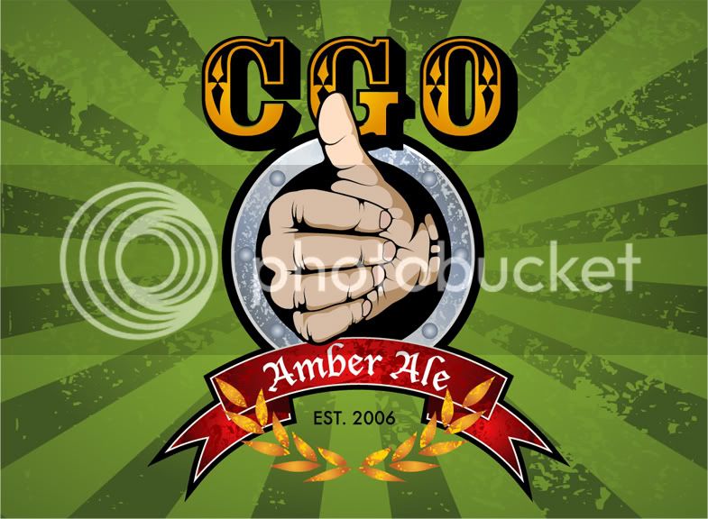
Here is my first label. I was at work and didn’t feel like working Friday afternoon. On a total whim I decided to work on my first label (with Powerepoint). Overall I’m pretty happy with it considering my lack of skill, but I don’t like the ‘robust porter’ lettering. I want it to stand out more without looking obnoxious.

Edit: I removed the originals from my phootobucket site and replaced with three versions

robustporterlable4.jpg


Robustporterlabel3.jpg


robustporterlabel2.jpg
 
One option would be to cut out 2 diaganol stripes from the picture of the dog/cow where the letters are. Then they would be easily readable and would add an angular pattern (which is a good thing) to the design.
 
I have an idea. If you take the "Robust Porter" and use some kind of rustic looking font. Then using the dog/cow scene as a center, write the font in a circle around them (Robust would be on top, Porter on bottom)...kind of to tie in a 'branding' idea. I think it would fit nice and pull it together. It would be a little bit of work, but I think it would be cool. Either that or replace where the brewery name is with the "Robust Porter" and then make a brand out of the brewery name, and stick it on the cow.
 
I think this is an improvement (especially spelling – ‘Hardy’ not ‘Hearty’). I tried to go with Zoebisch01’s idea. I wanted to crop the pic in a perfect circle then add the ‘Robust Porter’ around it, but couldn’t figure out how to modify the pic like that in Powerpoint. I also wanted to add two silhouettes of border collies stalking on either side of the ‘Dogtown Brewery’ lettering but couldn’t figure it out. I have the silhouettes when I past them from MS Paint I have the white background as well. I have to fugure out how to crop the image to the silhouette outline.

Robustporterlabel2.jpg
 
If you want more editing capabilities you should get off Powerpoint and MS Paint and use something like GIMP. Its free too so no worries paying for anything.

What you have so far looks pretty good but I imagine with some of those changes you mentioned, it will even look better! One thing you might want to do is have your brewery name up top and your beer name underneath. Have both arc around the image (in a circle form) For the beer name, create a banner underneath it that would stay the same from label to label and all you have to do is customize the type. Something like this (although doesnt have to be so ellaborate and could be arching down as opposed to up)

CGO2.jpg


For the image, maybe add a stroke/outline on the circle to make it stand out a bit more. And for some of the type, you might want to drop down to sentence case (for the tag line) So far everything is in CAPS which takes away from the design IMO.

Looks like it is shaping up well!

Bill
 
Free is good.

I agree with billpa. The "Robust Porter" part is kind of hard to read. It would be more clear if it were below the instead of around it. You could then make the rest of the text a bit smaller and move it down further.

I like the overall look, though. Good color scheme.
 
I downloaded gimp, but man it has a very steep learning curve if you have zero graphics experience. I spent a few hours on it one late night and was getting nowhere, so I abandoned it. I will probably go with one of these three.

Thanks for all your advice. It has helped.
 
your lettering is not "popping" like you want because of your color scheme, there is not enough contrast and the curved type with the background and the picture give it an optical illision of being hid.
The square shape of the picture and then the curved type lessens the readability also. There need to be more of an established heirarchy in the type all of it is competing which is why you have readability issues
THe best advice I can give from a graphic designer to someone just starting to play is sketch. Get away from the computer and get out your ideas on paper.
 
mot said:
your lettering is not "popping" like you want because of your color scheme, there is not enough contrast and the curved type with the background and the picture give it an optical illision of being hid.
The square shape of the picture and then the curved type lessens the readability also. There need to be more of an established heirarchy in the type all of it is competing which is why you have readability issues
THe best advice I can give from a graphic designer to someone just starting to play is sketch. Get away from the computer and get out your ideas on paper.


Yeah I agree, contrast is the key to making it pop. The reds in the fencing, and browns in the dog and cow are pulling the association with the name. They are tying into each other. Actually, just as another idea...(just brainstorming out loud)...you could trace out the dog and the cow. The scene itself is enough to carry the label. I don't think the fence background does much for the overall scene and is making it busy.
 
Back
Top