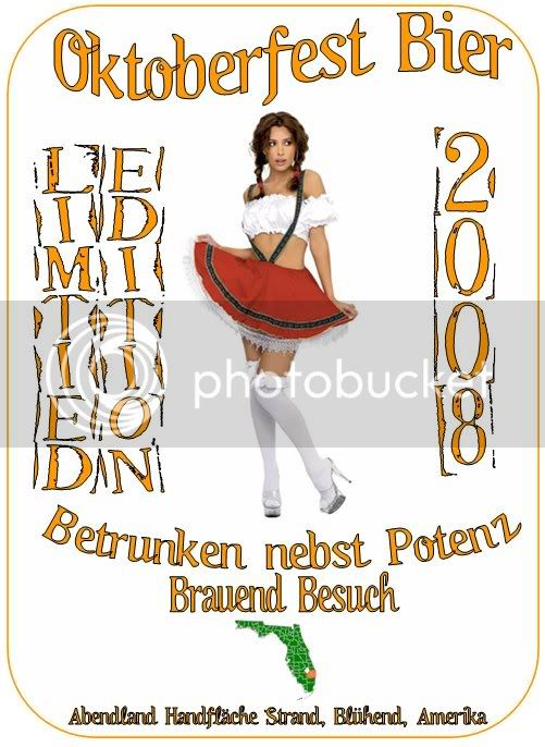
Chick is hot and the white background is a great base for a label.
"Limited Edition" is hard to read and is out of place, as is the 2008. I'd put it along a horizontal line towards the bottom or right below Oktoberfest Bier. 2008 should be half the size of Oktoberfest Bier and Limited Edition should be half the size of 2008.