Google maps. Why?

Homebrew Talk - Beer, Wine, Mead, & Cider Brewing Discussion Forum

Help Support Homebrew Talk - Beer, Wine, Mead, & Cider Brewing Discussion Forum:

This site may earn a commission from merchant affiliate links, including eBay, Amazon, and others.
Just wondering why they can't use somthing remotley accurate instead of something so outdated.

I know it's not easy to show a globe on a screen but come on.
 
Its just the type of projection they used. Plus that mass labeled greenland also includes all that ice that makes up the arctic.
 
Google Maps
Why show Greenland to be the same size as Africa?:(
Mefinks they could use an accurate map instead of something over 100 years old and wrong!

A cartographer would say "accurate for what purpose"? The size distortion is a function of the projection; ALL projections incur distortion.
 
*NO* map of the world is ever 100% accurate. Only a globe can represent everything reasonably well at that scale. When you convert from a 3-dimensional sphere to a 2-D piece of paper, computer, screen, etc., you must sacrifice something. The general rule in cartography is that you try to preserve accuracy in either area, distance, or direction, and you can't do all simultaneously.

The map projection on Google maps for the world view is a cylindrical projection. It is a very common projection at that scale, and preserves distance and direction reasonably well near the equator, but performs poorly at the poles.
 
This looks alot mor like it to me.

skin-colour-map-indigenous-people_003.jpg
 
Is it just me, or does that look like two asses and the one of the right is reaching over to grab the other?

Well, how about looking at the euro coin... Since Norway isn't part of the EU, it kind of looks...strange. Hint: what does Sweden and Finland look like with with Norway censored out up there in the right quadrant?

CO1EURO_50SV.JPG


Probably should be cross posted to the "Pictures of bad ideas" post :-/

H
 
Google Maps
Why show Greenland to be the same size as Africa?:(
Mefinks they could use an accurate map instead of something over 100 years old and wrong!

It's a Mercator projection, which is traditionally used for navigation, because going straight will correspond to a straight line on the map.
 
Of course there is the Peters Projection...

peters_475h.jpg


Traditional world maps such as the Mercator often exaggerate the scale towards the poles, giving an erroneous picture of the relative sizes of different countries. For example, Mercator maps show Greenland to be roughly the same size as Africa, when, in reality, Africa is actually fourteen times larger. Africa also looks considerably smaller than Russia on a Mercator map, even though Africa is actually 33% larger. However, generations of navigators weren't bothered much by Mercator's misrepresentations, since they cared most about longitude and latitude, which the Mercator projection handles rather well.

In 1973, Arno Peters published the Peters Projection map. This map preserves equal area and retains a rectangular grid of latitude and longitude. Thus all countries are the correct size in relation to one another. On this projection it becomes much easier to understand the relationships between countries. However, a price is paid in the distortion of shape - countries are progressively squashed towards the poles and stretched across the equator. For those who grew up with the Mercator map, the Peters projection map appears to be stretched vertically, and Africa suddenly looks huge.

A variety of social and religious groups argue that since the Mercator map makes many countries appear smaller than they really are, people seeing them may infer that certain countries are innately more important than others. This rhetoric has often escalated to the point where the Mercator map is openly described as being "racist". Many of these groups are working to address this perceived problem by lobbying schools around the world to adopt the Peters projection map in classrooms. This movement is not without controversy, however, since educators, well-aware of the Mercator map's deficiencies, were already adopting maps based on other projections, some of which are even more accurate than Peters's. Others argue that Peters wasn't even the first person to devise such a projection, since James Gall came up with the same idea in 1855 (which is why some refer to it as the Gall-Peters projection).
 
I don't know exactly why they use the Mercator map, but one aspect that translates directly: the same property that makes it very useful for navigation makes it easy to calculate a Lat/Long from a mouse click. All other projections would require cross-referencing each pixel to a Lat/Long.
 
Okay but who uses google maps for navigation on a global scale.
Its for the visual imagery and it's not proportionally correct.

Who uses Google Maps for global scale...that is what Google Earth is for!

All bow down to Google! An app for everything!
 
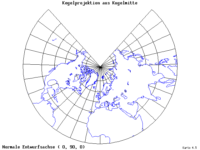
the most accurate (I think, and I used to be a quartermaster in the navy) map in relation to the relative size of different countries or continents is the Gnomonic projection. it's the type of chart that is used to plan long ocean voyages. for instance, if you are going from San Diego to Japan, you want the shortest route but drawing a straight line from Point A to Point B on a mercator projection chart WILL NOT give you the shortest distance (because you are plotting a straight line on a pieve of paper that does not take into consideration the curvature of the earth). instead you draw the line on a Gnomonic projection(which does take into consideration the earths curvature) and calculate your lat/long for every 5 degrees of longitude. you then take those coordinates and plot them on your mercator charts. because you cant navigate a gnomonic chart.

norm0008.gif


but anyway, I'm not sure where I was going with that. . . but essentially Mercator is the standard. that's what everyone has always seen and that's what they associate with a map of the world.
 
Back
Top