Logo, Labels, Blogs.. oh my

Homebrew Talk - Beer, Wine, Mead, & Cider Brewing Discussion Forum

Help Support Homebrew Talk - Beer, Wine, Mead, & Cider Brewing Discussion Forum:

This site may earn a commission from merchant affiliate links, including eBay, Amazon, and others.

redbenn

Well-Known Member
Joined
Dec 29, 2009
Messages
125
Reaction score
4
Location
Chicago
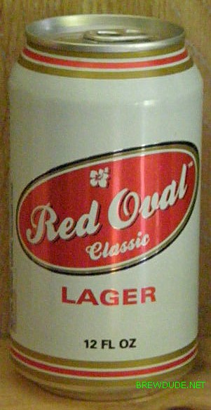
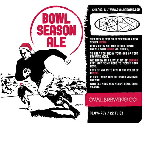
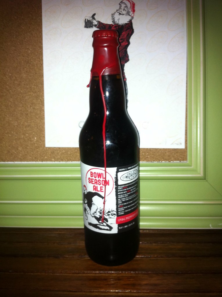
My buddy and I started brewing in the new year, I'm blogging the process here: BLOG OVAL BREWING CO.


Our brew names are Ohio themed for the most part (we're both in Chicago but from Cleveland and Buckeyes originally)

My buddy is a graphic designer and has helped a bunch w/ the labels (I did a couple myself).

oval.png
 
We are still working on the descriptions for the other brews, but have the labels mocked up...
woody_haze.png
 
I very much like the consistancy...and it's got a cool "underground comics" kind of vibe.

Good job of branding! No matter what the image is I'd be able to pick your bottle out among all others on the shelves because of the consistant unique style.
 
Ooooh, these are really good. Nice.

*edit* - Just checked out your blog - they look really good printed too, nice job!
 
New brew, after James Buster Douglas's knockout of Tyson, 20 yrs ago... (Columbus native)
421underdogIIPA.png
 
Those are really nice. Love the grunge/photocopied look.

I wonder about the logo being so far away from the words "Oval Brewing Co" though, as the graphic seems a bit random on its own. That is the only thing i don't just love about these.
 
Awesome, awesome labels. The only thing that bothers me is no GBV reference from two buckeye boys :rockin:
 
Those are really nice. Love the grunge/photocopied look.

I wonder about the logo being so far away from the words "Oval Brewing Co" though, as the graphic seems a bit random on its own. That is the only thing i don't just love about these.

Part of me agrees, but I do like how it accentuates the description this way. Attractive labels in my opinion.
 
When a logo appears without the brand name it tends to take on a cryptic quality that may or may not work with this style label. I think it does. The images change which gives me the impression the labels are telling a story, and you never know where the name of the beer will be.

You've also created the precedent of using just the logo which can be very powerful (if you were to do t-shirts and such). How often do you see the name "Nike" with the swoosh...usually it's just the swoosh.

I really like these labels and the whole design style. Love it actually!
 
+eleventy billion on "Stiffarm IPA" and the "42:1 Underdog IIPA." Both of those labels are fantastic. I just hope the beer is every bit as face-crushing as the labels would make it seem.
 
Ordered some plastic logos that I designed in Google Sketchup and had made up by shapeways.com. Trying to figure our tap handles out, these may top them... the problem is the tower is a 3 tap tower, but we have a 2-way shank that makes it 4, that puts them all really close together... therefore we can't have them face forward.

4413315820_7affca40ca.jpg


4412548257_4597ee2c17.jpg


4413316258_42b5562e53.jpg
 
Sounds like a cool project. Keep us all informed, I'm interested to see how it turns out!
 
What's the story behind the oval design?

(I keep trying to see if there are letters within all those lines...)
 
What's the story behind the oval design?

(I keep trying to see if there are letters within all those lines...)

The Oval is the central part of Ohio State's campus. The lines are the paths that intersect the Oval.

[ame="http://maps.google.com/maps?f=q&source=s_q&hl=en&geocode=&q=the+oval+ohio+state&sll=37.0625,-95.677068&sspn=30.323858,56.513672&ie=UTF8&hq=the+oval&hnear=Ohio&ll=39.999454,-83.01276&spn=0.003575,0.006899&t=h&z=17"]http://maps.google.com/maps?f=q&source=s_q&hl=en&geocode=&q=the+oval+ohio+state&sll=37.0625,-95.677068&sspn=30.323858,56.513672&ie=UTF8&hq=the+oval&hnear=Ohio&ll=39.999454,-83.01276&spn=0.003575,0.006899&t=h&z=17[/ame]
 
Back
Top