Thoughts on this label?

Homebrew Talk - Beer, Wine, Mead, & Cider Brewing Discussion Forum

Help Support Homebrew Talk - Beer, Wine, Mead, & Cider Brewing Discussion Forum:

This site may earn a commission from merchant affiliate links, including eBay, Amazon, and others.

gmcapone

Well-Known Member
Joined
May 23, 2011
Messages
256
Reaction score
30
Location
New Orleans
I'm a noob to photoshop so I don't really know anything too advanced but I was wondering if anyone could give me some suggestions on this label. I like where it's going so far but for the neck part it seems kind of....empty. Also, the gradient part on the neck portion is bigger than the actual label so I could be sure there isn't any edges that get missed. This is why the shape looks sort of obscure.

KokiriPaleAle.jpg


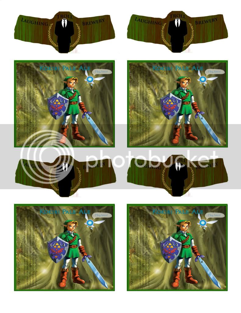
Any feedback is appreciated.

Thanks!
 
Looks great! One thought... if you sell a bottle you'll have the feds and Nintendo after you. Sounds like a good time to me :)
 
Add a stroke (outline) to the font you use for the name. You can google "adding a stroke to font" to find out how if you don't already know. The beer name blends into the background too much, but adding an outline might set it off a bit..
 
Add a stroke (outline) to the font you use for the name. You can google "adding a stroke to font" to find out how if you don't already know. The beer name blends into the background too much, but adding an outline might set it off a bit..

Will do, thanks!
 
I think the photo in the background of the main label needs to be fainter so the text stands out more. I'd also be inclined to put a semi transparent white box behind the black text to make it stand out also.

I'd change the font in the black blurb text. Papyrus is the new Comic Sans. I think it works for the title, but not in the blurb text. Choose a simple easy to read font like Helvetica for stuff like that.
 
just a design critique. when you apply the label to the neck, you want 90% of the "important" information to be contained within the circular area, the "wings" to either side are really only for extra info (like a quick description of that beer, or the brewery, or a joke or quote). I say this because most people don't think about the 3-dimensional surface of the bottle neck.
 
Back
Top