Working on a label.

Homebrew Talk - Beer, Wine, Mead, & Cider Brewing Discussion Forum

Help Support Homebrew Talk - Beer, Wine, Mead, & Cider Brewing Discussion Forum:

This site may earn a commission from merchant affiliate links, including eBay, Amazon, and others.

bsigmon1103

Well-Known Member
Joined
Feb 10, 2012
Messages
49
Reaction score
3
Location
Abingdon
Just started working with Adobe Photoshop. I am having a little more luck with acad and exporting to a wmf file. Take a look at my barley!
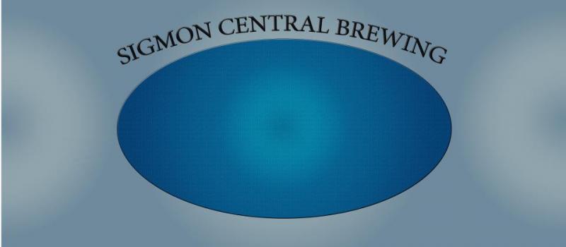

421823_395701530446878_100000211037886_1753093_359110403_n.jpg


drawing.jpg
 
Barley looks cool but shouldn't it be inside the blueish area? One on each side of the blue circle would look cool, just copy and flip the barley
 
Thehopguy said:
Barley looks cool but shouldn't it be inside the blueish area? One on each side of the blue circle would look cool, just copy and flip the barley

Yup that's the plan. Still learning the software so kinda piecemealing it for now. I should finish this weekend I'll post a finished product.
 
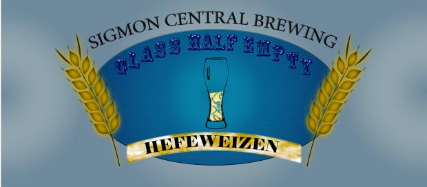
Alrght I'm done for now. I'm sure I'll make some mior adjustments still, but this is going to do for now. This is for my next batch.

LABEL.jpg
 
I'm not really sure I like the use of the Rosewood font in this situation. Maybe just the effect you applied to it. Either way, its a hard font to read, and even harder because of the effect on it. I'd at least change it from being all caps.

I'm assuming the name of the beer is "Glass Half Empty Hefeweizen", and your brewery is "Sigmon Central Brewing. " The font needs to be the same for the entire beer title or ese the label just looks kind of fractured.

The glass in the middle gives it a lot of weight there, but a huge blank space until you get to the barley. I might consider changing the "hefeweizen" banner so its curving up instead of down, moving it down a hair, making the barley smaller and pushing it in towards the glass.

I've been suggesting this all over the board lately, but if you have Illustrator, or Inkscape (free), I suggest giving either one a try. You are doing all vector/drawing graphics here, so there is pretty much no need for photoshop. You will find those programs easier to use because you don't have to deal with Photoshop's layering system that is meant for editing photos.

Hope this helps.

Thanks for the suggestions! Yes i have recently started using Inkscape. Much easier to use and learn that adobe photoshop. I may have to start over because i started half in adobe and imported into inkscape. I'm trying to get a spring theme going on behind the glass to fill in the blank spaces. This would stay true for the different seasons and such. Working on that background now.
 
Back
Top