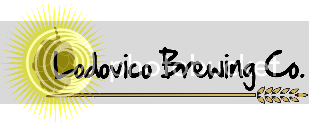
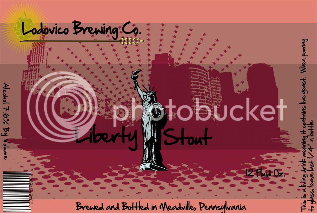
I've been looking at this logo and something has been bothering me.
When people read, they scan the top of the words rather than the whole word. Try looking at a sentence with the bottom half of the words covered. You can read it with no problem. Block the top half and you can't read it.
I'm thinking Lodovico is too high on the picture. Part of the word is conflicting with the picture. Can you indulge me and try lowering Lodovico a bit?
I get what you're saying. When I get home tonight, I will try lowering the text and see what it looks like and I'll re-post it. Thanks for the comment.
I'm not even sure I like the logo in the background now though. What do you think about that part?
Should I just scrap it and start over? I really appreciate all honest feedback.




![Craft A Brew - Safale S-04 Dry Yeast - Fermentis - English Ale Dry Yeast - For English and American Ales and Hard Apple Ciders - Ingredients for Home Brewing - Beer Making Supplies - [1 Pack]](https://m.media-amazon.com/images/I/41fVGNh6JfL._SL500_.jpg)


