• Please visit and share your knowledge at our sister communities:
  • If you have not, please join our official Homebrewing Facebook Group!

    Homebrewing Facebook Group

What do you think of this?

Homebrew Talk

Help Support Homebrew Talk:

This site may earn a commission from merchant affiliate links, including eBay, Amazon, and others.
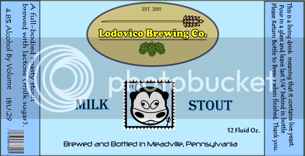
I've been looking at this logo and something has been bothering me.

When people read, they scan the top of the words rather than the whole word. Try looking at a sentence with the bottom half of the words covered. You can read it with no problem. Block the top half and you can't read it.

I'm thinking Lodovico is too high on the picture. Part of the word is conflicting with the picture. Can you indulge me and try lowering Lodovico a bit?

I get what you're saying. When I get home tonight, I will try lowering the text and see what it looks like and I'll re-post it. Thanks for the comment.

I'm not even sure I like the logo in the background now though. What do you think about that part?

Should I just scrap it and start over? I really appreciate all honest feedback.:D
 
You're going to have to make your own call on some of this. There are so many different personal preferences in a large audience like this that one person will say to do one thing and another person will say to do something completely different.

If you try to please everybody, you will never be "done" with this. :D
 
So messing with another idea here. Went REALLY simple but I think it's alright. Yay or nay??

Simple Logo.jpg
 
I like your second logo but I would lighten the background a bit.
I also like your first logo. In fact, I think I prefer it. I like the fact that it's a picture rather than a geometric shape.

Perhaps you could also lighten the background in the first one, almost to a watermark but not quite. It's competing with your name.

I'll also echo Walker; do what YOU like. It's your beer.
 
I like the label, it's clean, simple and minimalistic, which spells "classy" for me.

Thanks. Which one are you referring to? The one on the first page or the one just a couple posts above yours??
 
To me, the best one so far has been post #25. I like the fact that it's an image that sits on top of your overall label image rather than an enclosed geometric shape. That makes it unique. However, you might...

1) Make the hops vines larger or the grain smaller so they are roughly the same scale with one another.
2) Remove the texture on the grain but keep the shadow and thick border.
3) Curve the text ever so slightly? Maybe. I'm not sure.
 
Here is the second logo on a label. Basic label also and it needs some sprucing up. It's going to take awhile to learn all the tricks and possibilities with this program. This is my first time ever messing with digital graphic software.

LodoMilkStout.png
 
So, are these beers available to the public yet? :mug:

On my way to Titusville next week.


Cool. Homebrew swap??? PM me if you want to swap a few.

Our you checking out Blue Canoe while you are home?
 
Anyone that is totally sick of me changing my mind, I would just stop opening updates of this thread.:D I have major issues with decision making.

So I just messed with another idea. What do you think?


FreshLogo.png


I realize now that I have to lift the grain to be a layer above the sun.
 
OK. Last logo post for me. Sorry for all the pain. Many label posts to come. I've decided on this logo and I really like it. Here are the first two labels I've created with the new logo.

I want to try and make loud/modern type labels for the most part. I think I might finally be on to something.

Critique away!

NewestMilkStout.png


LibertyStoutOfficial.png


Don't know why the top and bottom of the second label is off-colored. It isn't in the design.
 
Wish I could bring some back, but I'm not checking a bag. Stupid TSA.

As for the Canoe, I always hit it when I'm back there. Fortunately, it's within walking distance of where I stay. :drunk:
 
The label for Liberty Stout is excellent and I like the new logo. One minor quibble is that the statue and name Liberty Stout could be just a bit bigger.

I also like the Milk Stout label but I feel like the logo gets a little lost in the splashing milk. If you could lower the splashes a bit, I think that would help.

Excellent work! I think you really have something.
 
Back
Top