You are using an out of date browser. It may not display this or other websites correctly.
You should upgrade or use an alternative browser.
You should upgrade or use an alternative browser.
The "We'll fix your label for you" thread
- Thread starter ThorGodOfThunder
- Start date

Help Support Homebrew Talk:
This site may earn a commission from merchant affiliate
links, including eBay, Amazon, and others.
Does anyone have any free font recommendations for this label? I'm just not happy with the one I've seen and the one problem with having lots of fonts is having too many fonts to choose from.
I'm looking for a nice, clean, heavy font, preferably with serifs, probably no italics.

I'm looking for a nice, clean, heavy font, preferably with serifs, probably no italics.
TasunkaWitko
Well-Known Member
Taadaaah!
Awesome!
Thanks, @JINKS - I've got a double batch this time, so I think I will do some with the train and some with the other one and see which one people like best.
I appreciate the assist, sir!

GrogNerd
mean old man
GrogNerd
Can you run the water all the way across and add sand? I like the gradients effects on the second image.
sorry it took so long
what about this?

JINKS
Fermentator Extrordinaire
- Joined
- Mar 2, 2014
- Messages
- 846
- Reaction score
- 357
Awesome!
Thanks, @JINKS - I've got a double batch this time, so I think I will do some with the train and some with the other one and see which one people like best.
I appreciate the assist, sir!
anytime
JINKS
Fermentator Extrordinaire
- Joined
- Mar 2, 2014
- Messages
- 846
- Reaction score
- 357
Does anyone have any free font recommendations for this label? I'm just not happy with the one I've seen and the one problem with having lots of fonts is having too many fonts to choose from.
I'm looking for a nice, clean, heavy font, preferably with serifs, probably no italics.
From here


$53.24
1pc Hose Barb/MFL 1.5" Tri Clamp to Ball Lock Post Liquid Gas Homebrew Kegging Fermentation Parts Brewer Hardware SUS304(Gas Hose Barb)
Guangshui Weilu You Trading Co., Ltd


$44.99
$49.95
Craft A Brew - Mead Making Kit – Reusable Make Your Own Mead Kit – Yields 1 Gallon of Mead
Craft a Brew


$22.00 ($623.23 / Ounce)
AMZLMPKNTW Ball Lock Sample Faucet 30cm Reinforced Silicone Hose Secondary Fermentation Homebrew Kegging joyful
无为中南商贸有限公司


$7.79 ($7.79 / Count)
Craft A Brew - LalBrew Voss™ - Kveik Ale Yeast - For Craft Lagers - Ingredients for Home Brewing - Beer Making Supplies - (1 Pack)
Craft a Brew


$28.98
Five Star - 6022b_ - Star San - 32 Ounce - High Foaming Sanitizer
Great Fermentations of Indiana


$719.00
$799.00
EdgeStar KC2000TWIN Full Size Dual Tap Kegerator & Draft Beer Dispenser - Black
Amazon.com


$176.97
1pc Commercial Keg Manifold 2" Tri Clamp,Ball Lock Tapping Head,Pressure Gauge/Adjustable PRV for Kegging,Fermentation Control
hanhanbaihuoxiaoshoudian


$159.99 ($26.66 / Count)
3M High Flow Series System BREW120-MS, 5616001, For Brewed Coffee and Hot Tea, Valve-in-Head Design
SpaceCityProviders


$479.00
$559.00
EdgeStar KC1000SS Craft Brew Kegerator for 1/6 Barrel and Cornelius Kegs
Amazon.com


$58.16
HUIZHUGS Brewing Equipment Keg Ball Lock Faucet 30cm Reinforced Silicone Hose Secondary Fermentation Homebrew Kegging Brewing Equipment
xiangshuizhenzhanglingfengshop

$10.99 ($31.16 / Ounce)
Hornindal Kveik Yeast for Homebrewing - Mead, Cider, Wine, Beer - 10g Packet - Saccharomyces Cerevisiae - Sold by Shadowhive.com
Shadowhive


$172.35
2 Inch Tri Clamp Keg Manifold With Ball Lock Posts, Pressure Gauge, PRV (0-30 PSI) – Homebrew, Fermentation, Kegging System
wuhanshijiayangzhiyimaoyiyouxiangongsi


$20.94
$29.99
The Brew Your Own Big Book of Clone Recipes: Featuring 300 Homebrew Recipes from Your Favorite Breweries
Amazon.com


$53.24
1pc Hose Barb/MFL 1.5" Tri Clamp to Ball Lock Post Liquid Gas Homebrew Kegging Fermentation Parts Brewer Hardware SUS304(Liquid Hose Barb)
yunchengshiyanhuqucuichendianzishangwuyouxiangongsi


$76.92 ($2,179.04 / Ounce)
Brewing accessories 1.5" Tri Clamp to Ball Lock Post Liquid Gas Homebrew Kegging Fermentation Parts Brewer Hardware SUS304 Brewing accessories(Gas Hose Barb)
chuhanhandianzishangwu
![Craft A Brew - Safale BE-256 Yeast - Fermentis - Belgian Ale Dry Yeast - For Belgian & Strong Ales - Ingredients for Home Brewing - Beer Making Supplies - [3 Pack]](https://m.media-amazon.com/images/I/51bcKEwQmWL._SL500_.jpg)


$33.99 ($17.00 / Count)
$41.99 ($21.00 / Count)
2 Pack 1 Gallon Large Fermentation Jars with 3 Airlocks and 2 SCREW Lids(100% Airtight Heavy Duty Lid w Silicone) - Wide Mouth Glass Jars w Scale Mark - Pickle Jars for Sauerkraut, Sourdough Starter
Qianfenie Direct


tnorman93638
Well-Known Member
GrogNerd
I like it better. But can the palms and flowers be moved to look like they are coming out of the sand and add more sand also. Remove the white line from the sun that's in the water
I like it better. But can the palms and flowers be moved to look like they are coming out of the sand and add more sand also. Remove the white line from the sun that's in the water
- Joined
- Jan 14, 2015
- Messages
- 1,101
- Reaction score
- 316
@JINKS sure thing, here's a few snaps of the little lady:
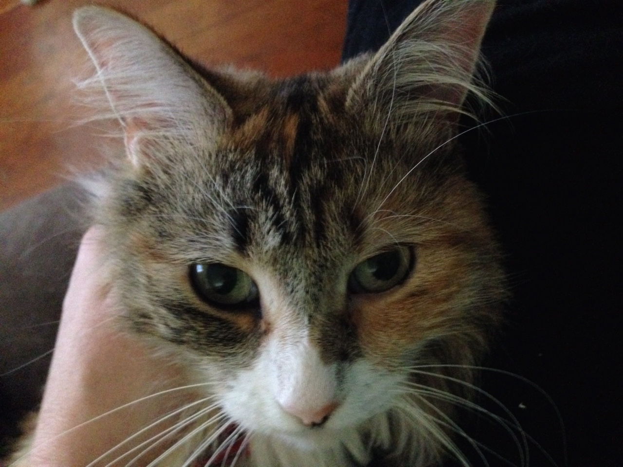
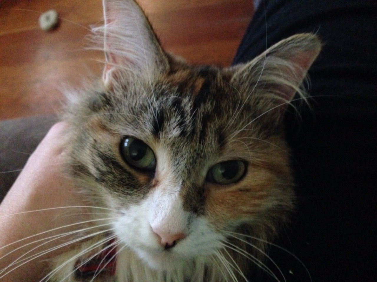
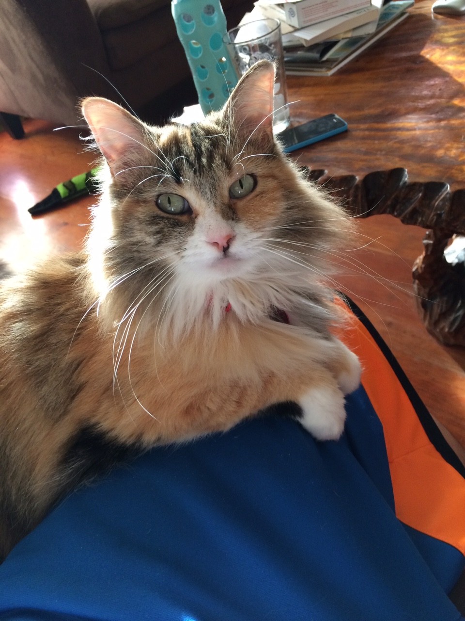
Just to make sure though, I'm really looking for more of a line drawing of a cat's face (like the first suggestion I posted) rather than an actual photo of a cat.
Just to make sure though, I'm really looking for more of a line drawing of a cat's face (like the first suggestion I posted) rather than an actual photo of a cat.
GrogNerd
mean old man
grognerd
i like it better. But can the palms and flowers be moved to look like they are coming out of the sand and add more sand also. Remove the white line from the sun that's in the water

skemp45
Well-Known Member
So, I could use some real help when it comes to a logo and a label for my bottles where I can just swap out the Beer name, the ABV and IBUs. I have tried fiverr like 4 times with no luck, I feel there is a lot we could do with my name too. ZooKeeper Brewing company. Can anyone assist?

JINKS
Fermentator Extrordinaire
- Joined
- Mar 2, 2014
- Messages
- 846
- Reaction score
- 357
Thanks Jinks, right now I'm going to have a look at Otama, Sling, and Fatface to make a decision.
I think Sling Bold works best for me.
any tweaks suggested?
Like a true artist you'll never be satisfied.
I like how it looks now.
JINKS
Fermentator Extrordinaire
- Joined
- Mar 2, 2014
- Messages
- 846
- Reaction score
- 357
@JINKS sure thing, here's a few snaps of the little lady:
Just to make sure though, I'm really looking for more of a line drawing of a cat's face (like the first suggestion I posted) rather than an actual photo of a cat.
Here is my shot:

Here is a blank if anyone would like to improve. Please feel free.:rockin:

Beautiful cat btw.
tnorman93638
Well-Known Member
GrogNerd It looks great Can you add my Brewery Name
Second Son Brews
- Joined
- Jan 14, 2015
- Messages
- 1,101
- Reaction score
- 316
JINKS
Fermentator Extrordinaire
- Joined
- Mar 2, 2014
- Messages
- 846
- Reaction score
- 357
@JINKS - That is great!!! Thank you so much for putting that together!
One small (hopefully) request - do you think you could squeeze "brewing company" into the bottom part of the circle as opposed to just "brewing"?
Here ya go

- Joined
- Jan 14, 2015
- Messages
- 1,101
- Reaction score
- 316
@JINKS - OMG, man, that is seriously awesome!! Thank you so much for taking the time to do that!
TasunkaWitko
Well-Known Member
@JINKS - hey, man, I hope all is well!
My wife decided that I want to go with this label for Smoked Wheat:
http://cdn.homebrewtalk.com/attachment.php?attachmentid=281063&d=1432866570
Can you add "5%/Vol" and "355ml" to this?
Thanks! If we make it to your town in the enxt month or two, I will bring a bottle or two!
My wife decided that I want to go with this label for Smoked Wheat:
http://cdn.homebrewtalk.com/attachment.php?attachmentid=281063&d=1432866570
Can you add "5%/Vol" and "355ml" to this?
Thanks! If we make it to your town in the enxt month or two, I will bring a bottle or two!
JINKS
Fermentator Extrordinaire
- Joined
- Mar 2, 2014
- Messages
- 846
- Reaction score
- 357
@JINKS - hey, man, I hope all is well!
My wife decided that I want to go with this label for Smoked Wheat:
http://cdn.homebrewtalk.com/attachment.php?attachmentid=281063&d=1432866570
Can you add "5%/Vol" and "355ml" to this?
Thanks! If we make it to your town in the enxt month or two, I will bring a bottle or two!
Here ya go.

MrHooligan
Member
Jinx,
Thanks for responding to my PM. I'd like ANY revisions you see fit.
Perhaps some wording in the blank space between the badge border. "Artisan Ales to Share with Pals" or "Est 2008" or "Pembroke Pines, FL"

Thanks for responding to my PM. I'd like ANY revisions you see fit.
Perhaps some wording in the blank space between the badge border. "Artisan Ales to Share with Pals" or "Est 2008" or "Pembroke Pines, FL"
TasunkaWitko
Well-Known Member
JINKS
Fermentator Extrordinaire
- Joined
- Mar 2, 2014
- Messages
- 846
- Reaction score
- 357
Jinx,
Thanks for responding to my PM. I'd like ANY revisions you see fit.
Perhaps some wording in the blank space between the badge border. "Artisan Ales to Share with Pals" or "Est 2008" or "Pembroke Pines, FL"
What is that brewlihan font? I'd like to try it bigger.
Here is what I have so far, is this what you were thinking?

This is a LOUD one if you want color. Just playing around.

I kind of like the Brewlihan bigger so if I can get the font name from you I'll use it to make a cleaner version.
MrHooligan
Member
What is that brewlihan font? I'd like to try it bigger.
Here is what I have so far, is this what you were thinking?View attachment 285397
I kind of like the Brewlihan bigger so if I can get the font name from you I'll use it to make a cleaner version.
Thanks for the quick turn around JINKS
Font is called CRACKED, but it's from an older version of MS word.
I think the additional requests for lettering might have been too much. Please remove the aforementioned requests: "Est 200" and "Artisan Ales..."
I do want to leave the location though. IF you can get a font similar to CRACKED, I'd like the location to match, or . I am not tied to CRACKED, but I like the blocky raw feel to it and the contrast of the well dressed man.
TasunkaWitko
Well-Known Member
@JINKS - hey bud, I hope all is well! I have two for you, if you don't mind - and I do think that they are going to be quite interesting!
I've learned how to attach photos to posts (I think), so I'll give it a try here - if it doesn't work, let me know, and I can try again or email them to you.
The first is my Grapefruit Honey Ale (5.5%/vol, 355ml, green background):

I couldn't find a "peasanty" picture to use, but that's okay for two reasons:
1. When I think of grapefruit, I think of that old-school "crate art," which is awesome!
2. The part of North Dakota where my ancestors settled is cattle country, and rodeo is THE thing there - so this works perfectly!
The next beer is my Jalapeño Saison (6%/vol, 355ml, red or maybe green background?), but since I used a red chile pepper instead of a jalapeño, I am calling it "Piment Rouge Saison" (French for "red pepper saison):

The picture I found is peasanty, colourful, lively, and it looks like everyone is having a good time.
I think these pictures are good, but if you find something "better," please feel free to give it a whirl, and we'll see what we have.
Very much appreciated, as always!
Ron
I've learned how to attach photos to posts (I think), so I'll give it a try here - if it doesn't work, let me know, and I can try again or email them to you.
The first is my Grapefruit Honey Ale (5.5%/vol, 355ml, green background):
I couldn't find a "peasanty" picture to use, but that's okay for two reasons:
1. When I think of grapefruit, I think of that old-school "crate art," which is awesome!
2. The part of North Dakota where my ancestors settled is cattle country, and rodeo is THE thing there - so this works perfectly!
The next beer is my Jalapeño Saison (6%/vol, 355ml, red or maybe green background?), but since I used a red chile pepper instead of a jalapeño, I am calling it "Piment Rouge Saison" (French for "red pepper saison):
The picture I found is peasanty, colourful, lively, and it looks like everyone is having a good time.
I think these pictures are good, but if you find something "better," please feel free to give it a whirl, and we'll see what we have.
Very much appreciated, as always!
Ron
JINKS
Fermentator Extrordinaire
- Joined
- Mar 2, 2014
- Messages
- 846
- Reaction score
- 357
Thanks for the quick turn around JINKS
Font is called CRACKED, but it's from an older version of MS word.
I think the additional requests for lettering might have been too much. Please remove the aforementioned requests: "Est 200" and "Artisan Ales..."
I do want to leave the location though. IF you can get a font similar to CRACKED, I'd like the location to match, or . I am not tied to CRACKED, but I like the blocky raw feel to it and the contrast of the well dressed man.
I can't find a matching font with that name that even looks close to what you have, even in my word 97. Or did you want to switch to the current cracked font as seen on a google search? Here are two different styles plain with the text removed and then with the Pembroke Pines Florida around the tip. Let me know what you want to try or not.


JINKS
Fermentator Extrordinaire
- Joined
- Mar 2, 2014
- Messages
- 846
- Reaction score
- 357
@JINKS - hey bud, I hope all is well! I have two for you, if you don't mind - and I do think that they are going to be quite interesting!
I've learned how to attach photos to posts (I think), so I'll give it a try here - if it doesn't work, let me know, and I can try again or email them to you.
The first is my Grapefruit Honey Ale (5.5%/vol, 355ml, green background):
I couldn't find a "peasanty" picture to use, but that's okay for two reasons:
1. When I think of grapefruit, I think of that old-school "crate art," which is awesome!
2. The part of North Dakota where my ancestors settled is cattle country, and rodeo is THE thing there - so this works perfectly!
The next beer is my Jalapeño Saison (6%/vol, 355ml, red or maybe green background?), but since I used a red chile pepper instead of a jalapeño, I am calling it "Piment Rouge Saison" (French for "red pepper saison):
The picture I found is peasanty, colourful, lively, and it looks like everyone is having a good time.
I think these pictures are good, but if you find something "better," please feel free to give it a whirl, and we'll see what we have.
Very much appreciated, as always!
Ron
This

Non Traditional aka Can't leave well enough alone pic.

Red Jalapeno

and Green

TasunkaWitko
Well-Known Member
Beautiful! I love what you did with the Grapefruit Honey Ale picture!
Thanks yet again, sir ~ I owe ya!
Thanks yet again, sir ~ I owe ya!
TasunkaWitko
Well-Known Member
Hi - I'm checking to see if this thread is still active.
@JINKS - are you still out there? I have a Bruxelles Blonde (6%/Vol, 355 mil) that is in need of a label, and would be grateful if you could assist!
I also have a Chokecherry Wheat beer that needs a label, but I haven't been having any luck finding a good "peasanty" or "rural farm" picture featuring the chokecherry very much.
Here is the picture that I found for the Bruxelles Blonde - I like it but of course I am always open to suggestions, my friend ~
Thank you -
Ron
Similar threads
- Replies
- 0
- Views
- 238
- Replies
- 130
- Views
- 6K
- Replies
- 14
- Views
- 938
