You are using an out of date browser. It may not display this or other websites correctly.
You should upgrade or use an alternative browser.
You should upgrade or use an alternative browser.
The "We'll fix your label for you" thread
- Thread starter ThorGodOfThunder
- Start date

Help Support Homebrew Talk:
This site may earn a commission from merchant affiliate
links, including eBay, Amazon, and others.
hunter_le five
Sheriff Underscore
TheCADJockey
ALL YOUR BASE
Any thoughts/suggestions would be appreciated.

Do you like what you've made so far enough to have it worked into a label or just something along those lines? Any color, style, or size preferences?
slym2none
"Lazy extract brewer."
OK, CAD, one more favor for now. I did try to use the pixlr program, but my laptop is old and some part of it just won't work with my comp, so I am asking a favor again - if you could take this pic, and add "6.2% ABV" and "35 IBUs" on the right side in the same font, that would be great. Maybe have the number above the letters, and maybe have them off-set a little? Or whatever looks good to your eye.
I really appreciate it!
TheCADJockey
ALL YOUR BASE


$76.92 ($2,179.04 / Ounce)
Brewing accessories 1.5" Tri Clamp to Ball Lock Post Liquid Gas Homebrew Kegging Fermentation Parts Brewer Hardware SUS304 Brewing accessories(Gas Hose Barb)
chuhanhandianzishangwu


$7.79 ($7.79 / Count)
Craft A Brew - LalBrew Voss™ - Kveik Ale Yeast - For Craft Lagers - Ingredients for Home Brewing - Beer Making Supplies - (1 Pack)
Craft a Brew


$172.35
2 Inch Tri Clamp Keg Manifold With Ball Lock Posts, Pressure Gauge, PRV (0-30 PSI) – Homebrew, Fermentation, Kegging System
wuhanshijiayangzhiyimaoyiyouxiangongsi


$33.99 ($17.00 / Count)
$41.99 ($21.00 / Count)
2 Pack 1 Gallon Large Fermentation Jars with 3 Airlocks and 2 SCREW Lids(100% Airtight Heavy Duty Lid w Silicone) - Wide Mouth Glass Jars w Scale Mark - Pickle Jars for Sauerkraut, Sourdough Starter
Qianfenie Direct

$176.97
1pc Commercial Keg Manifold 2" Tri Clamp,Ball Lock Tapping Head,Pressure Gauge/Adjustable PRV for Kegging,Fermentation Control
hanhanbaihuoxiaoshoudian


$28.98
Five Star - 6022b_ - Star San - 32 Ounce - High Foaming Sanitizer
Great Fermentations of Indiana


$44.99
$49.95
Craft A Brew - Mead Making Kit – Reusable Make Your Own Mead Kit – Yields 1 Gallon of Mead
Craft a Brew


$20.94
$29.99
The Brew Your Own Big Book of Clone Recipes: Featuring 300 Homebrew Recipes from Your Favorite Breweries
Amazon.com


$33.98
DYKWSWYX Heavy Duty Brewing Gloves (1 Pair) - 55CM Long Chemical Resistant Plastic Gloves for Beer & Wine Making, Cleaning, Homebrew Equipment Protection
wuhanshijiayangzhiyimaoyiyouxiangongsi


$719.00
$799.00
EdgeStar KC2000TWIN Full Size Dual Tap Kegerator & Draft Beer Dispenser - Black
Amazon.com


$479.00
$559.00
EdgeStar KC1000SS Craft Brew Kegerator for 1/6 Barrel and Cornelius Kegs
Amazon.com


$159.99 ($26.66 / Count)
3M High Flow Series System BREW120-MS, 5616001, For Brewed Coffee and Hot Tea, Valve-in-Head Design
SpaceCityProviders


$10.99 ($31.16 / Ounce)
Hornindal Kveik Yeast for Homebrewing - Mead, Cider, Wine, Beer - 10g Packet - Saccharomyces Cerevisiae - Sold by Shadowhive.com
Shadowhive

$53.24
1pc Hose Barb/MFL 1.5" Tri Clamp to Ball Lock Post Liquid Gas Homebrew Kegging Fermentation Parts Brewer Hardware SUS304(Liquid Hose Barb)
yunchengshiyanhuqucuichendianzishangwuyouxiangongsi


$22.00 ($623.23 / Ounce)
AMZLMPKNTW Ball Lock Sample Faucet 30cm Reinforced Silicone Hose Secondary Fermentation Homebrew Kegging joyful
无为中南商贸有限公司


$53.24
1pc Hose Barb/MFL 1.5" Tri Clamp to Ball Lock Post Liquid Gas Homebrew Kegging Fermentation Parts Brewer Hardware SUS304(Gas MFL)
Guangshui Weilu You Trading Co., Ltd


![Craft A Brew - Safale BE-256 Yeast - Fermentis - Belgian Ale Dry Yeast - For Belgian & Strong Ales - Ingredients for Home Brewing - Beer Making Supplies - [3 Pack]](https://m.media-amazon.com/images/I/51bcKEwQmWL._SL500_.jpg)

$58.16
HUIZHUGS Brewing Equipment Keg Ball Lock Faucet 30cm Reinforced Silicone Hose Secondary Fermentation Homebrew Kegging Brewing Equipment
xiangshuizhenzhanglingfengshop


xandersaml
Well-Known Member
I have been kicking around the idea of a new label.
The name of the brewery is Equilibrium, so was thinking that something similar
to Yin/Yang, Work/Life Balance. That type of thing. Attached is my first pass
at it, but it's not quite there yet.
Any thoughts/suggestions would be appreciated.
Perhaps another 3 or 4 "Equilibrium" texts in varying lighter shades, rotating in the center behind the present one. The idea to show it wobbling into balance as it is in your present label. If I had any programs, or talent, I'd show it.
hunter_le five
Sheriff Underscore
Perhaps another 3 or 4 tacos in varying lighter shades, rotating in the center behind the present one. The idea to show it wobbling into balance as it is in your present label. If I had any programs, or talent, I'd show it.
Excellent suggestion.
xandersaml
Well-Known Member
View attachment ImageUploadedByHome Brew1455680362.591632.jpg A prototype label to be put on green wine bottles. Made with Inkscape, features a local mural. Any feedback would be appreciated.
TheCADJockey
ALL YOUR BASE
View attachment 338086 A prototype label to be put on green wine bottles. Made with Inkscape, features a local mural. Any feedback would be appreciated.
Personally, I'd suggest a stronger border to match the solid frame of the mural. The only other thing that would get to me is the text. I'd just have to center it a little. Cool shape for the label, like it.
dstockwell
Well-Known Member
- Joined
- Jul 19, 2015
- Messages
- 994
- Reaction score
- 139
How is this?

TheCADJockey
ALL YOUR BASE
How is this?
Love the bottle date marker on the bottom. Cool idea man.
Firewalker11
Brewer
Very nicely done!
nutty_gnome
Well-Known Member
A prototype label to be put on green wine bottles. Made with Inkscape, features a local mural. Any feedback would be appreciated.
Is there a reason why the face is so long? There is a lot of precious bottle real estate taken up by the forehead!
nutty_gnome
Well-Known Member
I may as well pop up a few of my labels for critique. My inspiration came from the very understated yet classy label from the beers of 'Mateo and Bernabe' of Spain. I like the simplicity and the interest of the line drawings and the bold red numeric names on the cream background. Example shown is my favorite.
My labels are built to slap on a keg, so they are large. I enjoy geology and fossils. So I've used geologic and fossil line drawings as the background with a simple block letter overlay to indicate the beer name. So far these have been working well. Each style of beer gets a different line drawing, and as I re-brew styles, I just increment the roman numeral.
Thoughts and suggestions are welcome. N_G
Is there a reason why the face is so long? There is a lot of precious bottle real estate taken up by the forehead!
Genuinely how the mural is lol. I've revamped it since and I'll post pictures on the bottles maybe tomorrow once I get PVC foil.
slym2none
"Lazy extract brewer."
Pardons again, Mr. CADJockey... but could I bug you about one of these labels I already said was perfect, and get you to change one thing???
")
If you could take the basics of this

but use the font from this one

to say "Weird Alice Brewing"? I like the mixed-up capital & lower-case letters in that font.
Please???

If you could take the basics of this
but use the font from this one
to say "Weird Alice Brewing"? I like the mixed-up capital & lower-case letters in that font.
Please???
TheCADJockey
ALL YOUR BASE
Please???
Sure thing dude as long as ya can wait until tomorrow. I'll throw one together when I get to work.
hunter_le five
Sheriff Underscore
No worries @cadjunky I got this.


Firewalker11
Brewer
BWWWWAAAAAAAHHHHHAAAAAAA! 
slym2none
"Lazy extract brewer."

TheCADJockey
ALL YOUR BASE
/thread


You guys can end the thread if you want. I'm just trying to help people that want it in lieu of someone who was really great at making labels. Was only trying to keep the ball rolling.
slym2none
"Lazy extract brewer."
Nonono... it was a joke! As in, Hunter made the label to end all labels...
...unless I am missing your joke now... wow, this got a little meta.
Anyway, yes - that is what I was looking for! I even like that you made "Brewery" smaller than the other two words!!! That's perfect, I just can't decide on which one to use. The "ink spatter" on the blank parts looks cool, but sort of limits how much I can write, and where. So do I want the cool look, or the better writing space?
Saving both to my computer, just in case...

So once again, thank you VERY much, CAD! I really appreciate it!!! I will make sure to post pics of the first batch I put up with this label.
...unless I am missing your joke now... wow, this got a little meta.
Anyway, yes - that is what I was looking for! I even like that you made "Brewery" smaller than the other two words!!! That's perfect, I just can't decide on which one to use. The "ink spatter" on the blank parts looks cool, but sort of limits how much I can write, and where. So do I want the cool look, or the better writing space?
Saving both to my computer, just in case...
So once again, thank you VERY much, CAD! I really appreciate it!!! I will make sure to post pics of the first batch I put up with this label.
TheCADJockey
ALL YOUR BASE
I really appreciate it!!!
No problem.
No joke.

Here is the base image, in case you wish to toy with the borders on your own.
popsicleian
Well-Known Member
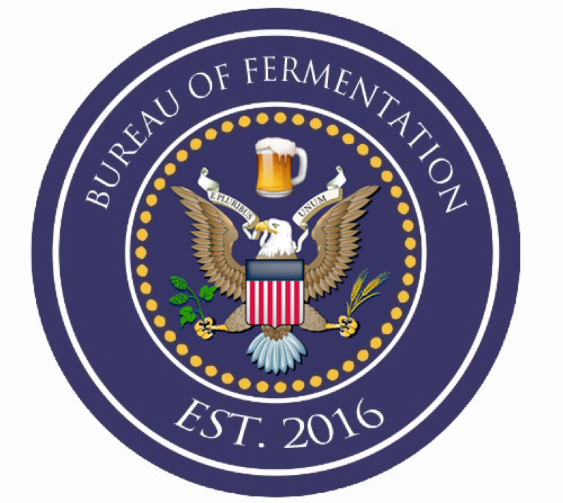
I've been a bureaucrat for most of my working life, so I'm waffling between "Department of Fermentation" or "Bureau of Fermentation," with a logo that looks like an official government seal. Below are a couple I put together using the Beerclings logo designer, since I have no graphic design ability or software. They convey the general concept I'm going for, but I'm not crazy about them--it looks a little cartoonish in general, but especially the images in the center of the seal. Can anyone offer any help or advice? I'm also interested in opinions on which name sounds better.
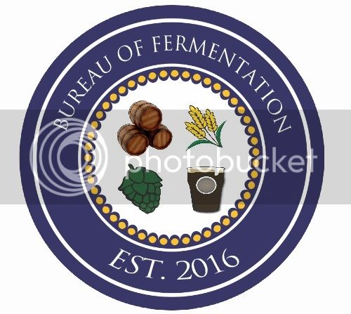
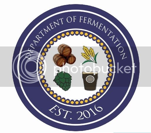


I've been a bureaucrat for most of my working life, so I'm waffling between "Department of Fermentation" or "Bureau of Fermentation," with a logo that looks like an official government seal. Below are a couple I put together using the Beerclings logo designer, since I have no graphic design ability or software. They convey the general concept I'm going for, but I'm not crazy about them--it looks a little cartoonish in general, but especially the images in the center of the seal. Can anyone offer any help or advice? I'm also interested in opinions on which name sounds better.
I kinda like "Department of Fermentation"...
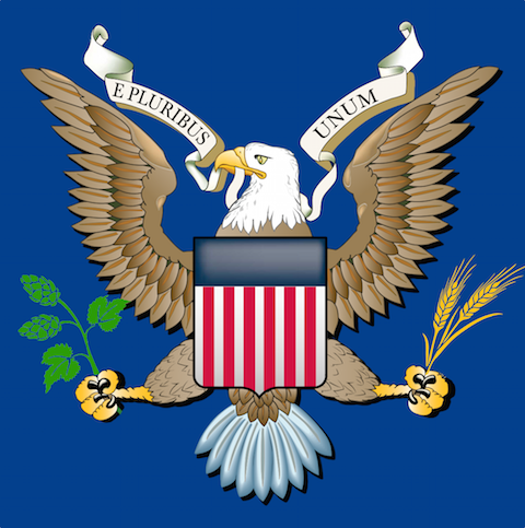
Maybe in the middle of the seal, an eagle clutching grain in one talon and hops in the other?
Maybe something like this... (just messing around here for concept... I'm sure it can be done better than this!)
Maybe a pint of beer superimposed over the shield?
Maybe a pint of beer superimposed over the shield?
Added some drop shadow to the hops and grain...
pointcity-homebrew
Crafting openers 1 at a time
I've been a bureaucrat for most of my working life, so I'm waffling between "Department of Fermentation" or "Bureau of Fermentation," with a logo that looks like an official government seal. Below are a couple I put together using the Beerclings logo designer, since I have no graphic design ability or software. They convey the general concept I'm going for, but I'm not crazy about them--it looks a little cartoonish in general, but especially the images in the center of the seal. Can anyone offer any help or advice? I'm also interested in opinions on which name sounds better.
I had a little fun with this.

A little more playing around with the original concept... Note that this is pretty low resolution, and there are some flaws in this image... This is just to show an idea... Not a finished design!
For one thing, I'd probably replace the "E PLURIBUS UNUM" with some other text... Or maybe put the "Established 2016" there?
I'd also enlarge the inner image and reduce the thickness of the outer rings...
(Does this link show now? Anybody?)
I like pointcity-homebrew's ideas, too. This is an exhibition, not a competition!
popsicleian
Well-Known Member
These are great, guys! Jimdkc--the image on your last post isn't showing up for me.
These are great, guys! Jimdkc--the image on your last post isn't showing up for me.
How about now?
Here it is as an attachment...

Maybe something like this... (just messing around here for concept... I'm sure it can be done better than this!)
Maybe a pint of beer superimposed over the shield?
How about the barley and hops in one claw, and a beer stein in the other?
popsicleian
Well-Known Member
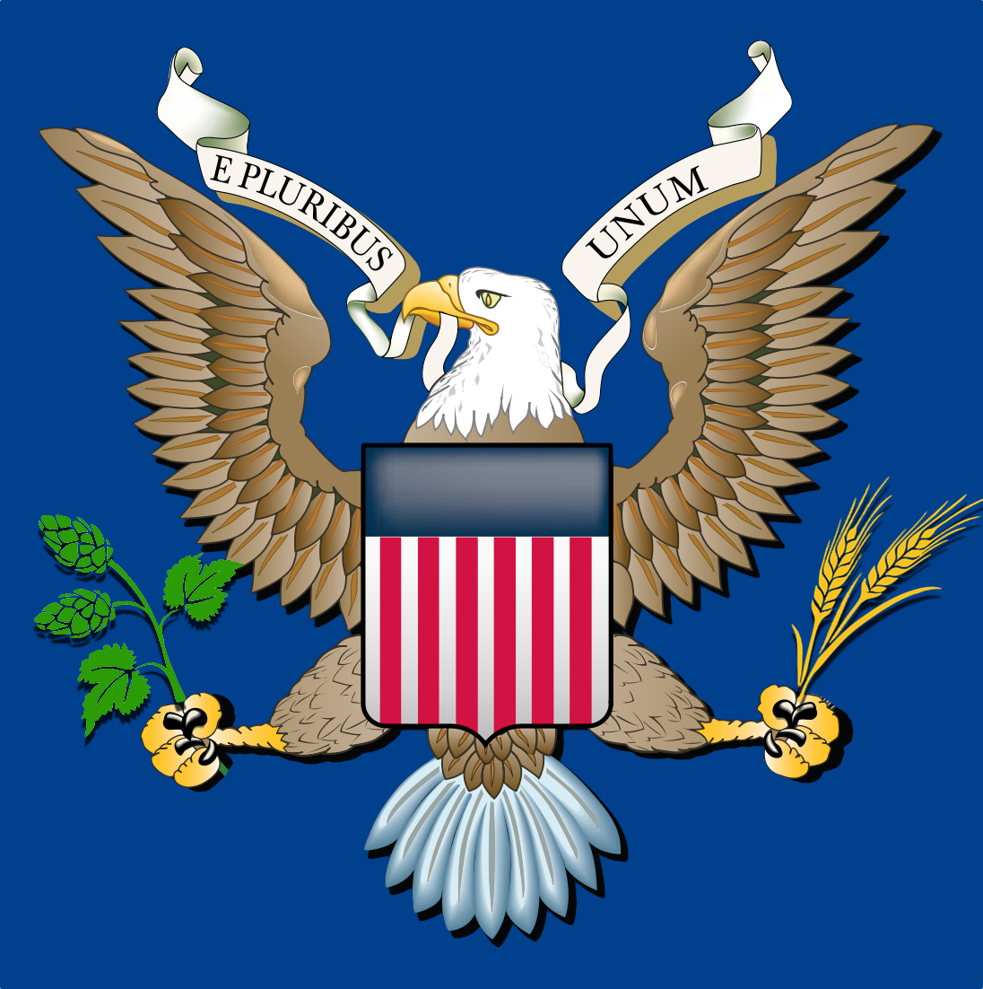
Here it is as an attachment...
This is great! I think the only thing I'd change is the "E Pluribus Unum". Either leave it blank or something more beer appropriate, but I can't think of anything at the moment.
OK... I'm in the process of redoing the whole thing... in higher resolution with more precision.
And I think I came up with some really good text for the banner...
I Googled "Latin Beer Quote" and came across this:
"In Vino Veritas, In Cervesio Felicitas"
Which means:
"In wine there is truth, in beer there is happiness."
Which is a bit long... so I just used the "In Cervesio Felicitas" part. Here's a sample:
Similar threads
- Replies
- 0
- Views
- 212
- Replies
- 130
- Views
- 6K
- Replies
- 14
- Views
- 914
