MX1
Texas Ale Works
The brushed steel looks pretty sharp man. I'd say remove half the rivets from the border, slap a test label of that on a bottle... I bet it looks sexy. It's not over complicated either.
This.....

The brushed steel looks pretty sharp man. I'd say remove half the rivets from the border, slap a test label of that on a bottle... I bet it looks sexy. It's not over complicated either.
How are you guys doing this stuff? Photoshop?
I have minimal photoshop skills. I'd love to get a basic label design that I could use. I was thinking might be cool to have a charicature of myself on the label? Seems those cost big bucks though.
I've been using the beer labelizer webpage and that is pretty cool, but after a while... boring.
Where do I start??
TD


I removed some of the rivets and tweaked it a little more. Looks great on the screen, but when I print it out, it doesn't look like metal though. Unless I use glossy photo paper, which I don't want to do.The brushed steel looks pretty sharp man. I'd say remove half the rivets from the border, slap a test label of that on a bottle...

I removed some of the rivets and tweaked it a little more. Looks great on the screen, but when I print it out, it doesn't look like metal though. Unless I use glossy photo paper, which I don't want to do.
How are you guys doing this stuff? Photoshop?
I have minimal photoshop skills. I'd love to get a basic label design that I could use.
Where do I start??
TD
This is my wine label, although im looking to use the same "dead tree" logo for my brews as well. any room for improvement here?
I removed some of the rivets and tweaked it a little more. Looks great on the screen, but when I print it out, it doesn't look like metal though. Unless I use glossy photo paper, which I don't want to do.
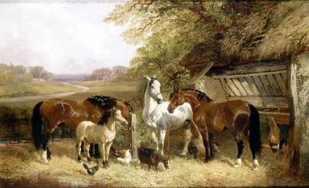
So i was thinking of using this picture as a label but other then that i haven't much of a clue. I came up with the name storm brewery as my last name is strom i figured it be a funny play on word type of thing. But as it turns out a strom brewery already exist. So any suggestions on the name would be nice too that has the same concept. Im not looking for much just a few suggestions =]
How about Stormy Weather Brewery?
So i was thinking of using this picture as a label but other then that i haven't much of a clue. I came up with the name storm brewery as my last name is strom i figured it be a funny play on word type of thing. But as it turns out a strom brewery already exist. So any suggestions on the name would be nice too that has the same concept. Im not looking for much just a few suggestions =]
How about: BrewStorm, Stormbrew beer company (SBC), StormBräu. Just a few ideas off the top of my head.So i was thinking of using this picture as a label but other then that i haven't much of a clue. I came up with the name storm brewery as my last name is strom i figured it be a funny play on word type of thing. But as it turns out a strom brewery already exist. So any suggestions on the name would be nice too that has the same concept. Im not looking for much just a few suggestions =]
Still just my opinion... but looks sharp man. The only thing I would add, is to maybe try and give the logo itself some depth. A few well placed lines could give it dimension and help it stand out from the steel. Adding depth and light variations would be your only chance of making the steel more realistic, yet unnecessary. Looking good.
Rough Waters Brewing Company
I really liked this name actually so i decided to roll with it and make up a mock label. Let me know what you guys think as this is the first time iv even used photoshop (i got the qr code from another guy on the forums actually i cant remember his user name but he gets all the credit for that haha)

wow I should have posted here before I made a thread... i need something to make my square1 look a little better on my labels. I change the color of it depending on the color of the beer inside the bottle but to me it looks sooo generic. I have it set as my default background layer and then I just updated the text layer and add some label image layer stuff. Heres an Example.
Maybe the border needs redone to make the label more appealing and less like I did it. .. suggestions?
Thanks again for the brewery logo JINKS
Have any of you used a service like Fiverr to do some logo design? I made a quick logo long ago, but feel it probably needs some refinement. Plus I'd like to do some glass etching or other things where something that translates better to monochrome would be helpful. Or... anyone want to tackle it yourselves?
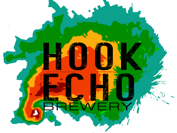
Okay. As my post above noted, I whipped together this quick logo some time ago. Never saved the PSD of the raster. However this definitely needs some refinement. Plus I'd like to be able to monochrome the logo at some point so I can do some pint etchings and other things. There's a part of me that would like of like to stay in this vein (thunderstorm on radar... the lower left part of the graphic is the "Hook Echo"), but I'm open for anything. Anyone want to take a stab at it?Post your idea if you want help with it, people tend to jump on them fairly quick with good results.


Okay. As my post above noted, I whipped together this quick logo some time ago. Never saved the PSD of the raster. However this definitely needs some refinement. Plus I'd like to be able to monochrome the logo at some point so I can do some pint etchings and other things. There's a part of me that would like of like to stay in this vein (thunderstorm on radar... the lower left part of the graphic is the "Hook Echo"), but I'm open for anything. Anyone want to take a stab at it?

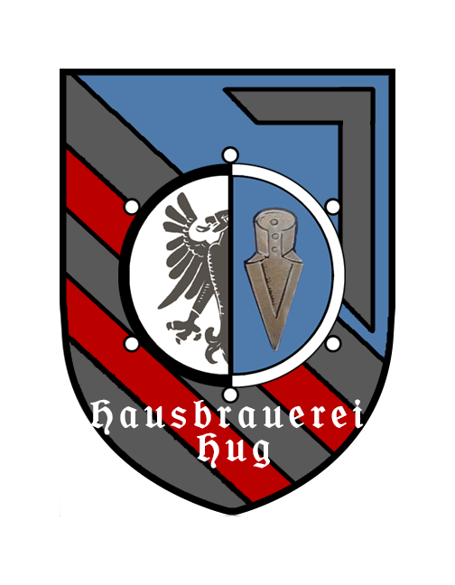
I'm trying to build up a label with a combination of two family crests from my Dad's side of the family, with Hausbrauerei Hug as the brewery name, in reasonably simple gothic type script, similar to what we've got in the Howdybrau logo.
I've got the sources, and some cleanup that I tried doing myself, the heraldry guy apparently liked embellishing.
Any help would be awesome, I'm at the limits of what my image editing skills are capable of. I was using pixlr for the above work, and have the layered files as well.
I really like the weathered font on it. I'm going to see if I can play around with the stray edges of the radar image a bit to see if I can maintain some perspective without it looking too artificial.
The monochrome is certainly the challenge. If I continue with the radar theme, I may just need to simply use text for the monochrome. Or simply drop the radar theme for something else.
Thanks @WayFrae !
Looking to improve on this
Started with the middle part and it grew. This part stays the same with each batch, except for whatever ridiculous name I decide to give the batch
On the left is a description of the beer, in a font of my own handwriting, then a little about me using flags; US, VA, the Battle Ensign of the ship I was on, the VFW Cross & a Navy Jack.
On the right is the gubmint warning, a barcode for that batch + brewed& bottling dates in my handwriting font
This is what I came up with for yours. Let me know what you think!
What kind of improvements are you looking for? Can you be more specific?


@JINKS - hey, bud...are you still in the label business? I've got the Beer Labelizer, but not having much luck with the fonts, pix etc. (using Chrome O/S)...
Any help would be appreciated!


![Craft A Brew - Safale BE-256 Yeast - Fermentis - Belgian Ale Dry Yeast - For Belgian & Strong Ales - Ingredients for Home Brewing - Beer Making Supplies - [3 Pack]](https://m.media-amazon.com/images/I/51bcKEwQmWL._SL500_.jpg)


