The "We'll fix your label for you" thread

Homebrew Talk - Beer, Wine, Mead, & Cider Brewing Discussion Forum

Help Support Homebrew Talk - Beer, Wine, Mead, & Cider Brewing Discussion Forum:

This site may earn a commission from merchant affiliate links, including eBay, Amazon, and others.
Not from Skyrim... although I love that game! It's more from Talladega Nights where he says "I play for keeps!" Curious how you related it to Skyrim... perhaps I could incorporate that somehow as well :mug:

Snow. Dragons. Castles. Lots and lots of barrels. Screams Skyrim :cross:

Nice label for sure.
 
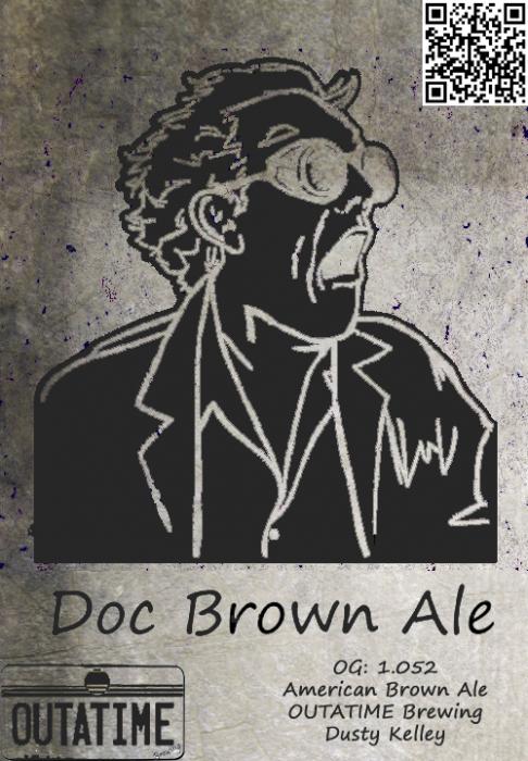
Ah gotcha. That wasn't my label. I got that from the show us your label thread as an example of a label design I like. I thought you were referring to the brewery name
 
Ah gotcha. That wasn't my label. I got that from the show us your label thread as an example of a label design I like. I thought you were referring to the brewery name

Yeah I thought that was your label.
 
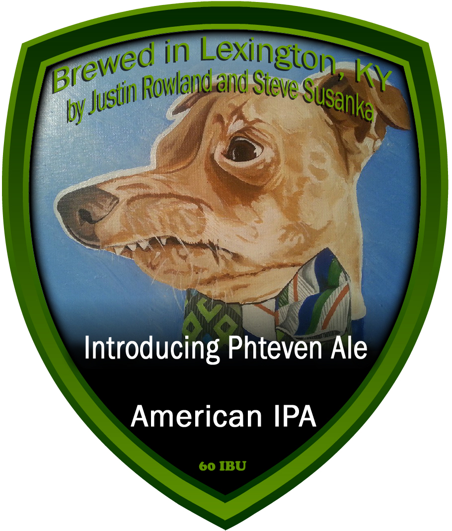
Thanks a ton for your help so far JINKS! After seeing that label, I'm not sure that layout is right for the picture. I am pretty sure I am settled on this simple one from Beerlabelizer. Same problems though; I do not like the font. It's too hard to read. I would also probably want it to say 60 IBUs instead of 12 oz. Also, with that website, I could not get the picture to fit right. I would like to see the whole dog head and the bowtie. The beer name needs to be complete if possible as that is part of the pun (IPA). Thanks again!

Beer label 2.jpg
 
Thanks a ton for your help so far JINKS! After seeing that label, I'm not sure that layout is right for the picture. I am pretty sure I am settled on this simple one from Beerlabelizer. Same problems though; I do not like the font. It's too hard to read. I would also probably want it to say 60 IBUs instead of 12 oz. Also, with that website, I could not get the picture to fit right. I would like to see the whole dog head and the bowtie. The beer name needs to be complete if possible as that is part of the pun (IPA). Thanks again!

Simple easy to read font.

aaa.jpg
 
Last edited:
Almost perfect. I don't want to ask too much, but could you possibly change a couple of things? Namely put a "g" in Lexington. Also, do you have a font called Daniel? I think that would look nice. I found it here:
http://www.fontsquirrel.com/fonts/daniel

Not sure if these are things I can do myself. I know the basics of MS Paint, but I think it would have to be layered to make easy changes? I still want my brewery name in there somewhere, but I haven't figured out where yet. I'll probably put it under the beer name and I'm certain I can do that in Paint.

Yea totally missed the "G" Don't have Daniel font, wait! I got it now, lol, took seconds to install, and No worries I enjoy making labels.

aaaa.jpg
 
Almost perfect. I don't want to ask too much, but could you possibly change a couple of things? Namely put a "g" in Lexington. Also, do you have a font called Daniel? I think that would look nice. I found it here:
http://www.fontsquirrel.com/fonts/daniel

Not sure if these are things I can do myself. I know the basics of MS Paint, but I think it would have to be layered to make easy changes? I still want my brewery name in there somewhere, but I haven't figured out where yet. I'll probably put it under the beer name and I'm certain I can do that in Paint.

Inkscape is free and can do font additions.
 
@JINKS - Hi, Jinks, hope all is well in your neck of the woods!:mug:

I don't have a "Germanic" font yet installed on my ChromeBook; I was wondering if you might have a few spare minutes to make this one into an Oatmeal Raisin Cookie Stout (or just Oatmeal Cookie Stout if space is an issue) - the stats are 4.5%/Vol and 355 ml:

231339d1414123115-well-fix-your-label-you-thread-timekiller.jpg


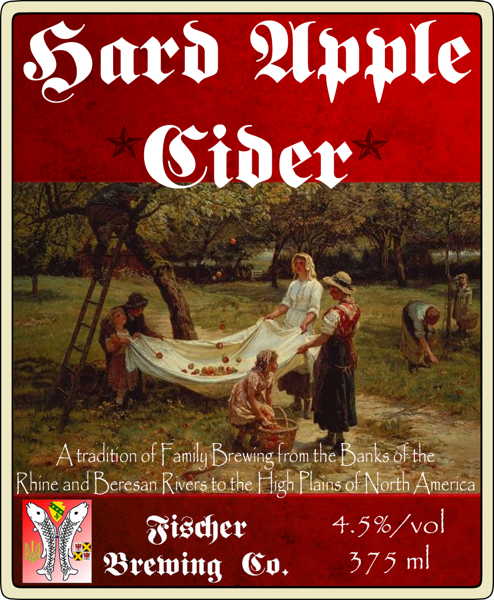
Also, would you be able to do a Hard Apple Cider with this (also 4.5%/Vol, 355 ml:

233041d1414815360-well-fix-your-label-you-thread-timekiller2.jpg


Thank you, sir, and if I can ever be of service, please let me know.

Merry Christmas! :eek:nestar:

Ron
 
TImekiller2.jpg


I didn't like the way the font looked like it said oatmeal raisin cootie stout so I used a capital "K" in place of the lowercase "k" just in case LOL


Timekiller.jpgTimekillerb.jpg


Or just Oatmeal CooKie Stout

Timekillerc copy.jpg
 
Hey, @JINKS - many, many thanks for the lightning fast work - they look great!

I can see what you mean about that weird lower-case "k" - I went ahead with the second version using the capital K, which turned out very nice!

Thanks again, and Merry Christmas ~

Ron
 
Good grief - you out-did yourself with that apple cider one - it's perfect!

Thanks for putting in the extra work on that, I greatly appreciate the way that you're able to find pictures that capture the spirit of what I'm going for. :mug:
 
Good grief - you out-did yourself with that apple cider one - it's perfect!

Thanks for putting in the extra work on that, I grreatly appreciate the way that you're able to find pictures that capture the spirit of what I'm going for. :mug:

Gotta love google
searched Peasant apple harvest painting and "bam"
 
Good grief - you out-did yourself with that apple cider one - it's perfect!

Thanks for putting in the extra work on that, I greatly appreciate the way that you're able to find pictures that capture the spirit of what I'm going for. :mug:

It's Interesting to see the differences in our styles cuz here is where I'm going with my cider labels.
 
It's Interesting to see the differences in our styles cuz here is where I'm going with my cider labels.

I like that look, too - great graphics and the fonts really appeal to me.

For mine, the inspiration is my German ancestors, who emigrated from Alsace to Ukraine and set up a farming colony - and then came to North Dakota right around the turn of the last century (this also shows up in the "logo"). The tradition, heritage etc are things that really resonate with me, since they brewed their own beer, cider etc as well. In fact, the hops that they grew in North Dakota are still there - my dad and I plan to go over there this year and bring some shoots back....

Cool maybe when you get your hops well established here in Montana, I'll drive up and snag a rhizome or two for down here. Plus bring some homebrew for sharing/exchanging.
 
Last edited:
Cool maybe when you get your hops well established here I'll drive up and snag a rhizome or two for down here. Plus bring some homebrew for sharing/exchanging.

That sounds like a great deal :mug:

We get down your way 3 or 4 times a year, so if we happen to be going that way when the rhizomes are fresh, I'll let you know. Otherwise, we can set up a time, with appropriate tasting opportunities, of course ~ :tank:
 
Thanks, I like to make labels, and help people who are less software blessed.
Now if I could only figure out how to draw and not just cut and paste. :D

Heard that. All I can draw are trees and buildings. Living things end up looking like...yeah I draw stick figures if needed.
 
Sorry. I meant "All I can draw are dead trees and buildings".

That's what I figured. I just couldn't find the smilies in the phone app. My artistic abilities are nonexistent, so dead trees and buildings are two steps past what I can do.

Happy New Year!
 
So I kind of started this thread a while ago and never followed through with anything. My apologies. A bunch of stuff kind of happened.

So who wants some work done? I'll take the next project.
 
So I kind of started this thread a while ago and never followed through with anything. My apologies. A bunch of stuff kind of happened.

So who wants some work done? I'll take the next project.

We understand, life gets in the way. Welcome back.:mug:
 
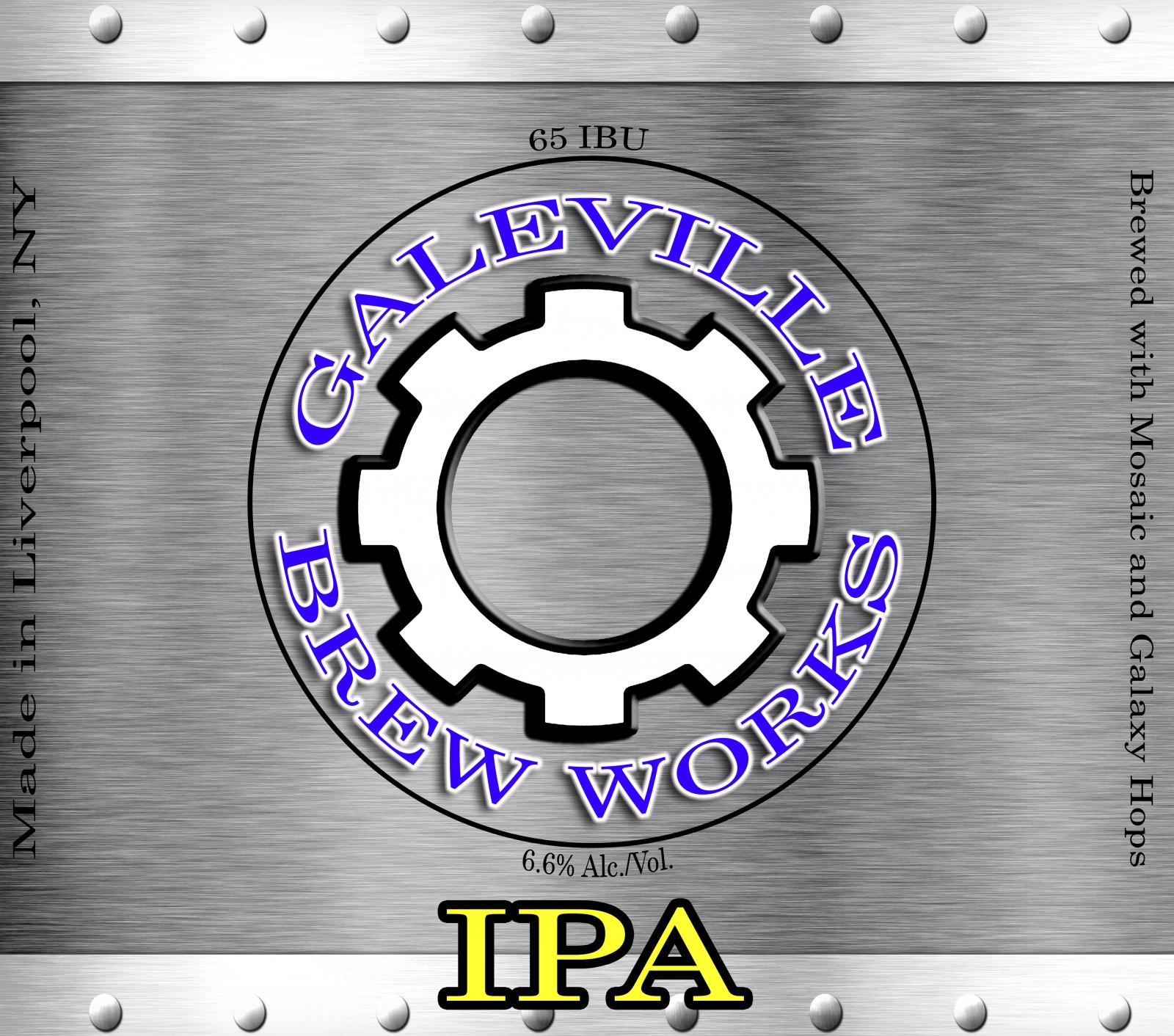
Here's my first label. It's almost done. But I think it needs a little something. I want to keep it basic so that all I have to do is change the (beer style) text at the bottom of the label when I bottle a different beer. Any ideas?

MybeerLabel2jpg.jpg
 
I think a different color background would make the logo stand out more. Maybe even just some sort of border. It's looking good though, nice layout man.
 
Here's my first label. It's almost done. But I think it needs a little something. I want to keep it basic so that all I have to do is change the (beer style) text at the bottom of the label when I bottle a different beer. Any ideas?

Looks Great! Better than my first label even thought of looking. Simple and easy to change with the beer. You could change background color with each beer as in a red background for a red , yellow for a cream ale, green for a hop bomb etc.

Try some drop shadows from the letters may make them pop a little more.
 
Here's my first label. It's almost done. But I think it needs a little something. I want to keep it basic so that all I have to do is change the (beer style) text at the bottom of the label when I bottle a different beer. Any ideas?

Ya know, looking at it again... maybe even dropping an opaque pattern on top of that grey. A texture may make it look less painted? Just a thought.
 
Ya know, looking at it again... maybe even dropping an opaque pattern on top of that grey. A texture may make it look less painted? Just a thought.
I like the texture idea. I also tried a metal texture but I think it goes against my original idea of being a basic design. I'm not sure which way I want to go :confused:

MybeerLabel2metal copy.jpg


MybeerLabel2jpg.jpg
 
I like the texture idea. I also tried a metal texture but I think it goes against my original idea of being a basic design. I'm not sure which way I want to go :confused:

The brushed steel looks pretty sharp man. I'd say remove half the rivets from the border, slap a test label of that on a bottle... I bet it looks sexy. It's not over complicated either.
 
Back
Top