You are using an out of date browser. It may not display this or other websites correctly.
You should upgrade or use an alternative browser.
You should upgrade or use an alternative browser.
Terra Incognita - new label
- Thread starter riromero
- Start date

Help Support Homebrew Talk:
This site may earn a commission from merchant affiliate
links, including eBay, Amazon, and others.
very nice! I don't have any trouble reading the name and the dry hopped isn't too much for my tastes.
love. it. I was thinking of posting some of my labels, but they pale in comparison to ones like this. Nice job.
BTW, I love the idea of putting the grains and hops on the side. I'm gonna steal that. Thanks.
BTW, I love the idea of putting the grains and hops on the side. I'm gonna steal that. Thanks.

$20.94
$29.99
The Brew Your Own Big Book of Clone Recipes: Featuring 300 Homebrew Recipes from Your Favorite Breweries
Amazon.com

$176.97
1pc Commercial Keg Manifold 2" Tri Clamp,Ball Lock Tapping Head,Pressure Gauge/Adjustable PRV for Kegging,Fermentation Control
hanhanbaihuoxiaoshoudian

$53.24
1pc Hose Barb/MFL 1.5" Tri Clamp to Ball Lock Post Liquid Gas Homebrew Kegging Fermentation Parts Brewer Hardware SUS304(Liquid Hose Barb)
Guangshui Weilu You Trading Co., Ltd

$39.22 ($39.22 / Count)
Brewer's Best Home Brew Beer Ingredient Kit - 5 Gallon (Mexican Cerveza)
Amazon.com

$53.24
1pc Hose Barb/MFL 1.5" Tri Clamp to Ball Lock Post Liquid Gas Homebrew Kegging Fermentation Parts Brewer Hardware SUS304(Liquid MFL)
yunchengshiyanhuqucuichendianzishangwuyouxiangongsi

$58.16
HUIZHUGS Brewing Equipment Keg Ball Lock Faucet 30cm Reinforced Silicone Hose Secondary Fermentation Homebrew Kegging Brewing Equipment
xiangshuizhenzhanglingfengshop

$719.00
$799.00
EdgeStar KC2000TWIN Full Size Dual Tap Kegerator & Draft Beer Dispenser - Black
Amazon.com
$22.00 ($623.23 / Ounce)
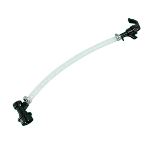
AMZLMPKNTW Ball Lock Sample Faucet 30cm Reinforced Silicone Hose Secondary Fermentation Homebrew Kegging joyful
无为中南商贸有限公司

$172.35
2 Inch Tri Clamp Keg Manifold With Ball Lock Posts, Pressure Gauge, PRV (0-30 PSI) – Homebrew, Fermentation, Kegging System
wuhanshijiayangzhiyimaoyiyouxiangongsi

$7.79 ($7.79 / Count)
Craft A Brew - LalBrew Voss™ - Kveik Ale Yeast - For Craft Lagers - Ingredients for Home Brewing - Beer Making Supplies - (1 Pack)
Craft a Brew

$27.29 ($13.64 / Count)
$41.99 ($21.00 / Count)
2 Pack 1 Gallon Large Fermentation Jars with 3 Airlocks and 2 SCREW Lids(100% Airtight Heavy Duty Lid w Silicone) - Wide Mouth Glass Jars w Scale Mark - Pickle Jars for Sauerkraut, Sourdough Starter
Qianfenie Direct

$10.99 ($31.16 / Ounce)
Hornindal Kveik Yeast for Homebrewing - Mead, Cider, Wine, Beer - 10g Packet - Saccharomyces Cerevisiae - Sold by Shadowhive.com
Shadowhive
bass-a-roo
Active Member
i like the old world/map theme. looks great.
mitch171
Well-Known Member
Since you arn't trying to sell this (I am assuming) I would take the Dry Hopped out. I think it looks like something BMC would do to pull someone in. Maybe note that with the ingredients, or make it more subtle.
Other than that, it is a really great label, and looks worthy of a commercial brew. ONTOH the Dry Hopped! adds to the authenticity of looking like a commercial beer if that is what you are going for.
Other than that, it is a really great label, and looks worthy of a commercial brew. ONTOH the Dry Hopped! adds to the authenticity of looking like a commercial beer if that is what you are going for.
Looks really good. I also would move/remove the 'Dry Hopped' lettering. Also, I really like the background texture. The lettering for the name is slightly difficult to read, I wonder if you angled the words from bottom left to top right (once you removed the 'Dry Hopped' letters) you could either spread the letters a little more or make the font larger. Don't know if it would work.
All in all a fantastic label. Good job!
All in all a fantastic label. Good job!
mitch171
Well-Known Member
That Sir is perfect IMHO now! Really great call on rotating the main text, I think it flows into the subtext better now.
Apollofrost
Active Member
nice work man
CenCalWorthog
Well-Known Member
Good work... really like it... interesting label but very clean.
Was thinking there needs to be a magnifying glass somewhere for the "incongita" part... like your searching for something. Maybe I'm nuts.
Good work though!
Was thinking there needs to be a magnifying glass somewhere for the "incongita" part... like your searching for something. Maybe I'm nuts.
Good work though!
MagicLarry
Well-Known Member
Beautiful work, very well done.
How can I like it more?... but I do! Great! Love the name. Looks like something Dr. Livingston would have drank while traversing the dark continent. Nice.
I'd almost want to throw in a "Here there be dragons" somewhere but that would likely be overdoing it.
I would have saved the name and the label for a dark beer, probably a RIS or other expedition style beer. I think the name and theme of this label are inconsistent with a house beer, especially a pale ale.
Once again, though, I love the art.
Once again, though, I love the art.
DubbelDach
Well-Known Member
Great label, and I love the modifications on the 2nd version.
What font did you use on the title? It's awesome...
What font did you use on the title? It's awesome...
Similar threads
- Replies
- 1
- Views
- 2K
Latest posts
-
-
-
I just poured 42 bottles of HB Dunkelweizen down the drain
- Latest: homebeerbrewer
-
-
-
Factors affecting Water Chemistry Calculations (Oh no, not again!)
- Latest: Unicorn_Platypus
-
-









![Craft A Brew - Safale BE-256 Yeast - Fermentis - Belgian Ale Dry Yeast - For Belgian & Strong Ales - Ingredients for Home Brewing - Beer Making Supplies - [3 Pack]](https://m.media-amazon.com/images/I/51bcKEwQmWL._SL500_.jpg)
