Captain_Eo
Member
Any other Ween fans out there?
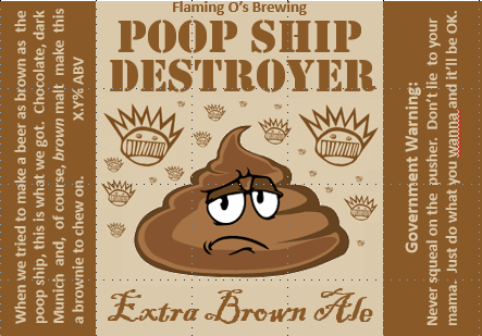


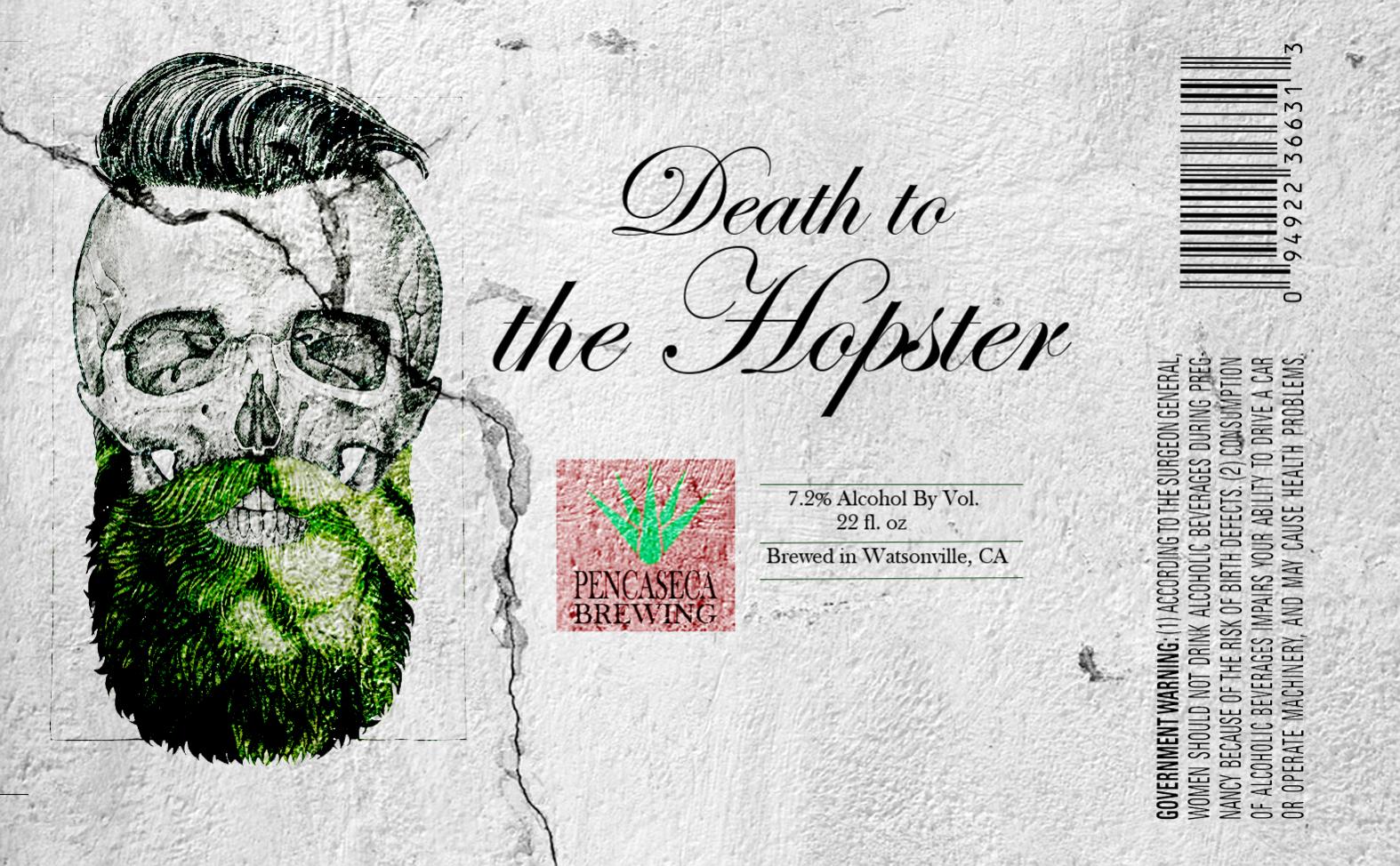
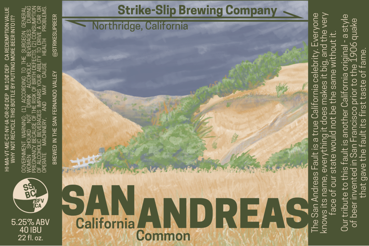
Here's a label I did quickly last night in MS Paint. I'm on 5.0 of this recipe and I think it's almost there. Just need to up the abv to about 7% and up the IBU's a little and perhaps add a little more rye. It's amazing after 5 times of brewing nothing but this beer I'm not tired of it at all.
Look good but might want to spell check the hops before printing. Just trying to help.

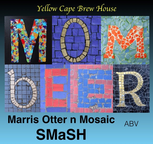




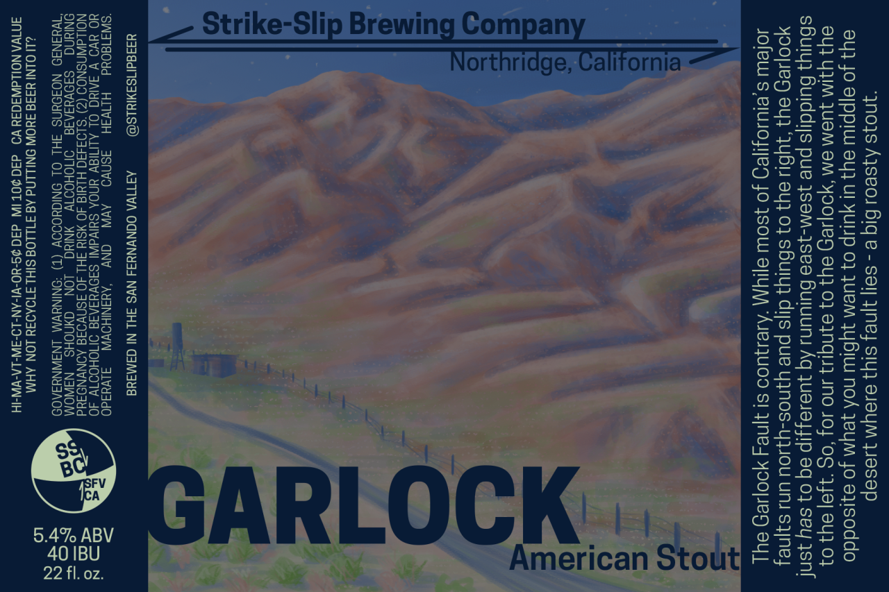
Latest label for American Wheat, with tropical fruit flavor and aroma from hops.
I'd change "smell" (which generally has a bad connotation) to "aroma"...
Also... why can't fat chicks drink it?
Edit: Sounds delicious, by the way!
Good point on using "smell"!
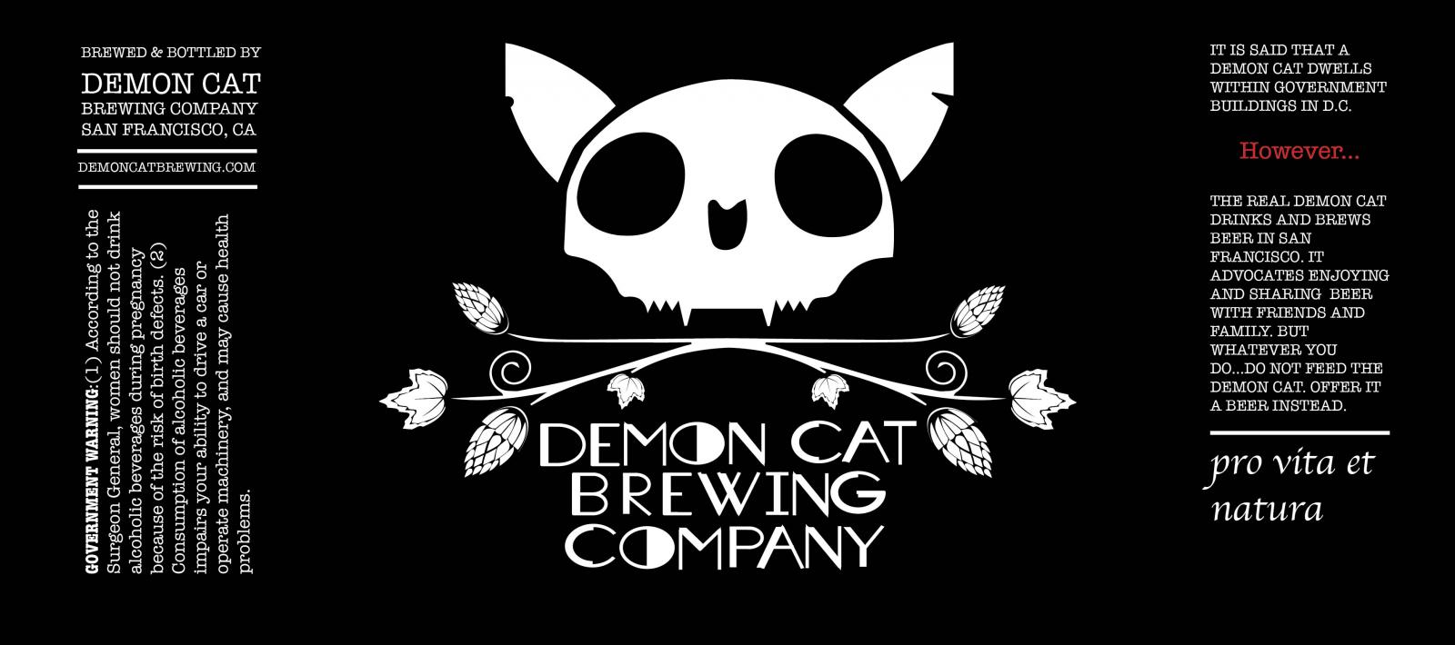

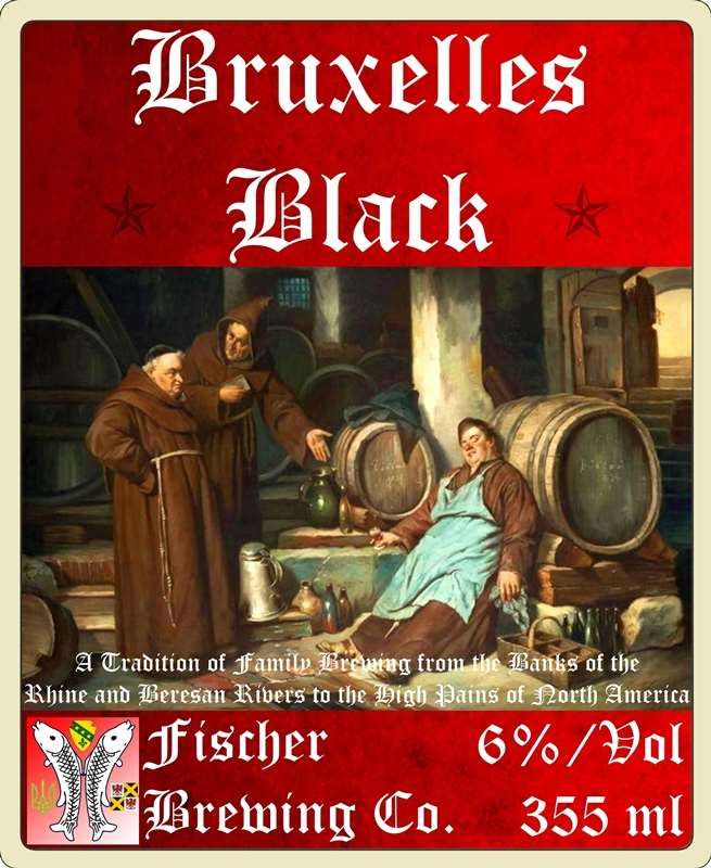
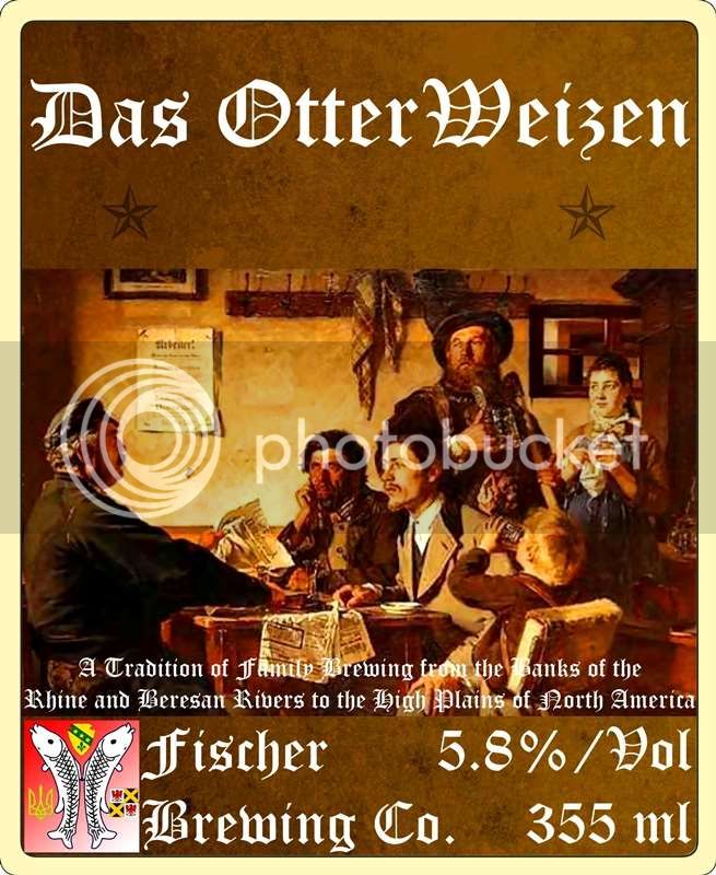
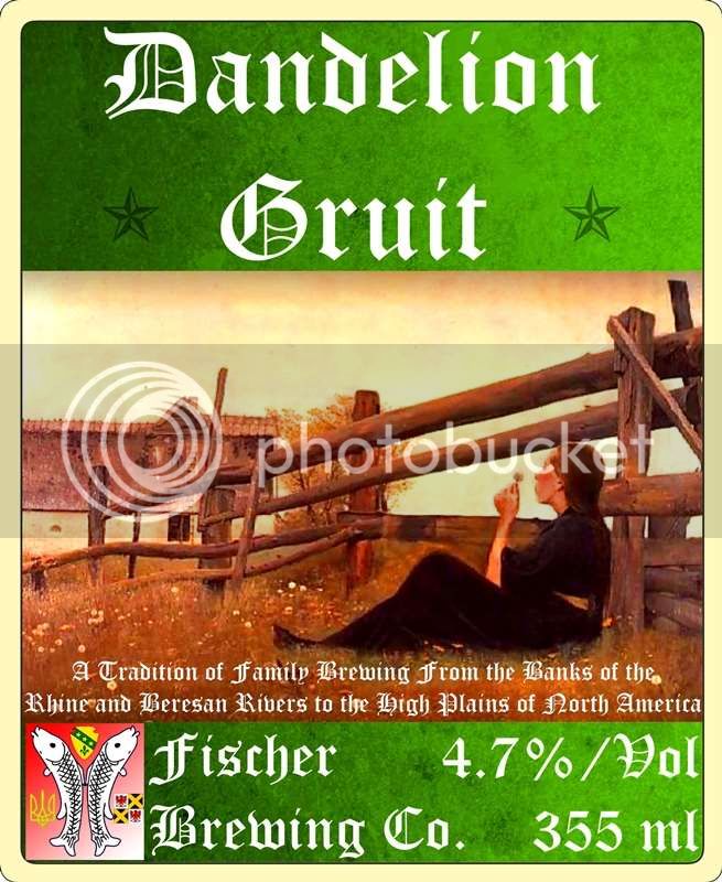
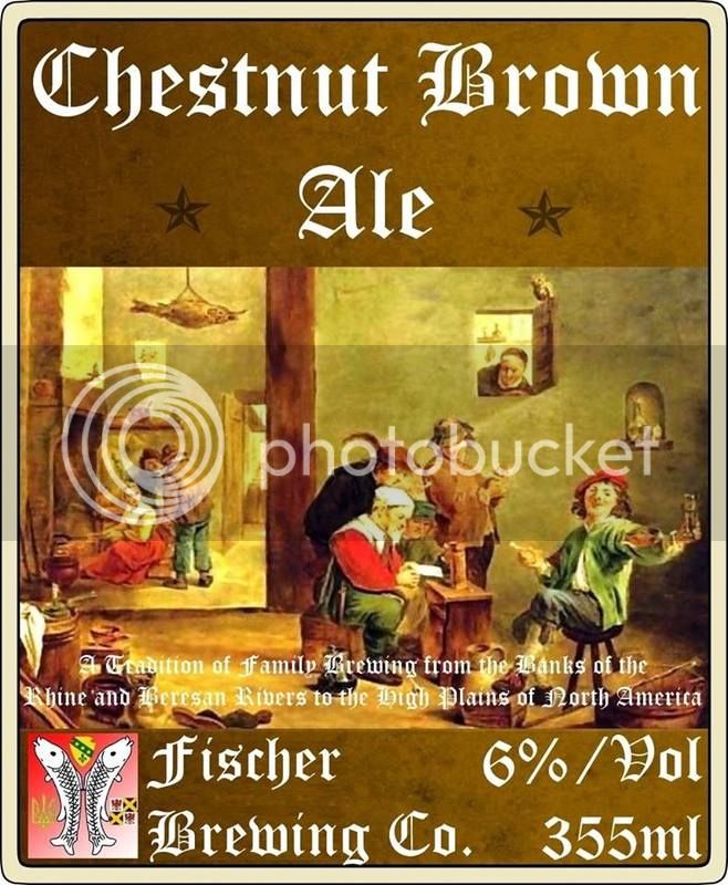
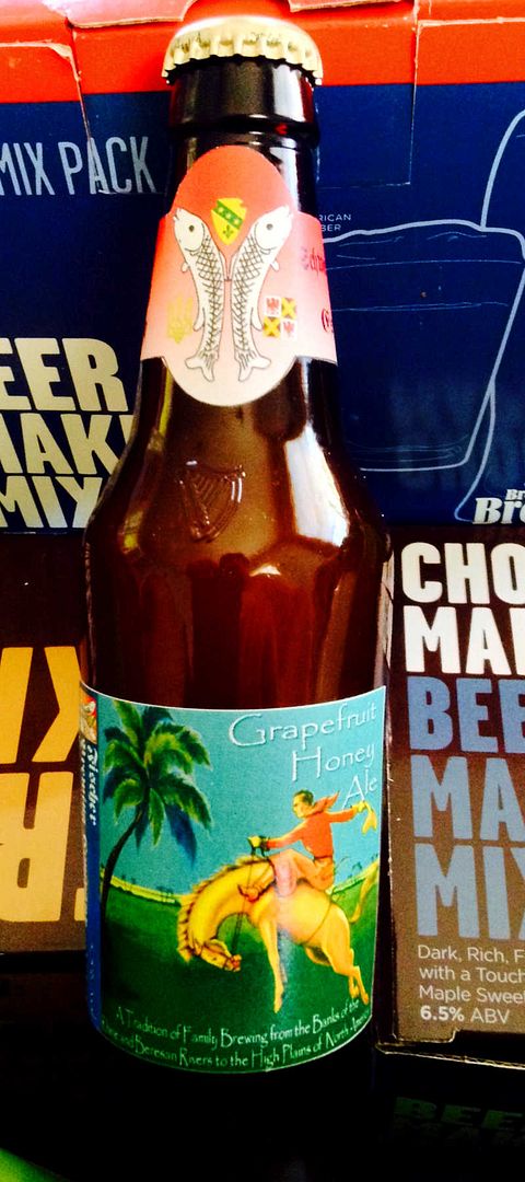
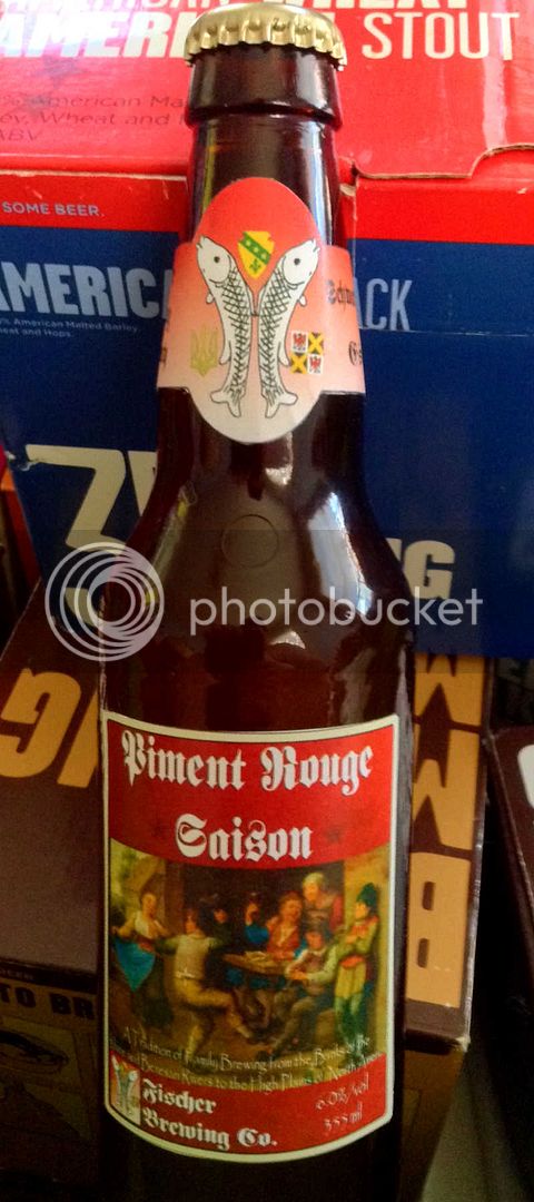
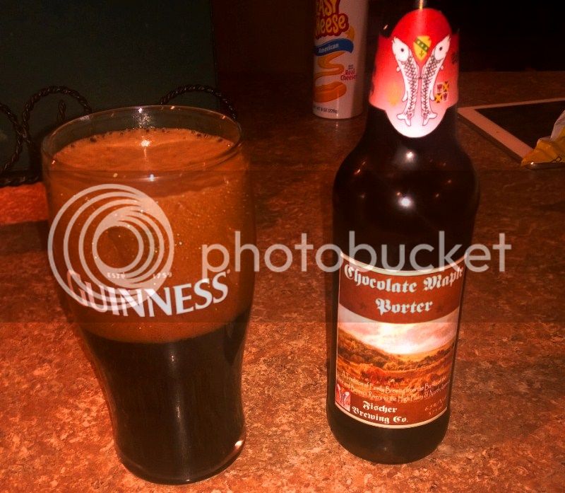
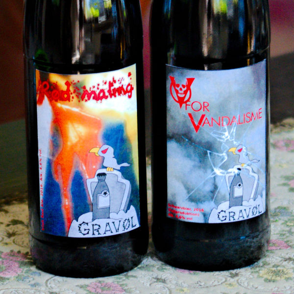
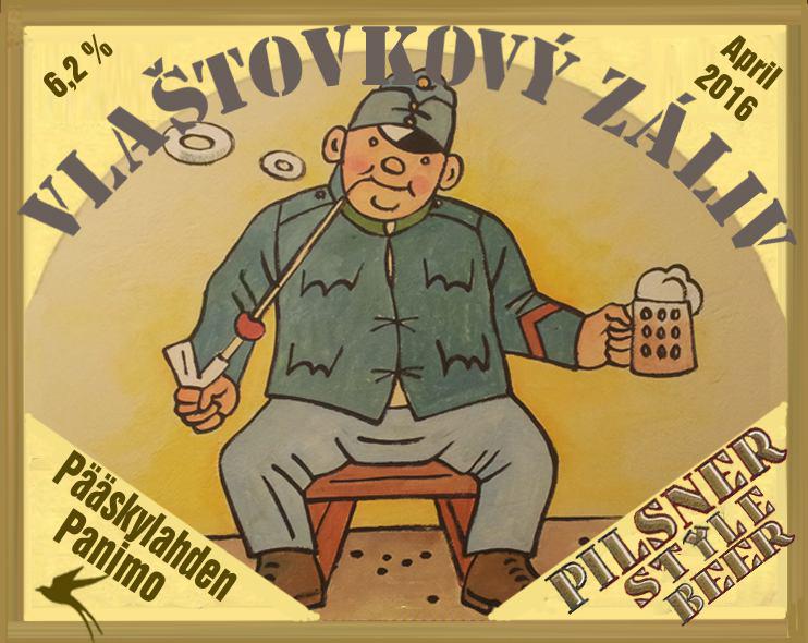

Depends on what kind of image style you're going for... I like the minimalist simplicity of it. If I was doing it, I'd make the font pop a little more with an outline or color change. But that's just my opinion.

I like the font the way it is. Integrates well with the graphic. Also just an opinion.
Brew on
Depends on what kind of image style you're going for... I like the minimalist simplicity of it. If I was doing it, I'd make the font pop a little more with an outline or color change. But that's just my opinion.
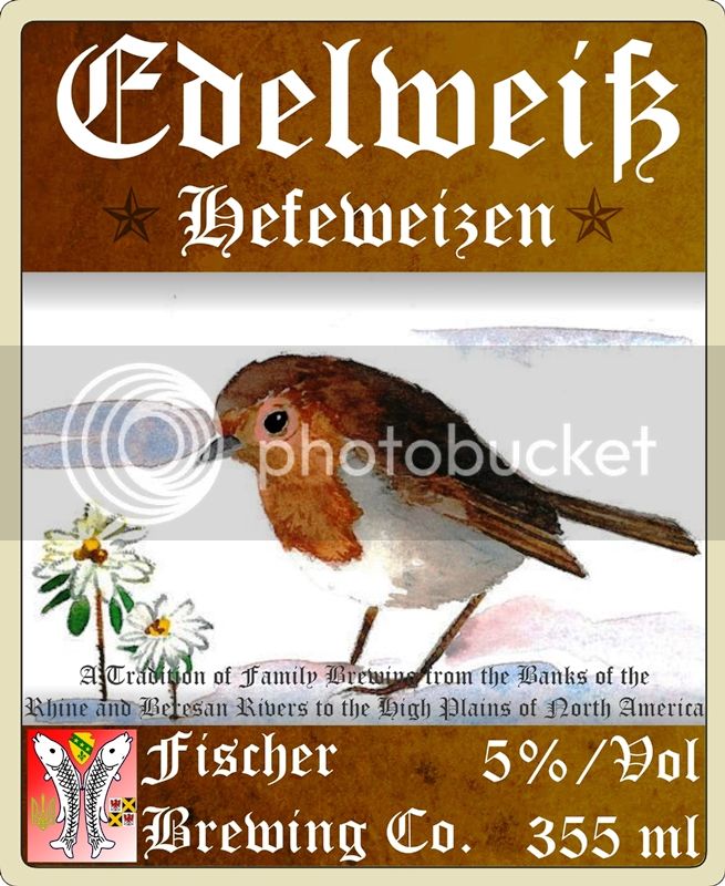
An old label I did from a photo my son took with the old Vivitar
[IMG]http://i563.photobucket.com/albums/ss71/unionrdr/drklager_zps893850fa.jpg[/IMG]
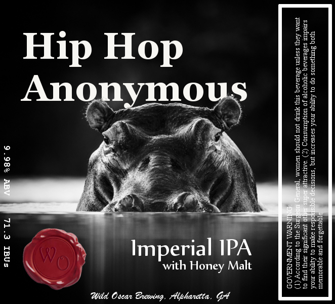
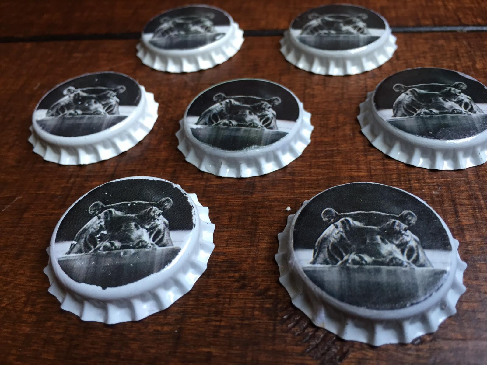
"Hybrid Cager"
The cursive "L" stuck me as a "C" [emoji6]
