You are using an out of date browser. It may not display this or other websites correctly.
You should upgrade or use an alternative browser.
You should upgrade or use an alternative browser.
Show Us Your Label
- Thread starter muse435
- Start date

Help Support Homebrew Talk:
This site may earn a commission from merchant affiliate
links, including eBay, Amazon, and others.


Been holding off on sharing these till I knew they would be used. These are for an inherited partial mash kit a friend gave me. The grain bill was unknown (which gave me the name), the yeast had to be replaced with Notty, and I adjusted the hop schedule and dry-hopping (+50g Cascade) to fit my tastes in an American IPA. Bottled last week and it's spot on ....
Love these and also like someone else said the accent colors on the side look great!
Northumberlandmonkey
Member
The brews i am going to try next month got the grains just need the time off
View attachment 1445601118180.jpg
View attachment 1445601137782.jpg
View attachment 1445601118180.jpg
View attachment 1445601137782.jpg
TheCADJockey
ALL YOUR BASE
Those look professional as hell. Awesome job. Angry Irish one is excellent.
CKelly
Well-Known Member
- Joined
- Jan 12, 2015
- Messages
- 98
- Reaction score
- 98
I know I've said it before, but you really got everything right with these. The Angry Irish one is perfect. Very professional and just a pleasure on the eyes!
Seismogenic
Well-Known Member
Finally had time to make another label! At this rate, it's going to take me forever to make labels for everything I've brewed...


$479.00
$559.00
EdgeStar KC1000SS Craft Brew Kegerator for 1/6 Barrel and Cornelius Kegs
Amazon.com


![Craft A Brew - Safale S-04 Dry Yeast - Fermentis - English Ale Dry Yeast - For English and American Ales and Hard Apple Ciders - Ingredients for Home Brewing - Beer Making Supplies - [1 Pack]](https://m.media-amazon.com/images/I/41fVGNh6JfL._SL500_.jpg)
$6.95 ($17.38 / Ounce)
$7.47 ($18.68 / Ounce)
Craft A Brew - Safale S-04 Dry Yeast - Fermentis - English Ale Dry Yeast - For English and American Ales and Hard Apple Ciders - Ingredients for Home Brewing - Beer Making Supplies - [1 Pack]
Hobby Homebrew


$53.24
1pc Hose Barb/MFL 1.5" Tri Clamp to Ball Lock Post Liquid Gas Homebrew Kegging Fermentation Parts Brewer Hardware SUS304(Liquid Hose Barb)
yunchengshiyanhuqucuichendianzishangwuyouxiangongsi


$7.79 ($7.79 / Count)
Craft A Brew - LalBrew Voss™ - Kveik Ale Yeast - For Craft Lagers - Ingredients for Home Brewing - Beer Making Supplies - (1 Pack)
Craft a Brew


$159.50 ($26.58 / Count)
3M High Flow Series System BREW120-MS, 5616001, For Brewed Coffee and Hot Tea, Valve-in-Head Design
Amazon.com

$53.24
1pc Hose Barb/MFL 1.5" Tri Clamp to Ball Lock Post Liquid Gas Homebrew Kegging Fermentation Parts Brewer Hardware SUS304(Liquid Hose Barb)
Guangshui Weilu You Trading Co., Ltd


$76.92 ($2,179.04 / Ounce)
Brewing accessories 1.5" Tri Clamp to Ball Lock Post Liquid Gas Homebrew Kegging Fermentation Parts Brewer Hardware SUS304 Brewing accessories(Gas Hose Barb)
chuhanhandianzishangwu


$22.00 ($623.23 / Ounce)
AMZLMPKNTW Ball Lock Sample Faucet 30cm Reinforced Silicone Hose Secondary Fermentation Homebrew Kegging joyful
无为中南商贸有限公司


$176.97
1pc Commercial Keg Manifold 2" Tri Clamp,Ball Lock Tapping Head,Pressure Gauge/Adjustable PRV for Kegging,Fermentation Control
hanhanbaihuoxiaoshoudian


$33.99 ($17.00 / Count)
$41.99 ($21.00 / Count)
2 Pack 1 Gallon Large Fermentation Jars with 3 Airlocks and 2 SCREW Lids(100% Airtight Heavy Duty Lid w Silicone) - Wide Mouth Glass Jars w Scale Mark - Pickle Jars for Sauerkraut, Sourdough Starter
Qianfenie Direct


$20.94
$29.99
The Brew Your Own Big Book of Clone Recipes: Featuring 300 Homebrew Recipes from Your Favorite Breweries
Amazon.com


$10.99 ($31.16 / Ounce)
Hornindal Kveik Yeast for Homebrewing - Mead, Cider, Wine, Beer - 10g Packet - Saccharomyces Cerevisiae - Sold by Shadowhive.com
Shadowhive


$44.99
$49.95
Craft A Brew - Mead Making Kit – Reusable Make Your Own Mead Kit – Yields 1 Gallon of Mead
Craft a Brew

$58.16
HUIZHUGS Brewing Equipment Keg Ball Lock Faucet 30cm Reinforced Silicone Hose Secondary Fermentation Homebrew Kegging Brewing Equipment
xiangshuizhenzhanglingfengshop


$719.00
$799.00
EdgeStar KC2000TWIN Full Size Dual Tap Kegerator & Draft Beer Dispenser - Black
Amazon.com
Nomofett
Well-Known Member
- Joined
- Dec 21, 2014
- Messages
- 339
- Reaction score
- 162
So I've been watching this thread for a while and obviously others watching it are into designing a good label for their beers. But it's really easy to get caught in your first style of label and just repeat it, I know I do that.
But I'm curious, to all of you that are into labels; what makes a great label in your mind? Is it the evocation of the beer style that the asthetics create? Is it the name? Is is the colors? The simplicity? The way the information is laid out? And what information is important? I see many labels with warning on them but that seems unnecessary on a homebrew label (unless they are a play on it) but do you guys dig it? I wanna kinda deconstruct labels and get everyone's thoughts and help us all take our labels up a notch.
Also, please don't just say it's a balance of those, of course the perfect balance makes the perfect label, but I'm curious what helps that balance.
Thanks!
Of course this is all going to be personal thoughts and opinion but here's my thoughts.
Before I was into home brewing a co-worker used to share home brewed cider. The bottles he gave me didn't have any label, so they sat in my fridge for quite some time before trying them to be honest. I started thinking about the reason behind this when I started brewing myself. I quickly realized I was hesitant to try something I wasn't very sure exactly what it was. Was it dirty water, was it going to be good, was it going to be sanitary? What exactly is in this bottle, maybe I'm not in the mood that day to try that. To me a label completely changes the way someone looks at that beer when they're first trying it.
It is my thought that the more appealing it looks and the more "store bought" it looks the more someone is going to WANT to try it and psychologically they may even end up liking and enjoying it more because of it. This is the only reason I put government warnings, barcodes, a made up brewery name, etc.
That is beside the fact that I love playing in Photoshop and it is a part of the hobby I enjoy very much while sitting around twiddling my thumbs while beer is fermenting. It gives me something brew related to do all of the time.
Nomofett
Well-Known Member
- Joined
- Dec 21, 2014
- Messages
- 339
- Reaction score
- 162
Perfect, what I take from that is tip #1 make it look professional. So many homebrewers don't bother to use labels, but I was a bartender/waiter for 8 years and one thing I learned is that the first thing you eat with is your eyes. Make it look professional, 1: put a label on every beer. If it's worth making it is worth labeling. 2: if you are going to label it put the same trouble into labeling as you did into making it. We don't just throw random hops and malts together and hope it works so don't just throw random images together. Plan it, think about how the images interact with each other. Just like the recipe you created realize that every color and image interacts with each other. Put time and thought into it. Don't just toss it together and use the first draft.
Great, thanks! Keep em coming. I really want to dig deep into this and help us understand how to make every aspect of our beers better.
If I get enough tips together from everyone I will put together some sort of manifesto that will help us all about designing the perfect label and really kick our hobby up a notch
Perfect, what I take from that is tip #1 make it look professional. So many homebrewers don't bother to use labels, but I was a bartender/waiter for 8 years and one thing I learned is that the first thing you eat with is your eyes. Make it look professional, 1: put a label on every beer. If it's worth making it is worth labeling. 2: if you are going to label it put the same trouble into labeling as you did into making it. We don't just throw random hops and malts together and hope it works so don't just throw random images together. Plan it, think about how the images interact with each other. Just like the recipe you created realize that every color and image interacts with each other. Put time and thought into it. Don't just toss it together and use the first draft.
Great, thanks! Keep em coming. I really want to dig deep into this and help us understand how to make every aspect of our beers better.
If I get enough tips together from everyone I will put together some sort of manifesto that will help us all about designing the perfect label and really kick our hobby up a notch
I think this is a great discussion to add so thanks for asking. I was actually approached to see if I was interested in writing an article and this is the first idea that came to mind was home brewing labels.
This will help add to the creativity.
Northumberlandmonkey
Member
I just nock up any label I fancy and always use black white as it's 10p sheet at my local library ")
CKelly
Well-Known Member
- Joined
- Jan 12, 2015
- Messages
- 98
- Reaction score
- 98
Like Nomofett said, when you're making a beer you are creating a harmony between malt, hops, yeast, etc. Likewise, with labels, you should aim to create harmony between the colors, fonts, and artwork.
To me, the best looking labels on here are those that are simple, balanced, and convey a theme or idea that somehow ties back to who the brewer is. This could be anything from location to a childhood story that has stuck with them and helped define their style. The best labels are simple in design, but use that imagery to say something about their beer without adding paragraphs of text. I think the biggest thing to kill the aesthetics of a label is to add too much text. A picture is worth a thousand words - let them do the talking!
To me, the best looking labels on here are those that are simple, balanced, and convey a theme or idea that somehow ties back to who the brewer is. This could be anything from location to a childhood story that has stuck with them and helped define their style. The best labels are simple in design, but use that imagery to say something about their beer without adding paragraphs of text. I think the biggest thing to kill the aesthetics of a label is to add too much text. A picture is worth a thousand words - let them do the talking!
BrooklynTom
Well-Known Member
- Joined
- Aug 6, 2014
- Messages
- 374
- Reaction score
- 89
A quick label for a 1 gallon batch of Christmas ale. I know a picture is worth a thousand words, but with this one, most might not know who Krampus is. image is clearer in publisher.

What software/tool did you use to create these labels? They look amazing!
fumanchu282
Member
- Joined
- Aug 10, 2015
- Messages
- 9
- Reaction score
- 6
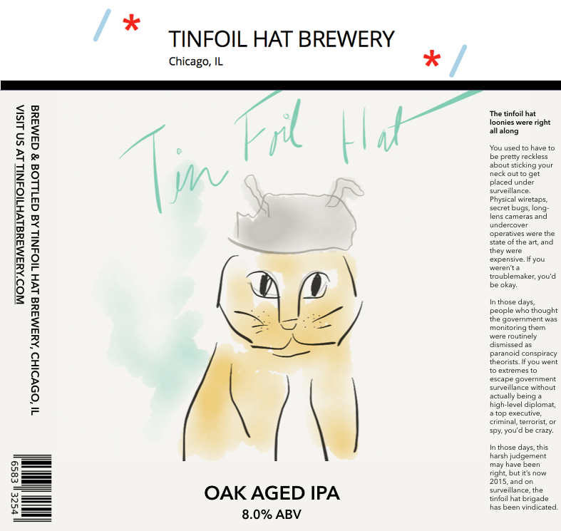
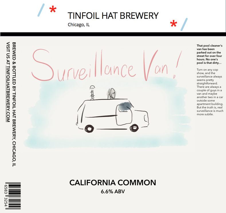
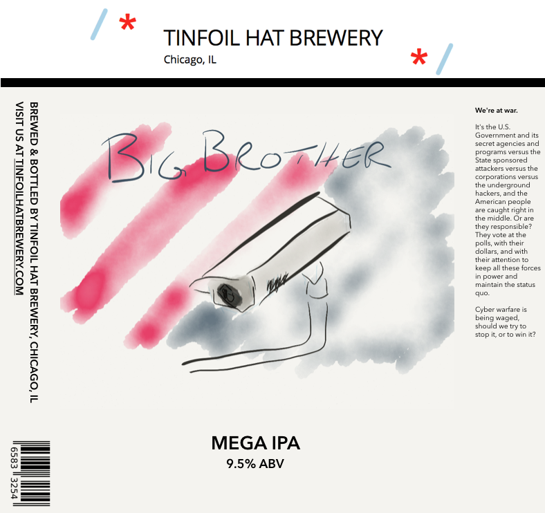
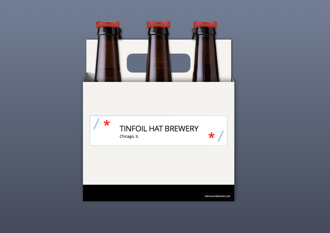
Just started brewing a few months ago but I've been messing around with a brewery concept. I have my 3rd, 4th, and 5th beers fermenting right now, and I plan to bottle them and give them as holiday gifts this year.
I drew some sketches on my iPad for the graphics of each beer, and mocked them up in Keynote on my Mac. I also built a little website, tinfoilhatbrewery.com
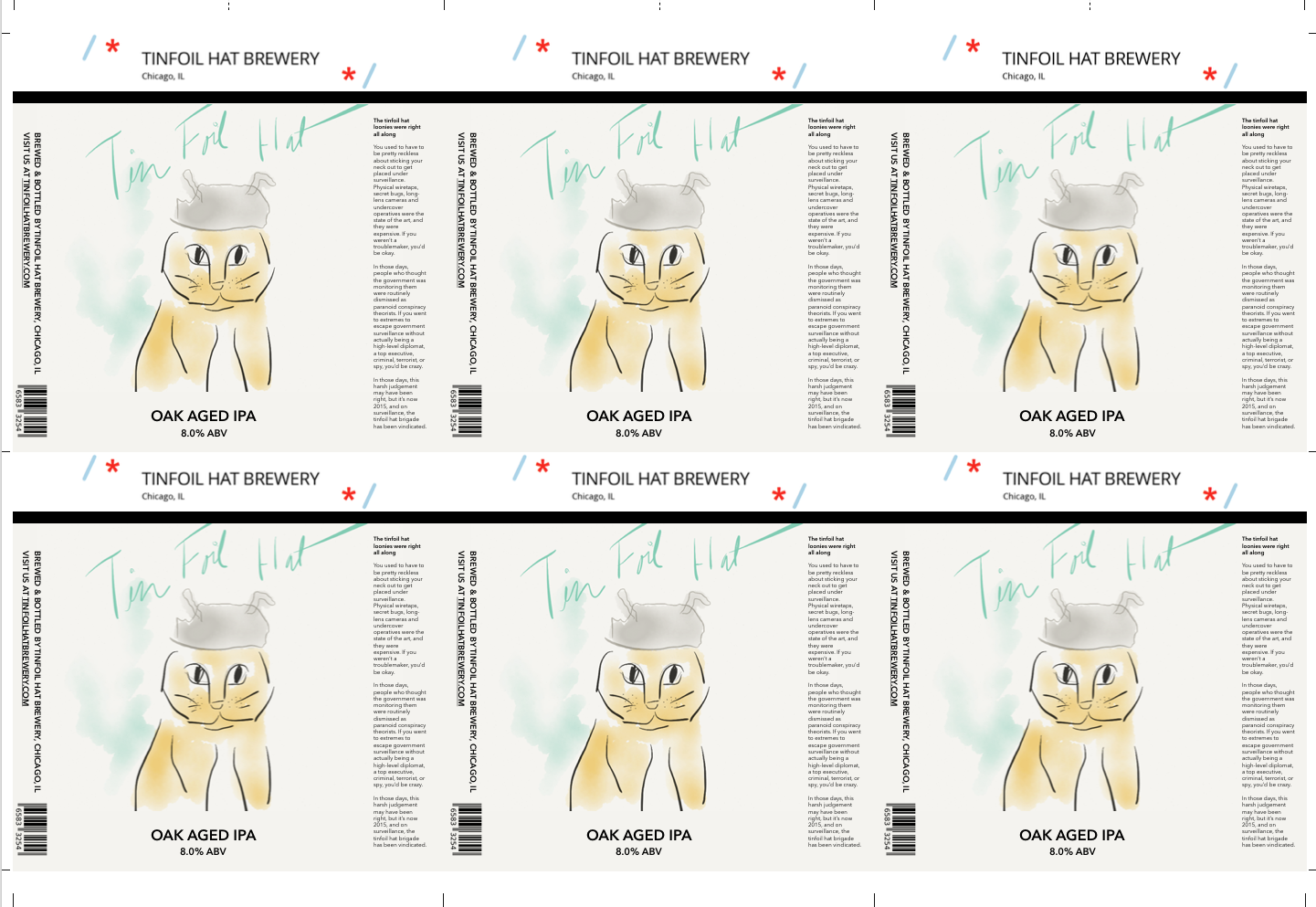
Thought it would be fun to come up with a cohesive theme that unifies it all, I took some inspiration from Revolution and their hero series of beers but chose a story a little closer to my heart (I work in cybersecurity). Each beer is a character, and each has a little backstory.
Hopefully the beers turn out...let me know what you think of the concept!
I drew some sketches on my iPad for the graphics of each beer, and mocked them up in Keynote on my Mac. I also built a little website, tinfoilhatbrewery.com
Thought it would be fun to come up with a cohesive theme that unifies it all, I took some inspiration from Revolution and their hero series of beers but chose a story a little closer to my heart (I work in cybersecurity). Each beer is a character, and each has a little backstory.
Hopefully the beers turn out...let me know what you think of the concept!
Just started brewing a few months ago but I've been messing around with a brewery concept. I have my 3rd, 4th, and 5th beers fermenting right now, and I plan to bottle them and give them as holiday gifts this year.
I drew some sketches on my iPad for the graphics of each beer, and mocked them up in Keynote on my Mac. I also built a little website, tinfoilhatbrewery.com
Thought it would be fun to come up with a cohesive theme that unifies it all, I took some inspiration from Revolution and their hero series of beers but chose a story a little closer to my heart (I work in cybersecurity).
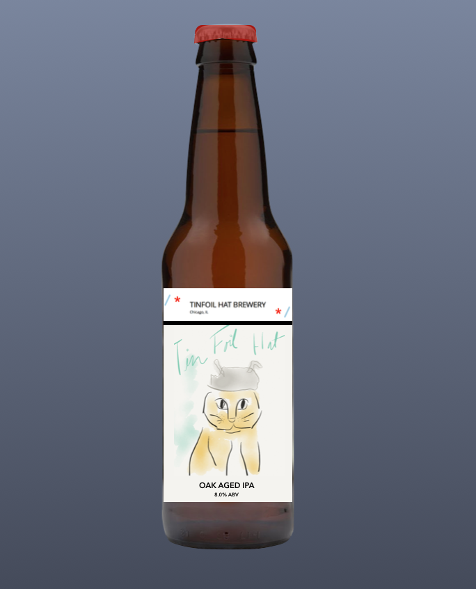
Very nice! Love the hand drawing look. I think they would look even more fantastic with a neck label with the brewery name rather than the label above the label. Just my opinion.
What software/tool did you use to create these labels? They look amazing!
Thanks.
I use GIMP (you can get this for free) with free plug-ins for fonts and texture brushes. There are a lot of layers on each label. The same thing can be accomplished by paying more than you need to for Photoshop....
I am hopefully putting out an article soon for the front page on labels that will explain more.
fumanchu282
Member
- Joined
- Aug 10, 2015
- Messages
- 9
- Reaction score
- 6
Very nice! Love the hand drawing look. I think they would look even more fantastic with a neck label with the brewery name rather than the label above the label. Just my opinion.
Yea I'd like to do a neck label but I wasn't sure how to incorporate.
It's kind of tough to tell on the computer screen, but the label design is actually a white strip on the top with a skinny black bar underlining it, and then the bottom of the label is a subtle beige color. I think the subtle contrast of the colors will look really cool with the stark black line through.
I tried to carry the same idea into the six packs. I have a bunch saved up, and I'm planning to spray paint them all a light beige color first, and then paint a black bar on the bottom and stick on a white label.
This might show it better:
Thanks.
I use GIMP (you can get this for free) with free plug-ins for fonts and texture brushes. There are a lot of layers on each label. The same thing can be accomplished by paying more than you need to for Photoshop....
I am hopefully putting out an article soon for the front page on labels that will explain more.
Awesome, thanks for the info. And what do you print them on/how do you get them on your bottles? Sorry for all the questions!
Awesome, thanks for the info. And what do you print them on/how do you get them on your bottles? Sorry for all the questions!
I lay 6 labels out on a GIMP template that I upload and print with Fedex Kinkos for pick up. 25 lb. laser jet paper I believe is their thinnest and works the best. I use kid's glue sticks to apply them and they literally fall with the glue off the minute you put them into an oxy bath.
Awesome, thanks for the info. And what do you print them on/how do you get them on your bottles? Sorry for all the questions!
You could also look into Inkscape, a free vector graphics editor.
Brew on
dustinboyd
Well-Known Member
Some of my "labels". I don't really label my bottles, persay, it's more of a hanging tag. I just punch a hole in the top of the tag and wrap it around the neck of the bottle with twine. I put the design on the front and the beer description on the back, along with my brewery name and ABV.
View attachment ImageUploadedByHome Brew1446127645.536083.jpg
View attachment ImageUploadedByHome Brew1446127655.460691.jpg
View attachment ImageUploadedByHome Brew1446127666.302010.jpg
View attachment ImageUploadedByHome Brew1446127676.435486.jpg
View attachment ImageUploadedByHome Brew1446127683.570180.jpg
View attachment ImageUploadedByHome Brew1446127693.605415.jpg
View attachment ImageUploadedByHome Brew1446127702.991340.jpg
The PB&J one is my favorite label.
TheCADJockey
ALL YOUR BASE
The PB&J one is my favorite label.
The amber one is pretty sharp. I'd like to see one hung on a bottle.
Slick idea man.
dustinboyd
Well-Known Member
Thanks man. I can't take 100% credit for all of the designs... Some were taken from other posts here or Google images and then slightly modified. Some I did design 100% of though. Below is a pic of them all on bottles. There are more labels shown in this pic because I have some that I took from here and didn't modify at all, so I didn't post them as "mine" in the above post.
View attachment ImageUploadedByHome Brew1446130750.343992.jpg
View attachment ImageUploadedByHome Brew1446130750.343992.jpg
TheCADJockey
ALL YOUR BASE
Thanks man. I can't take 100% credit for all of the designs...
Thanks for the picture. That looks like it would be a pain in the ass to do an entire batch but would make one hell of a six pack to give someone as a gift. That's great.
The latest batch of beers finally got labels:
1. third northern brewer/vienna smash, quickly becoming our house ale, recipe originally by @deathbrewer
2. my first porter, based on @edwort bee cave robust porter
3. a chocolate vanilla stout, left-over coopers kit i got for 1 buck at the sales store, date was running out, so they couldn't sell it full price any more.
The latest batch of beers finally got labels:
1. third northern brewer/vienna smash, quickly becoming our house ale, recipe originally by @deathbrewer
2. my first porter, based on @edwort bee cave robust porter
3. a chocolate vanilla stout, left-over coopers kit i got for 1 buck at the sales store, date was running out, so they couldn't sell it full price any more.
Love the Monty Python reference!
Thanks, to clarify for non-finnish, I live in Pääskylahti, translated: swallow bay.
Gotta love your labels Kharnynb. Did that batch I "helped with" work out?
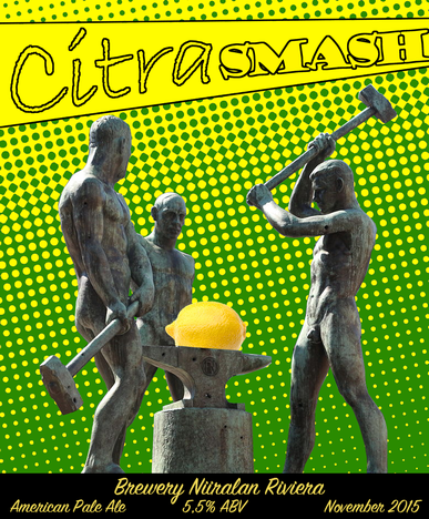
My first ever brew, CitraSMaSH, is almost through primary fermentation, need to come up with a label for it in the next month or so... =)
EDIT: Will probably end up being very close to this draft, if not indeed this one exactly.
My first ever brew, CitraSMaSH, is almost through primary fermentation, need to come up with a label for it in the next month or so... =)
EDIT: Will probably end up being very close to this draft, if not indeed this one exactly.
id be pretty scared of three naked dudes with big hammers...
Similar threads
- Replies
- 17
- Views
- 2K
- Replies
- 0
- Views
- 352
- Replies
- 130
- Views
- 7K
