- Joined
- Jun 12, 2014
- Messages
- 574
- Reaction score
- 191
"Who run Barleytown?"
Fantastic

"Who run Barleytown?"
Or guys? (I noticed the glory hole is brown)


I am keeping my labels primarily white and simple so I am not wasting a ton of ink to print them…
I used to have two on mine, one would link to the recipe. Now I just have one that when you scan it, it goes to the check in for it on Untappd.
(Both titles or pics are puns that would only be known to people pretty familiar with Japanese creatures)
")


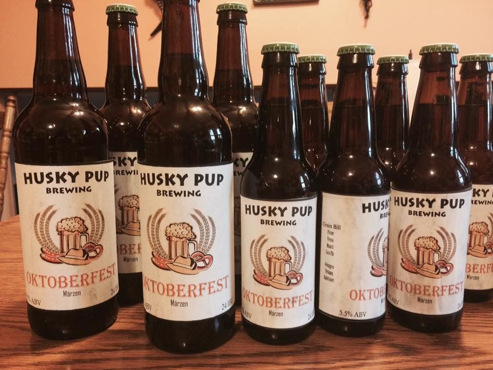
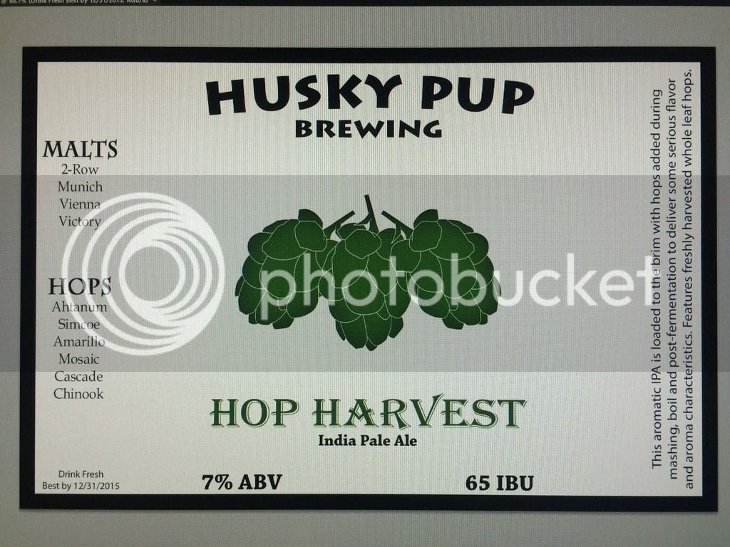
My bigger beers that were worthy of labels.
We name the good ones after our dogs or their nicknames.
My 2c, give the dog his/her neck back on the first label
easy fixThat's how it had to be cropped. But, I see what you mean, the space missing. I can go back and fix the label, its saved as a psd. We never noticed it before.
The picture was taken with his head hanging off of my gf's lap.
Experimental batch.

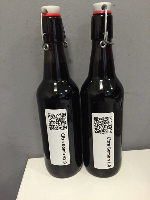
Had to fix my label. The previous one was much too dark, the text was unreadable. Unfortunate, I liked the other one on the screen. I definitely need to tone them down to a simple black and white logo or something.
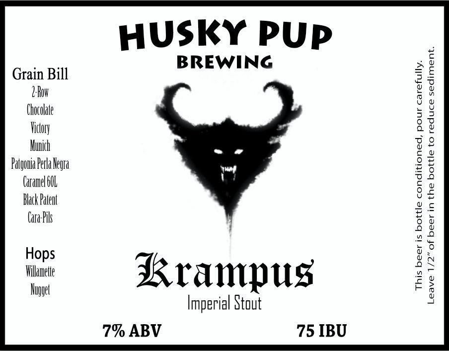
Those look great I really like the warning


Been holding off on sharing these till I knew they would be used. These are for an inherited partial mash kit a friend gave me. The grain bill was unknown (which gave me the name), the yeast had to be replaced with Notty, and I adjusted the hop schedule and dry-hopping (+50g Cascade) to fit my tastes in an American IPA. Bottled last week and it's spot on ....
It is the first IPA I have brewed that I adjusted the water profile for, did a first wort hopping, hop stand at 160-170F and oxygenate with pure O2... The result?
I'm so jealous... I can't use anything but mspaint... lol


![Craft A Brew - Safale BE-256 Yeast - Fermentis - Belgian Ale Dry Yeast - For Belgian & Strong Ales - Ingredients for Home Brewing - Beer Making Supplies - [3 Pack]](https://m.media-amazon.com/images/I/51bcKEwQmWL._SL500_.jpg)


