• Please visit and share your knowledge at our sister communities:
  • If you have not, please join our official Homebrewing Facebook Group!

    Homebrewing Facebook Group

Show Us Your Label

Homebrew Talk

Help Support Homebrew Talk:

This site may earn a commission from merchant affiliate links, including eBay, Amazon, and others.
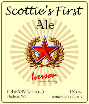
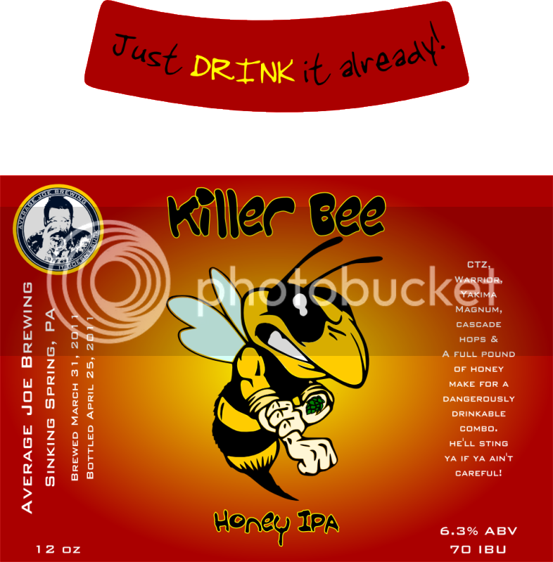
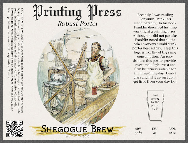
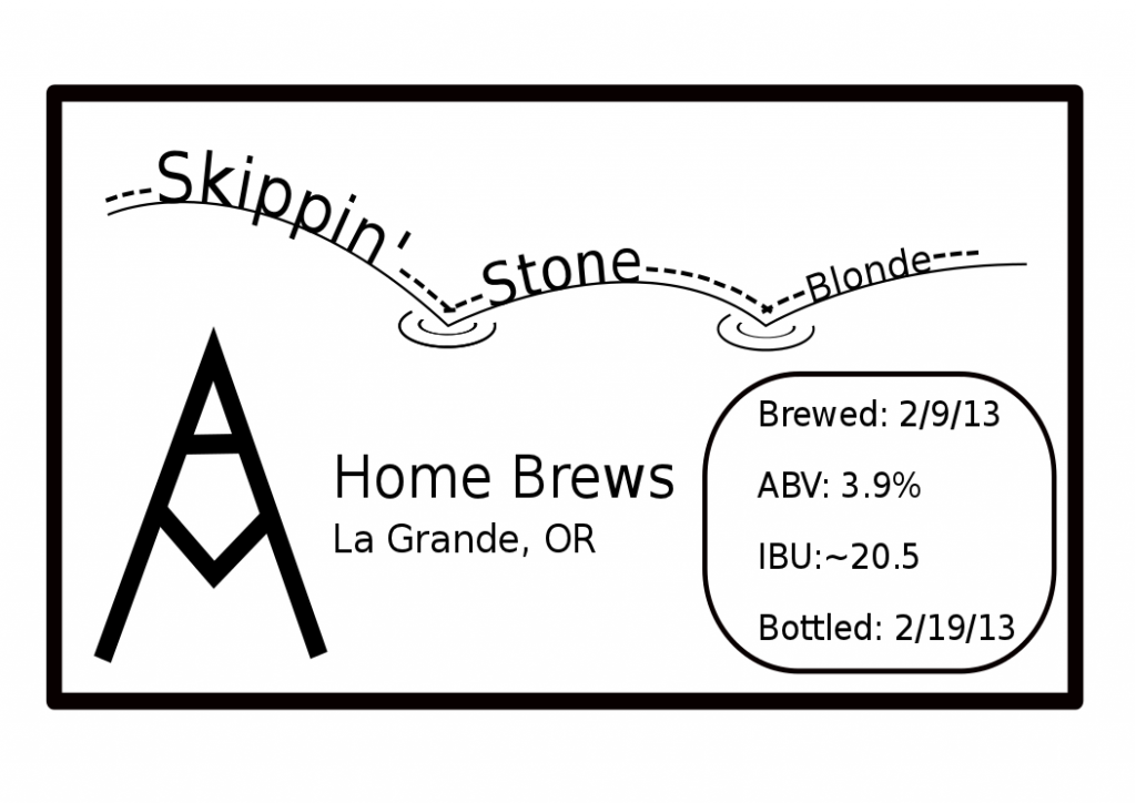
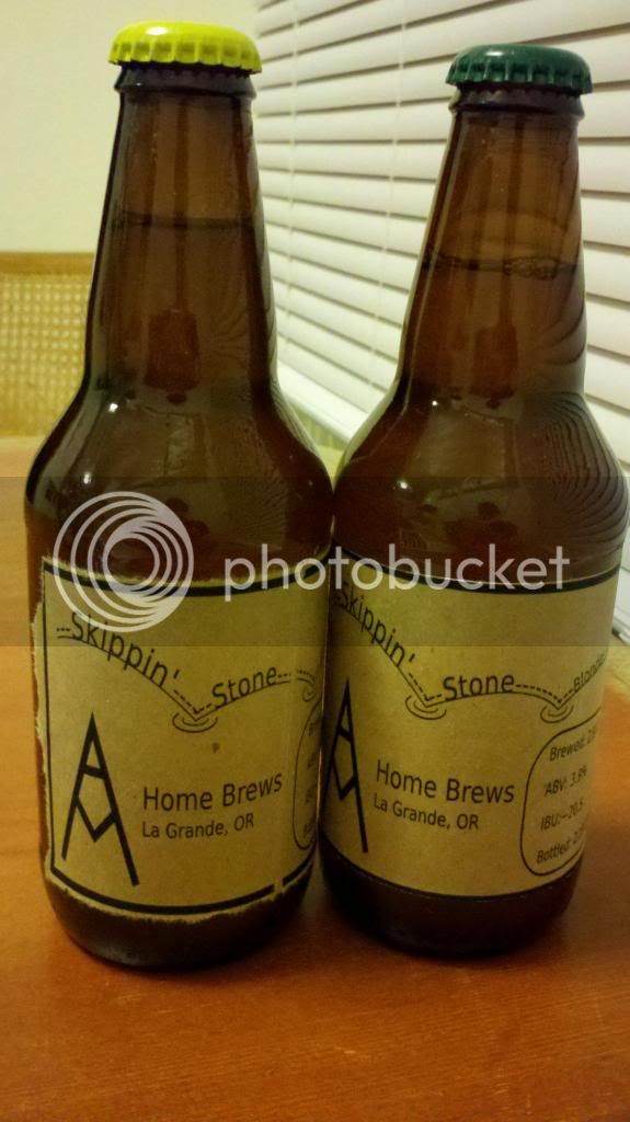
Here are my latest Gitmoe-inspired brown paper labels. I cut the paper to 8.5" x 11" size, and then printed them 9 up. I used a straightedge metal ruler to rip them to size for that craft look, and then used a glue stick around the edges and with an X through the middle to stick them to the bottles.Cheers!

Those look really nice! How are you adhering them?
 
Hey everyone who is wayyyy more artistic than me! Im looking to have a logo designed for my "brewery" I figured someone on here may be able to help me out.

What Im looking for...

Brewery name: Two Hounds Brewing
( it is named after the two hounds my wife and I have, a brown/red dachshund and a black and tan coonhound mix ( rescue dog).

I want a logo that includes the name, and a representaion of both dogs that I can place on all my labels I build. Nothing crazy, but simple/professional looking, basically something that would look good on bottles, placed on equipment etc

I am willing to pay for someone to design this ( please let me know aprox how much you would charge, and we can go from there) send me a PM if you might have the talents to design me a logo!
 
Cultkid said:
It's funny that you say that, because I did the same thing last week :tank:

I also ordered a special ink for watermarking the paper with a semi-transparent "brewery" logo watermark.

Link to the watermarking ink? I'd be interested in something like that. Sounds rad.
 
Link to the watermarking ink? I'd be interested in something like that. Sounds rad.

http://www.clearsnap.com/product-category.cfm?top-boss-watermark-ink

This is what they had at the Michaels near me. There may be other stuff, but this is what I will be using.

I know it will be a lot of work, but I am thinking of making some woodcut labels and using the watermark ink on them with the brown paper. It should look really nice. I can create different woodcut blocks, and then dust with different colored chalks on the watermark ink. Still deciding if I want to use that much time up on labels... maybe for a special occasion or something.
 
I'm having a hard time getting the brown paper to adhere with a glue stick, maybe I just need to put it on a lot thicker. I'll keep at it.
 
I'm having a hard time getting the brown paper to adhere with a glue stick, maybe I just need to put it on a lot thicker. I'll keep at it.

I don't know... I just apply it. I don't think it's that thick... it's a glue stick after all... it doesn't need to stay on there until doomsday for me...
 
Made some minor changes to the ultra simple labels. Brewed this baby last night, so this is the first one that will be going to print, with one for a Dunkelweizen in the naming stage now and will be the second of these guys to come to life.

'von Gottes Gnaden' is german for 'By the Grace of God", which aptly describes how we didn't lose this batch after a seemingly endless stuck sparge.

von Gottes Gnaden.jpg
 
Cultkid said:
http://www.clearsnap.com/product-category.cfm?top-boss-watermark-ink

This is what they had at the Michaels near me. There may be other stuff, but this is what I will be using.

I know it will be a lot of work, but I am thinking of making some woodcut labels and using the watermark ink on them with the brown paper. It should look really nice. I can create different woodcut blocks, and then dust with different colored chalks on the watermark ink. Still deciding if I want to use that much time up on labels... maybe for a special occasion or something.

That looks pretty awesome. I've also toyed with the idea of woodcuts. I spend a ridiculous amount of time on labels and packaging but I love it. Being a designer, doing the packaging is as fun as brewing for me. What's the font you used on the rauchbier? I've been looking for a better old Bavarian style typeface. I really like that one.
 
Working on label designs. So far I've got the logo more or less how I like it. Adding the style/ABV/IBU stats might be done as hazmat warning diamonds or as elemental symbols (such as with a good Periodic Table of Beer Styles).

Black & White:
9LL0wBJ.png


With some color:


Full Label B&W:


Full Label Color:

Can you tell me where you picked up your images (in particular, the yeast)? I'm adding these to my next label, but have struggled getting any vector based image of yeast and couldn't come up with much in terms of search terms that would lead to something usable. Any help would be appreciated.
 
These are my first two labels I entered into my first competition. The IPA didn't carbonate very well, so that one didn't do too well, but the vanilla porter got some great responses!

image-724970216.jpg


image-522260113.jpg
 
I just realized that I insinuated that I entered the labels into a competition. I hope we all understand I was referring to the beer, not the labels. They were just for show! However both labels got good feedback as well!
 
That looks pretty awesome. I've also toyed with the idea of woodcuts. I spend a ridiculous amount of time on labels and packaging but I love it. Being a designer, doing the packaging is as fun as brewing for me. What's the font you used on the rauchbier? I've been looking for a better old Bavarian style typeface. I really like that one.

Ahahaha! So, the plot thickens! I too am a designer. Once upon a time I worked as a Sr. Art Director for one of the biggest advertising agencies in the world. But I dropped out and now I drive a bus. lol. Less stress. Now I only do freelance design work, but it's no longer my day-job as it was for 15 years. I only take on projects I am personally interested in and/or feel a connection to. My design and art has gone back to being my personal fun-time instead of my 60+ hour a week job. The best way to kill your creative juices is to work for a bunch of suits.

I think Banksy said it best when he said; "The thing I hate the most about advertising is that it attracts all the bright, creative and ambitious young people, leaving us mainly with the slow and self-obsessed to become our artists. Modern art is a disaster area. Never in the field of human history has so much been used by so many to say so little."

Anyways, I digress. The font you're looking for is a free font called Dirt2 Soul Stalker. I got my copy from http://www.1001freefonts.com/Dirt2Soulstalker.php
 
That's awesome. Thanks for the font link. I'm one of those young burgeoning designers. But I have no ambitions of going to work for suits. I do freelance. Unfortunately not only jobs that interest me. That would be nice. I'm hoping to score a job doing design for one of the hundred breweries we have in the Philly area. I'm interning at one right now. I work at a homebrew shop for my day job. Not a bad combo. I'm never thirsty...
 
BD.jpg

My label, made in honor of our family pet that passed away recently. We had two great danes, the silhouette is an actual picture of the Dog that passed, this is not the full label just the main body. Her name was Betty, My first FG batch will be a Stout named Whoa Black Betty,which was her kennel name, corny I know but she was a much loved member of our family.
 
sasky7777 said:
@tyippers great work

Thanks! I got a few more I'm going to post soon. I'm just too busy commissioning my new e-keggle! I thought I might want to do graphic design professionally, but I find I have more fun engineering stuff!
 
Here is my latest label.

We actually split a gallon off of the main batch and put jabeneros in secondary with it... should be a hot one!

hot chocolate label logo.jpg
 
My favourite so far...

I love everything about that label except the bavarian font on the date 2012. Just seems out of place. Not terribly out of place. Honestly I'm just being hyper crytical cause I may have been drinking.... lol. AWESOME LABEL!
 
I love everything about that label except the bavarian font on the date 2012. Just seems out of place. Not terribly out of place. Honestly I'm just being hyper crytical cause I may have been drinking.... lol. AWESOME LABEL!

Now that you mention it to a certain extent I might agree. It does look a little out of pace, but then again maybe it would seem to uniform if it were all the same. Either way, I like the simplicity of the design. Good job
 
I posted earlier with the initial design a couple days ago, finally got around to printing it out. Borrowed the brown paper bag idea and I'm very happy with the results of my first labeled beer.

Design
SkippingStoneBlonde2_zps8a81db88.png


Tried ripping and cutting to see what I liked better.
2013-02-21_19-44-58_657_zps33e94d98.jpg
 
Any time you have a border on a label, you're better off cutting it exactly with an exacto knife and ruler (or scissors if your hands are very steady) or using a guillotine. Ripping really works best on borderless labels as the rip will be inexact, but without a visual cue from a border your eyes will be more forgiving.
 
Back
Top