bsigmon1103
Well-Known Member
I'm a Beginner!!


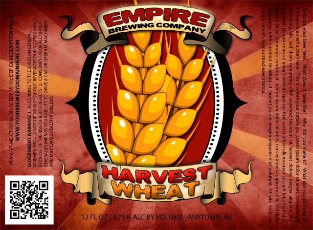
We came up with this customizable option today:
looks good. the scrolls remind me of spamalot/mp and the holy grail.
since this is customizable, are you going to make this template available to others who can't design labels?

looks good. the scrolls remind me of spamalot/mp and the holy grail.
since this is customizable, are you going to make this template available to others who can't design labels?
Did you click on their link?


Here's the label for my Milk Oatmeal Stout that is conditioning. Everyday on my way to work, I drive by this field with a bunch of cows grazing. There is only one black cow among them, and it always looks sort of curious. I decided to take a photo and dedicate my beer to him/her.

I know I've posted this before but I wanted to use it to give my friend James a plug. He did this label for me in about an hour. The guy is incredibly talented in every aspect of art. He was one of the lead designers and did most the landscaping in the new game Kingdoms of Amalur: Reckoning. He did some of the characters but pretty much all the landscapes. He is setting up a website as we speak and once its up I will post it on here. He really likes doing the labels and Im sure would love to help you out if you so desire. So thats my plug for my buddy.
I have a bunch more somewhere on another hard drive. I keg all my beers for the most part so I framed my labels and they are hanging above the bar. 


redstache said:First labels I've done. Thought I would do something I could use for several different batches. Left spots to write the abv and volume. Think I'll add a spot for a brew date and a batch name on one side. Printed at office depot and applied with milk.
kurtism said:it is probably just me but the contrast of sharp well defined lines/text box with the more dull background looks out of place. also the tonal differences aren't just right...a pink hue fading to blue, with a black center image AND gold lining...the elements don't blend well to me but its just an opinion. plus, you say it took an hour...my labels don't take me a long time, but this looks like it should have taken less than an hour. the only "difficult" thing here is coloring the donkey. other than that...its a couple of textures and a few lines of text with transparency.
Sounds like you went to art school or something?!
Thats what I though...a long post criticizing a label with nothing constructive in it...smells of an art history major or something
A buddy of mine designed this for me but left out the side notes about pouring and the alc content. First draft. Might do a separate label on the neck with that info. not sure yet
I'm a Beginner!!

kurtism said:i would recommend revisiting the image fade. if i were him, i'd duplicate the image, set transparency to about 20%, fade that, then overlap (maybe even dodge the color to make it pop) and fade the top image. that way the transition from red to house image isn't abrupt.
otherwise...it looks cool. do you have labels that are this pattern or are you going to hand cut them.
ha....no art history for me. i took real classes...hard ones too. i just like da photoshop...i likes it alot!
the reason for lack of constructive criticism is that the guy who posted it said...
1) a friend made it...
2) ...a while ago and
3) his friend is a professional game designer
taken together there is little reason to offer advice because the designer likely won't see the comments and may not revisit a past project that might have been printed and used already.
most importantly, the poster thinks this label is awesome and that his friend is an excellent designer. the latter may be true, but the former is clearly subjective. that it took an hour to make is a comment directed at the relative ease his friend had in making this label. that's somewhat insultive to the efforts others put in without any understanding to the process. hence my criticism.

I'll show him what you said. Overall I'm pleased. I don't have a pattern. I'm only labeling a six pack or two of each beer I make so I won't mind cutting them. I'm a noob but I want to keep one of each kind unopened for years just for keepsake. My business deals with a local print shop so I can get awesome prices on vinyl stick labels.
Yeah I certainly wasnt trying to insult anyone. Not sure how you got that from the post. I would have to agree with Calic and Dave. The point of saying it took an hour was that I think my buddy is an outstanding artist. If you're insulted then I would say you are far too sensitive and read into stuff a little much. And I disagree with your assesment
Dand, thats a sweet label. Love the covered bridge.
kurtism said:good job. i especially like that you put approximate abv...gold star for accuracy.
are you keeping the general style going for other brews or making them all different?
Thanks! This was my first label. I plan to create a style in due time. I don't have a hydrometer yet so "approx" seemed appropriate.
1stTimer said:Dand, thats a sweet label. Love the covered bridge.
dand9066 said:More like you want to be friends with my graphics guy!!
I like it man, crisp printing... very nice
I meant to say thanks to you and the above to kurt


![Craft A Brew - Safale BE-256 Yeast - Fermentis - Belgian Ale Dry Yeast - For Belgian & Strong Ales - Ingredients for Home Brewing - Beer Making Supplies - [3 Pack]](https://m.media-amazon.com/images/I/51bcKEwQmWL._SL500_.jpg)


