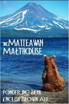
superslomo
Well-Known Member
Another new one... I'm not sure whether it's too photo-ey, but I just loved the underlying pic:


donny70 said:Here's my new label. It's for my summer ale...
Here's my new label. It's for my summer ale...
I really like this one too!
Here's my new label. It's for my summer ale...
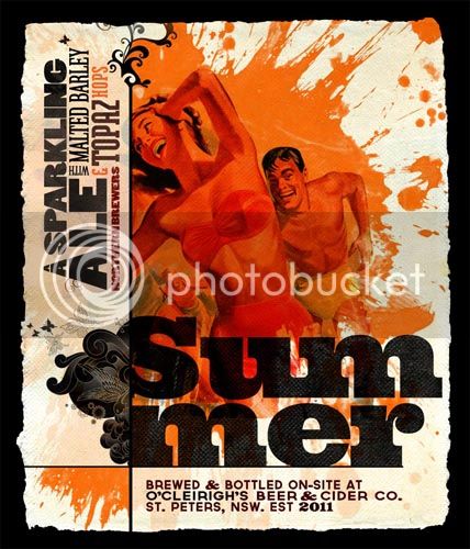
Actually. Only the label is mine. The wife has elected herself to brew this one. I think she might have a lighter hand than me...


I like the idea of labels, especially when you're giving your brews as gifts, but being the lazy person I am, I made a multi-use tag that I just tie on the necks with twine. For the ones I give out, I wax the caps. It actually looks pretty cool. I don't have an actual picture, but heres the tag I came up with.
Nice. Simple and clean. I like the type too.
Thanks! I'm an architecture student so they've been preaching simplicity in design like it's a verse from the bible. I've also been doing freelance graphic design as a hobby for several years now and i'm definitely all about minimalism.
Amazing thread, very entertaining. You guys have all done GREAT work. I posted my first few labels in a separate thread (pls click here). But my latest project is a LOTR-themed series called "Lord of the Ales". I haven't developed all the branding for it yet and I am still playing around with fonts. I am using some LOTR fonts I found online and illustrations by the Brothers Hildebrandt below. This whole thing started because I have a 100% Nelson Sauvin IPA and I wanted to play on the New Zealand theme....


"british thinking - american drinking" sounds better to me. but I am an ******, so take it for what it's worth.
I'm not completely sold on the font choice for "Brew Co." It's probably the weight in contrast to the other fonts.
Great clean design and good use of typography.
I'm not completely sold on the font choice for "Brew Co." It's probably the weight in contrast to the other fonts.

I'd scrap the "brew co." altogether. The way I see it, Eleven is just so bad-ass and makes such good beer, that we all know it's a brewing company.
Kinda like how Purolator dropped the "courier". Knowwhatimsayin?
haha i wouldnt go that far as of bad ass beer. I mean forcing your girlfriend and dog to drink my beer doesnt count as bad ass beer....knowwhatimsayin?
and slinky, love your paint skills, il move the words around, think spelling out brewing company fits better too...thanks again

Okay, my idea is no where near as fancy/detailed as most of yours, but I'm thinking 'simple' for my logo. Looking for critique (definitely want to change the font), and if anyone has the ability to change the colors (blue where the brown/brown where blue is) I'd really appreciate it.


![Craft A Brew - Safale BE-256 Yeast - Fermentis - Belgian Ale Dry Yeast - For Belgian & Strong Ales - Ingredients for Home Brewing - Beer Making Supplies - [3 Pack]](https://m.media-amazon.com/images/I/51bcKEwQmWL._SL500_.jpg)


