• Please visit and share your knowledge at our sister communities:
  • If you have not, please join our official Homebrewing Facebook Group!

    Homebrewing Facebook Group

Raspberry Red - From Deadwood, SD - 1st Label

Homebrew Talk

Help Support Homebrew Talk:

This site may earn a commission from merchant affiliate links, including eBay, Amazon, and others.

BlackHillsBrewing

Active Member
Joined
Jan 11, 2010
Messages
25
Reaction score
1
Location
Deadwood, SD
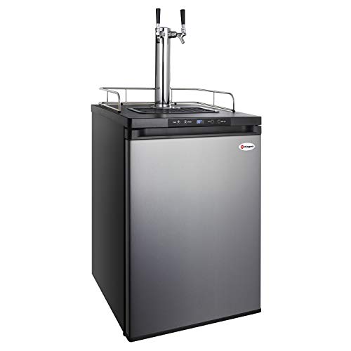
Dear HB bud's, this is my first label... so please be as critical as you wish... I have about 20 gallons fermenting and my first batch of Irish Stout is 1/2 gone. I have this batch of Raspberry Red which is about ready to be bottled and I thought I would make up a label. I'm going to be kegging from here on out too.. Still will do some bottling, but this keg thing is awesome. I'm working on building my first kegerator right now. www.BlackHillsBrewing.com is coming.

RaspberryRed480.jpg
 
Sweet label. If you are looking to go commercial you should get you stuff on tap at Deadwood Tobacco. I love that place!
 
Thanks JediJoel, that is my Friday Night Hang-out! I quit smoking cigars, but still love the tunes and brew... Now I'm working on building my own hang-out at home... mmmmm!
 
That is simply gorgeous. The original was good, but the update makes it awesome. :rockin:

Only one thing I would change, and it's minor: in the name Raspberry Red, the R's are black-outlined while the rest of the words aren't. I think it may look a little better with all the letters in the words outlined.
 
Ha, just saw the updated logo as I scrolled down... was going to say that the first logo was good but too much open space at the top.

I like the R-n-R, though, have you considered overlapping? Bring the RR closer together, so that the dashes overlap the letters? It would visually link the letters together a bit more.

Typography wise...

'...a soft fiery red ale...' is a bit too close to the curly accent on the right side. You'd want to match the spacing a bit more to the left side.

The side labels, "around 1897 the mining camps..." and on the other side "Brewed from high on..." may have too much space around them for the font size. Also, shouldn't have more than 70 characters per line else the eye gets lost reading. Maybe set the font size up a small amount and incrase the spacing a bit to keep it from looking as tight.

... not trying to sound like a jerk or anything, I'm a designer and just thought I'd offer a few tweaks to a nice looking label. :)
 
Both are great. Have you tried changing the color of the RnR on top? That's the only thing that throws me. I liked all the earth tones on the original (and guessed the top would eventually have something to occupy the open space), but the red seems a bit too much. I also liked how ONLY the Raspberry Red was red and made it pop; now it seems the RnR and the Rasp Red are competing for my attention.

Fantastic design!
 

Latest posts

Back
Top