Our new microbrewery logo

Homebrew Talk - Beer, Wine, Mead, & Cider Brewing Discussion Forum

Help Support Homebrew Talk - Beer, Wine, Mead, & Cider Brewing Discussion Forum:

This site may earn a commission from merchant affiliate links, including eBay, Amazon, and others.

St. Jon's Wort

Well-Known Member
Joined
Aug 26, 2007
Messages
79
Reaction score
0
We have been working on starting up a microbrewery and I have finally completed our brewery logo:
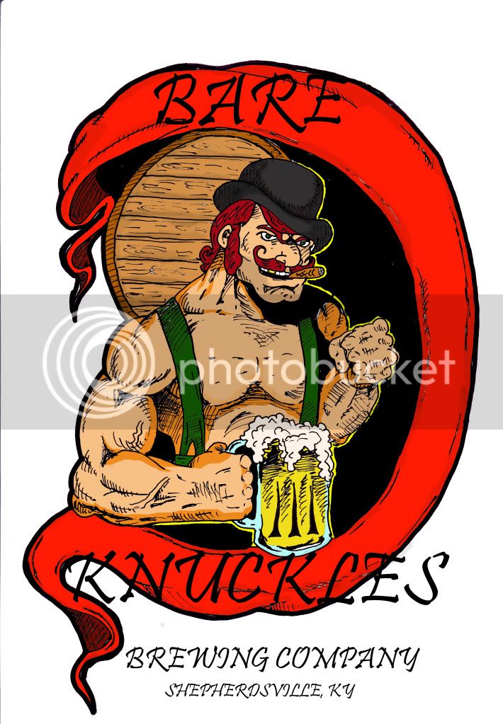
bareknucklesbrewingco2-colored-TITLEcopy.jpg


Let me know what you guys think.
 
I'm not a huge fan of the font choice. The imagery works well with your name.

Have you tried to warp the text to follow the contours of the flag/cloth? White maybe a more suitable color if you chose to go that route.
 
I used Adobe photoshop 7.0 to paint the drawing and it doesn't seem to have many text options outside of the beasic stuff. Can you suggest another program that I could use? Would Adobe illustrator be a better option?
 
the font choice and color for the name are off, they get lost with the bold black border of the flag/cloth/ribbon. making them bolder and maybe with an outline would be good.

photoshop has plenty of tools to do the work, illustrator would be a better choice overall since it's vector based, which means the image can be scaled with out any loss in quality. where as in photoshop it's pixel based will loose quality when going larger or smaller.
 
I used Adobe photoshop 7.0 to paint the drawing and it doesn't seem to have many text options outside of the beasic stuff. Can you suggest another program that I could use? Would Adobe illustrator be a better option?

Illustrator would be a good way to go so that you could bend or shape the type different ways if that's the route you wanted to go. If you wanted more font options: www.dafont.com has a lot of fonts that you can download and use. It's a nice looking logo but the type does need some work to make it more readable.
 
yea looks nice but I have to agree with the fonts, you can purchase diff fonts online or even get them free if you look hard enough. Regardless I like the concept and I wish you the best! :)
 
Whichever font you do end up with (I think it should be bolder) it could use a stroke /outline of a different color (possibly white) to help it stand out from the black outline of the art. It's kind of getting lost right now.

I'd also re-think the heavy shadow on the character's left side because the way it is now it looks like he's holding a chicken leg in his hand, it's not really reading as his shoulder poking through the shadow.
 
It's very cool, but I don't think that it would be long before you got a C&D from AB as they have (had?) a beer named Bare Knuckle Stout.
 
Back
Top