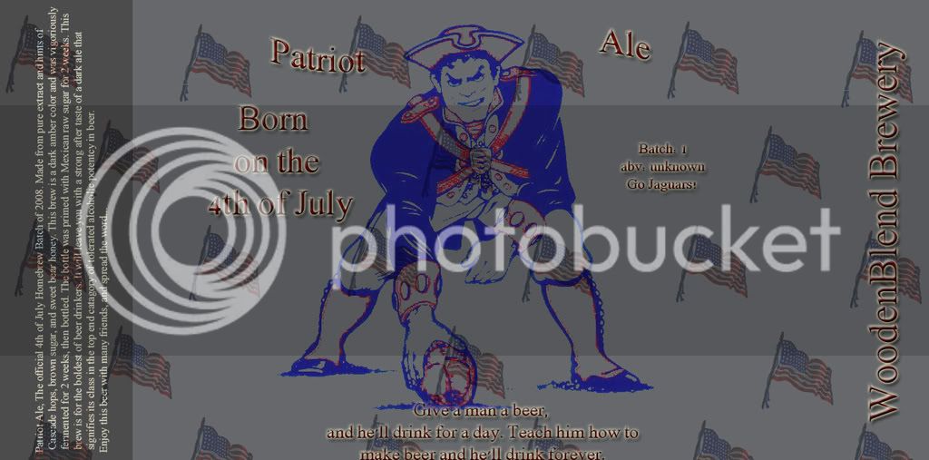
Hello. This is my first label for my first homebrew. I used photoshop and a quote from one of the users that i saw on the forums... lemme know what u think. Thanks to MVKTR2 for the idea.
I'd suggest making the 'Patriot Ale' font a lot larger, and maybe lighten the gray - the ball player kind of fades into the background. Good start, though!
My two cents is that I feel it lacks cohesiveness. It looks like a lot separate elements instead of a unified design. Even the words Patriot and Ale don't look like they are together. I don't think the flags necessarily need to go but maybe they need to be rethought or muted down a bit or maybe instead of lots of little flags maybe a large waving flag as a back drop. I don't know exactly but I feel like it needs to be brought together in some way.
I would take the "Patriot" off and insert "Packer". Then take of the football player and insert another football player. Then I would take THAT football player off and change it to another one. Then maybe take the "Packer" off and change it to "Buccaneer" .


![Craft A Brew - Safale S-04 Dry Yeast - Fermentis - English Ale Dry Yeast - For English and American Ales and Hard Apple Ciders - Ingredients for Home Brewing - Beer Making Supplies - [1 Pack]](https://m.media-amazon.com/images/I/41fVGNh6JfL._SL500_.jpg)


