Name change, and the new logo that corresponds!

Homebrew Talk - Beer, Wine, Mead, & Cider Brewing Discussion Forum

Help Support Homebrew Talk - Beer, Wine, Mead, & Cider Brewing Discussion Forum:

This site may earn a commission from merchant affiliate links, including eBay, Amazon, and others.

Which do you like better?

  • The horizontal-oriented logo

  • The vertically-oriented oval logo

  • I hate 'em, but I'm attaching something I like better!


Results are only viewable after voting.

Chriso

Broken Robot Brewing Co.
Joined
Oct 31, 2007
Messages
4,618
Reaction score
89
Location
Someplace
OK, so it's been rough being "Damn Your Eyes Brewing Co."... Mostly because all the puns I try to devise for the names of my beers just wind up forced and convoluted.... But even worse, because I never managed to get my ideas into real art as far as my logo is concerned.

I kept thinkin' about it. And I thought some more. And as a result of a number of wacky life changes that have taken place in the past 3 months, and will continue to take place for a while........... I've decided (tentatively!!!) to rename...... to....
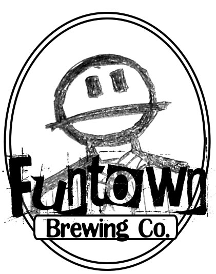
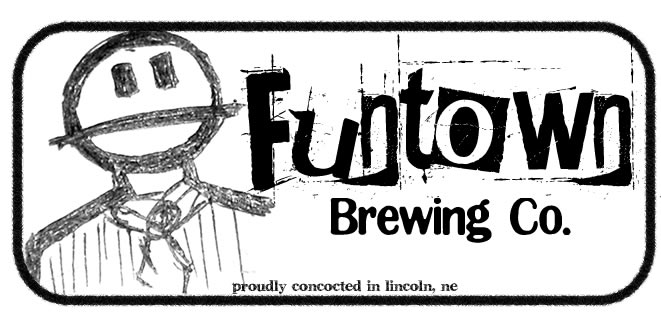
FUNTOWN BREWING CO.


Why Funtown? Well that's a long story. But in short, a bunch of my friends started a nerdy commune named Funtown, but then a bunch of drama went down and we reclaimed the title of Funtown from the mutinous ex-Mayor. I am now the Mayor of Funtown, it is my little haven of fun, and I brew my beer for my constituents. Fun, eh?

So. This brings me to logos.

So far I've whipped up two. I'm still thinking, these are not final fo' sho', but I already know which I like better.

I want you all's feedback too! Tell me what you like, don't like, etc.

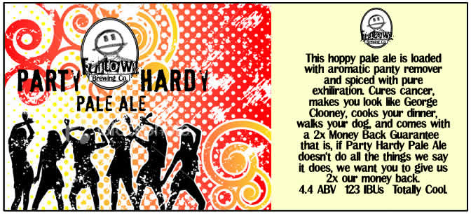
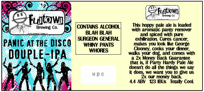
The only "criteria" I have is that whatever logo I produce, I want to use it as-is on every bottle label I make. Similar to how the Samuel Adams logo never changes, no matter what variety of beer it is, or what color the label's background or art is, the Samuel Adams icon is always instantly recognizable, thus I want my logo instantly recognizable too. (A number of you have done it this way too, olllllo, yuri_rage, RoaringBrewer, Brewtopia, etc.)

Here they are:
Logo_Idea_1.jpg

Logo_Idea_2.jpg
 
IF I have to pick just one, I say the vertical...BUT
I would be tempted to use the horizontal one as a bottom label in addition to whatever label you design for a specific beer....like I've seen on some wine bottles.
 
I like the vertical one also. It seems like it will fit a bottle better. I also think the font you used works great with the new name. Your guy looks like a Canadian from South Park, with their beady little eyes and flapping heads:D

southpark031of.jpg
 
The dude drawing is done by my friend Shae, one of the co-founders of Funtown (and 100% less mutinous than the ex-mayor).

I don't know if I explained it right, so I want to clarify with a picture. I don't mean that I want to use the logo AS my labels, I instead mean that I want to use the logo ON my labels. Here's an example:

SampleLogo.jpg


This is why I think the oval logo will be much harder to incorporate, whereas the horizontal logo seems much easier to "work into" any design I come up with.

Thoughts?

(Like the sample? Took 10 minutes. ;)
 
SampleLogo.jpg


This is why I think the oval logo will be much harder to incorporate, whereas the horizontal logo seems much easier to "work into" any design I come up with.

Thoughts?

(Like the sample? Took 10 minutes. ;)

I Like it!!!

I think the horizontal works great...But I'd like to see an example like this but with the oval one to compare....
 
OK, I'm back from Brunch, here are some more examples. Please note:

- Background images are blatantly jacked from Google Image Search, I'm just trying to find pieces that are similar to what I want to use in the future, these are NOT meant to be the "final product" because I try (really really hard!) to get properly licensed images when I can!

I'm reposting the 1st example to help keep context.

SampleLogo.jpg


SampleLogo2.jpg


SampleLogo3.jpg


SampleLogo4.jpg


What I'm looking for is similar to what Great Divide Brewery does - No matter what color the label is, it always looks like a Great Divide label. (Like This!) I want mine to always look like a Funtown Brewing label.
 
The more I stare at these, I start to envision a different approach : Perhaps the oval will always go on the Front of the label, and the rectangle (more visible text) will always go above the "back panel" where I talk about the beer. Eh? EH? :D
 
Well that helped me make a decision...The rectangle is the best...It compliments the amazing labels....You could always use the oval on a neck label.


one thing though on the rectangle the "proudly concoted in Lincoln, Ne is un readable at that size...you should either make in bigger, or get rid of it in the rectangle and put in on the label.
 
I like the horizontal one for adding to labels. Though the vertical would look awesome as part of a neck label.
 
I like them a lot, and I gotta agree the art work makes your brew look Canadian. Atleast thats what I now think canadians look like. :cross:
 
i love the horizontal logo man, the vertical one seems too "busy" with the black and white text over the black and white guy

my only problem with your horizontal label (especially when you put it on the "actual" label) is that you end up with little black pixels and spots that take away somewhat from a great label (for example see the "n"s in Funtown) i think those labels are pretty sweet, cant wait to see em on a bottle!!
 
The pixels are actually inherent to the font I used. If I use the same font in the future I will probably do a "final touchup" on letters such as the 'n' to make sure this issue doesn't happen.

Thanks for all the feedback you guys! :D
 
The more I stare at these, I start to envision a different approach : Perhaps the oval will always go on the Front of the label, and the rectangle (more visible text) will always go above the "back panel" where I talk about the beer. Eh? EH? :D

You thought of it before I got to page 2 to post the idea... I'd definitely have the oval on the front (bigger than the example) and the rectangle on the back.

:mug:
 
Isn't the phrase, "Party Hearty"?

By the way, put a beard and glasses on that guy and it's like looking in the mirror.
 
You thought of it before I got to page 2 to post the idea... I'd definitely have the oval on the front (bigger than the example) and the rectangle on the back.

:mug:


+1 I like the oval, but it would have to be a little bigger for the front. Perhaps if you layered it so that the dancing girls overlapped the bottom of the oval and you wrapped the text like in the oval "Party Hardy" label.

I do like the idea of the rectangle for the back pannel as well, since in smaller size it is hard to read the oval.
 
I like both labels and think that the character and font are distinct enough to create a strong brand in multiple border configurations.

Of course, when I see the name, I think of Legoland's Fun Town but that's just 'cause it's in my backyard.
Hey! Maybe they'll serve your beer there!:mug:
 
I really like your little guy. The charcoal sketch style goes well with your font choices. One thing what would be cool would be to remove the little man's head and put it up on the neck as well. Right now he is a little bit lost in the busy main label. If he's going to be the common theme running throughout, you can more easily feature him this way.
 
I like the idea of using both. One thing you might try is to offset the vertical logo on the front instead of trying to keep it centered. I'm personally a fan of (tasteful) asymmetricallity.
 
More design sketches coming soon -- my LCD monitor at home is going out, and anything more than basic web browsing is annoying because I have GIANT BLUE LINES running through the right half of my screen. Argh.

I've got Fireworks installed on the Macbook but I haven't adapted to trying to do "real" work on such a tiny screen. My dying screen is a Dell 2001FP and it's even "too" small for my useless eyeballs.
 
+1 to the idea of using the oval on the neck of the bottle and rectangle at the bottom
 
Cool Logo. To me, the rectangular one seems a little easier to read. The "Funtown" on the oval kind of gets lost against the stripes in the shirt.

Kornbread
 
Back
Top