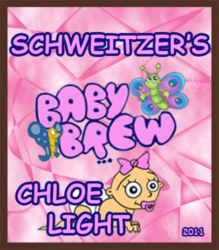
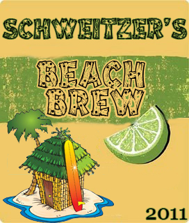
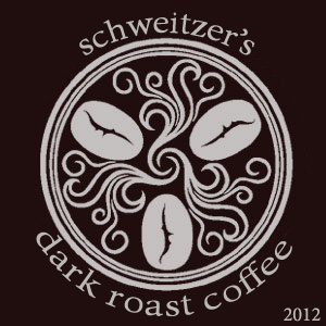
not bad. i agree that the style of the cherry stout is quite appealing but that's because the other's are more cartoony.
that said...do you have a logo or something that you are using to tie the brews together or do you not mind that they are all so different?
also, see the comment i made about image resolution in disturbdchemist's label thread...the source image your baby brew image isn't sharp enough for your titling. try a bit of Gaussian blur and unsharpen mask, and some contrast changes to sharpen the details and bring up the black levels
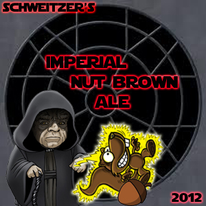
finally, on the imperial brown nut ale...it doesn't look right that in your name, the hue goes from pink to red and the 2012 hue is pink when the center title is red. try it all in the same red (so it all looks uniform), or at least change the hue in your name to be all pink (so only the title is set off with red)
