What has been seen often cannot be unseen.
NO!! Definetly not the same!

NO!! Definetly not the same!


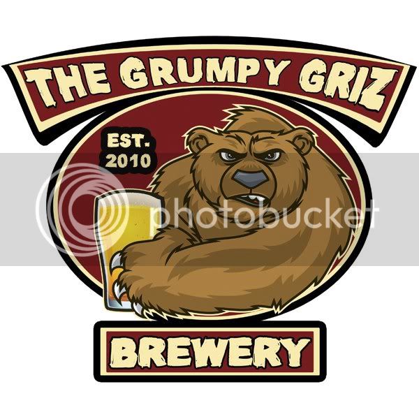
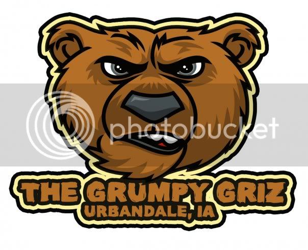


I think that is pretty cool. How do you get that on caps? Is it just a sticker?
I have had a number of them, so here is the latest:
[/IMG]
Here is what I've been using...really simple, I know, but it looks GREAT on bottle caps.
View attachment 15461
BTW, a sun dog is not a trendy golden retriever that wears sunglasses and a bandana...it's a celestial phenomenon that looks something like this:
View attachment 15462
View attachment 15463
It happens when ice crystals in the atmosphere break the sunlight into a rainbow/halo...
-Tripod
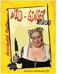
I know that I am not the most computer savvy guy on the planet and I also know that because I am not yet a paid member I can't add a photo directly. But how in the hell do I attach a link from Flickr or Photobucket, etc????? I finally finished my logo and it rocks and I want to share it!!!

Ok, let's try this...My brewery is called Wild Ginger Brewing. It's the street I live on but I thought it sounded cool too. I came up with an idea for this logo after xjncoguyx made one that I really liked. I took the ideas that I had and gave them to my brother, a graphic designer, and told him to go for it. He made a label for all of "my" brews. They are all basically the same except with a different color for each different brew. Would love to hear some feedback on this!
And Coy, thanks for helping a computer idiot! ha
http://farm5.static.flickr.com/4041/4615763869_788342a384_m.jpg

I've been goofing with this all afternoon...
Going for a Clerks theme - hope I don't get Kevin Smith or Miramx on my tail...

I've been goofing with this all afternoon...
Going for a Clerks theme - hope I don't get Kevin Smith or Miramx on my tail...

Big fan of this one! It must look great on bottles - are you thinking of going with different color schemes for different brews?


![Craft A Brew - Safale BE-256 Yeast - Fermentis - Belgian Ale Dry Yeast - For Belgian & Strong Ales - Ingredients for Home Brewing - Beer Making Supplies - [3 Pack]](https://m.media-amazon.com/images/I/51bcKEwQmWL._SL500_.jpg)


