Label/ Logo Help

Homebrew Talk - Beer, Wine, Mead, & Cider Brewing Discussion Forum

Help Support Homebrew Talk - Beer, Wine, Mead, & Cider Brewing Discussion Forum:

This site may earn a commission from merchant affiliate links, including eBay, Amazon, and others.

cmorkat

Member
Joined
Jan 18, 2008
Messages
18
Reaction score
0
Location
Brunswick, Me.
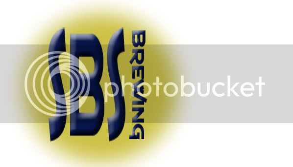
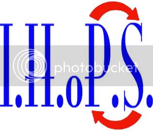
I am not very computer literate when it comes to drawing on the computer and I have seen some of the labels and logo's that have been designed on here and was really impressed. So I wanted to see if anyome would help me draw one up. I am stuck between 2 names right now either IHoPS Brewing or SPS Brewing. The idea I had for the SPS is for the letters to be really tall and skinny and then brewing being turned sideways and go by the second "S". I would like to also like for it to be in a blue almost hand written look. For the IHoPS I thought about doing periods after every letter except for the o like this I.H.oP.S. and the putting the switch arrows over and under the P and S . It is for my favorite saying I Hate Stupid People. so the o would be silent and the P andS whould be switched around. I am not sure of anything else so i am up for any sugestions. Any help would be greatly appreciated. Thanks Brady
 
Here is what I have come up with but like i said I deffinatly do not have the computer skills that some of you have much less any computer skills at all lol.


brewing1.jpg
[/IMG]
 
I like the font & color of the i.h.o.p.s. one, seems like it will fit well on a bottle and not take all the attention away from the label.

For the SPS one, imo the letters are a little too skinny and is hard to read at first, if you fatten them up a tad it would read better.
 
Here's another take on the IHoPS logo. It's huge as shown, but you can shrink it down easily enough. (On my system, you just drag the graphic into an open Word doc. From there, you can resize it as you like.)

ihops.jpg
 
foulplayer said:
Heres one i quickly came up with:

DP

Here's another take on the IHoPS logo. It's huge as shown, but you can shrink it down easily enough. (On my system, you just drag the graphic into an open Word doc. From there, you can resize it as you like.)

Man, you guys are pretty good. Both of those logos look great. :rockin: I should commission you guys for my logo.
 
wow you guys are awsome I cant wait to get home and print a few out so I can try them out and see wich one works the best. for those of you that pm'd me and asked what the abbreviations mean SPS(stupid people suck) and IHoPS( I Hate Stupid People) that is why the PS has the reverse arrows on them. Those are just some sayings that I always say. (you know the people that I am talking about. The ones that you catch yourself saying Dumba$$ after they do some thing dumb) LOL. Thankd agian for the help. Next is a label that fits the brewing name of a batch of a honey blone ale that I am brewing. The name I am thinking about is Honey Hippychick Ale. Just to top it off I bought some bottle caps with a tyedyed pattern on them as well as a peace sign. I just thought they were really cool looking and I thought they would go good with a honey blonde ale All I could think about is a blonde hippy chick now. Thanks Brady
 
I use a combination of Photoshop 4.0 and Logo Design Studio Pro.

I am far from proficient with either program but I have fun playing around with labels.
 
Back
Top