
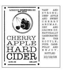
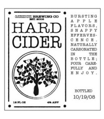
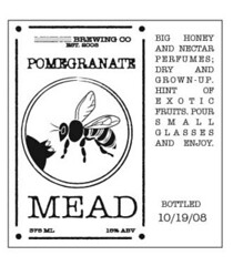
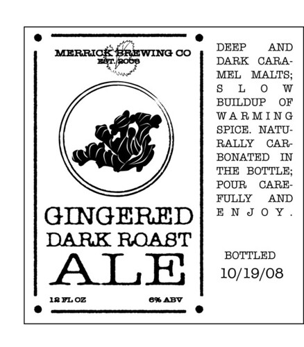
Hi guys! My boyfriend and I have gotten really into brewing beer and cider this year (thanks in part to HomeBrewTalk!) and I thought I would make and give him labels as part of his Christmas present. I need really honest feedback on these (I still have some cleanup and aligning etc. to do, and need to write actual descriptions, so ignore that stuff):
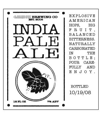
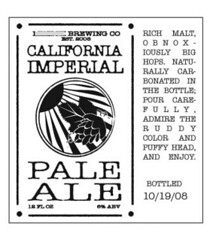
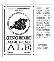
They are supposed to be sort of old-fashioned and the drawings are supposed to have that primitive woodcut character, but I am not a good enough artist to keep a truly consistent style across a series. We both like this simple, old-school look in general, though. Any advice you can give me on tweaking the drawings and type would be much appreciated - more ornamentation? Any one that doesn't fit with the rest? ANY advice is good, I want to get these looking as good as possible with my limited skills before surprising him with them (we're exchanging gifts on Sunday, so at least there's a little time). I like the apple tree best, and think the cherry cider label looks the worst - but I don't know what else to draw or how else to draw it.
I am planning on printing these on a slightly off-white paper that looks a bit aged, like old parchment. I'll put them on with the milk method. Does that seem like it would work, or does anyone have better suggestions?


![Craft A Brew - Safale BE-256 Yeast - Fermentis - Belgian Ale Dry Yeast - For Belgian & Strong Ales - Ingredients for Home Brewing - Beer Making Supplies - [3 Pack]](https://m.media-amazon.com/images/I/51bcKEwQmWL._SL500_.jpg)


")
