anchorage42
Well-Known Member
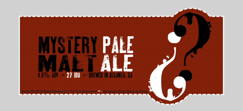
Ch-ch-check it out, fellas
Cheers.
Cheers.


![Craft A Brew - Safale S-04 Dry Yeast - Fermentis - English Ale Dry Yeast - For English and American Ales and Hard Apple Ciders - Ingredients for Home Brewing - Beer Making Supplies - [1 Pack]](https://m.media-amazon.com/images/I/41fVGNh6JfL._SL500_.jpg)

Schnitzengiggle, what's that?
Thanks, BargainMugs


