You are using an out of date browser. It may not display this or other websites correctly.
You should upgrade or use an alternative browser.
You should upgrade or use an alternative browser.
Beer Label 2.0
- Thread starter cap1
- Start date

Help Support Homebrew Talk:
This site may earn a commission from merchant affiliate
links, including eBay, Amazon, and others.

Grinder12000
Well-Known Member
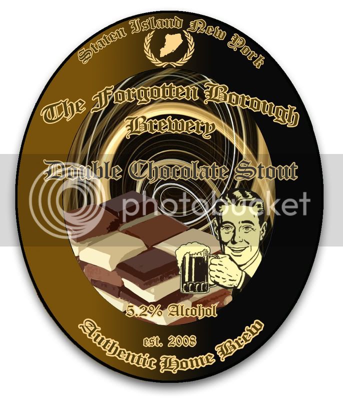
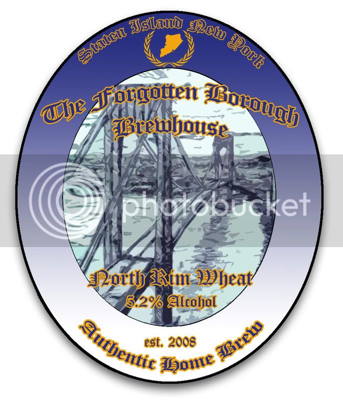
Lookin' good!! Not super fond of blue and orange but over all it's nice.
Not super fond of blue and orange.
Those are New York colors. Mets, Knicks, & Islanders
")

$28.98
Five Star - 6022b_ - Star San - 32 Ounce - High Foaming Sanitizer
Great Fermentations of Indiana


$176.97
1pc Commercial Keg Manifold 2" Tri Clamp,Ball Lock Tapping Head,Pressure Gauge/Adjustable PRV for Kegging,Fermentation Control
hanhanbaihuoxiaoshoudian


$22.00 ($623.23 / Ounce)
AMZLMPKNTW Ball Lock Sample Faucet 30cm Reinforced Silicone Hose Secondary Fermentation Homebrew Kegging joyful
无为中南商贸有限公司


$159.99 ($26.66 / Count)
3M High Flow Series System BREW120-MS, 5616001, For Brewed Coffee and Hot Tea, Valve-in-Head Design
SpaceCityProviders


$1.91
$29.95
Mastering Homebrew: The Complete Guide to Brewing Delicious Beer (Beer Brewing Bible, Homebrewing Book)
Goodwill Retail Services, Inc.

$53.24
1pc Hose Barb/MFL 1.5" Tri Clamp to Ball Lock Post Liquid Gas Homebrew Kegging Fermentation Parts Brewer Hardware SUS304(Liquid Hose Barb)
yunchengshiyanhuqucuichendianzishangwuyouxiangongsi


![Craft A Brew - Safale S-04 Dry Yeast - Fermentis - English Ale Dry Yeast - For English and American Ales and Hard Apple Ciders - Ingredients for Home Brewing - Beer Making Supplies - [1 Pack]](https://m.media-amazon.com/images/I/41fVGNh6JfL._SL500_.jpg)
$6.95 ($17.38 / Ounce)
$7.47 ($18.68 / Ounce)
Craft A Brew - Safale S-04 Dry Yeast - Fermentis - English Ale Dry Yeast - For English and American Ales and Hard Apple Ciders - Ingredients for Home Brewing - Beer Making Supplies - [1 Pack]
Hobby Homebrew


$58.16
HUIZHUGS Brewing Equipment Keg Ball Lock Faucet 30cm Reinforced Silicone Hose Secondary Fermentation Homebrew Kegging Brewing Equipment
xiangshuizhenzhanglingfengshop


$53.24
1pc Hose Barb/MFL 1.5" Tri Clamp to Ball Lock Post Liquid Gas Homebrew Kegging Fermentation Parts Brewer Hardware SUS304(Gas MFL)
Guangshui Weilu You Trading Co., Ltd


$76.92 ($2,179.04 / Ounce)
Brewing accessories 1.5" Tri Clamp to Ball Lock Post Liquid Gas Homebrew Kegging Fermentation Parts Brewer Hardware SUS304 Brewing accessories(Gas Hose Barb)
chuhanhandianzishangwu


$44.99
$49.95
Craft A Brew - Mead Making Kit – Reusable Make Your Own Mead Kit – Yields 1 Gallon of Mead
Craft a Brew

$33.99 ($17.00 / Count)
$41.99 ($21.00 / Count)
2 Pack 1 Gallon Large Fermentation Jars with 3 Airlocks and 2 SCREW Lids(100% Airtight Heavy Duty Lid w Silicone) - Wide Mouth Glass Jars w Scale Mark - Pickle Jars for Sauerkraut, Sourdough Starter
Qianfenie Direct


$20.94
$29.99
The Brew Your Own Big Book of Clone Recipes: Featuring 300 Homebrew Recipes from Your Favorite Breweries
Amazon.com


$10.99 ($31.16 / Ounce)
Hornindal Kveik Yeast for Homebrewing - Mead, Cider, Wine, Beer - 10g Packet - Saccharomyces Cerevisiae - Sold by Shadowhive.com
Shadowhive


$479.00
$559.00
EdgeStar KC1000SS Craft Brew Kegerator for 1/6 Barrel and Cornelius Kegs
Amazon.com


$719.00
$799.00
EdgeStar KC2000TWIN Full Size Dual Tap Kegerator & Draft Beer Dispenser - Black
Amazon.com


$7.79 ($7.79 / Count)
Craft A Brew - LalBrew Voss™ - Kveik Ale Yeast - For Craft Lagers - Ingredients for Home Brewing - Beer Making Supplies - (1 Pack)
Craft a Brew
Deacon240
Well-Known Member
A brighter text on the first and a darker text on the second is probably what I would do to help with readability. Other than that I think it looks great!
EDIT:: Out of curiosity what program did you use to create your labels?
EDIT:: Out of curiosity what program did you use to create your labels?
Bigpete9000
Well-Known Member
The thing that catches my eye is that the text is not anchored to anything its just floating above the whole thing. I would say try and rework the text so that it looks like it more integrated into the design.
Eastside Brewer
Well-Known Member
- Joined
- Feb 1, 2007
- Messages
- 328
- Reaction score
- 3
Labels look great! How does one get beer label 2.0? is there a download? cost?
Eastside
Eastside
Similar threads
- Replies
- 30
- Views
- 881
- Replies
- 9
- Views
- 626
- Replies
- 30
- Views
- 2K
