A new poster idea for HBT

Homebrew Talk - Beer, Wine, Mead, & Cider Brewing Discussion Forum

Help Support Homebrew Talk - Beer, Wine, Mead, & Cider Brewing Discussion Forum:

This site may earn a commission from merchant affiliate links, including eBay, Amazon, and others.

Sir Humpsalot

Supporting Member
HBT Supporter
Joined
Nov 26, 2006
Messages
3,996
Reaction score
94
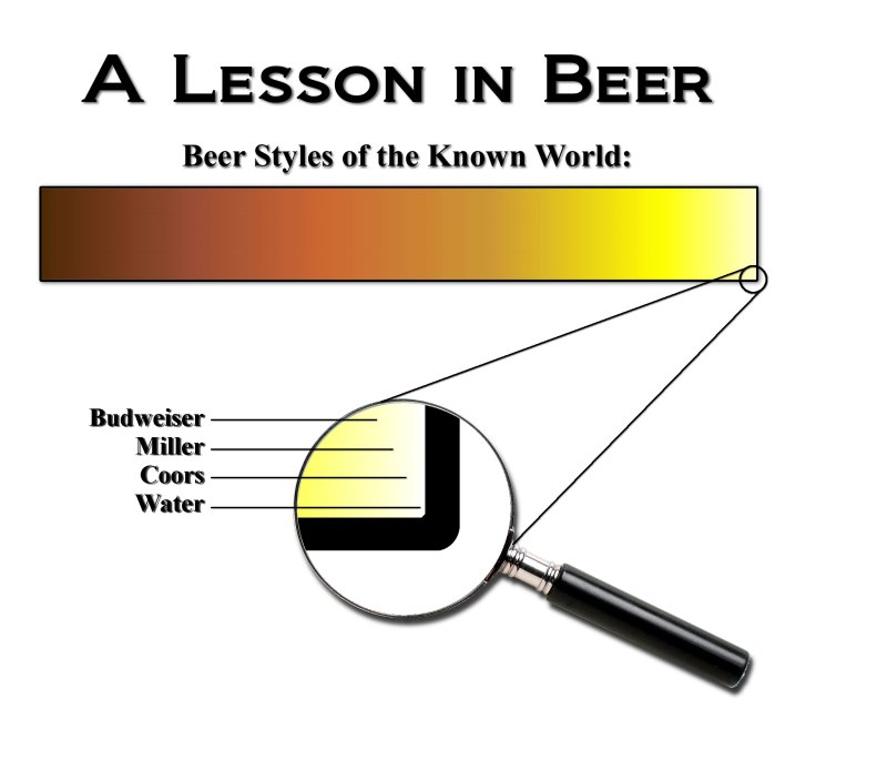
Inspired by the "Stupidest thing somebody's said about your homebrew" thread, I created this concept for a poster. I thought we might be able to collaborate and come up with something that would look nice hung up over our kegerators. Maybe give the "If it ain't Bud, it ain't beer" crowd a little bit of perspective as to the diverse world we live in...

Now, I'll admit I'm no graphic artist. I'm not beholden to any particular aspect of this picture I created. It's just a concept. I've taken an autoCAD course, I've used a variety of cheap photo and graphics programs and I've taken a LOT of photography courses. But I'm basically the equivalent of a "hunt and peck" graphics person. I usually know what I am looking for, but it takes me a long time to find it. As a result, I'm hoping maybe a graphics guru can add their two cents and make a fun poster out of what you see below. Just go ahead and throw some paint on the canvas wherever you see fit.

Here's my initial concept...


Beer_Styles.jpg
 
Air Pirate said:
XD

very nice, i like it muchly

can you make it fade to red on the y axis?

Yes, I could... but I won't. :p

The thing is, I just did it as a small concept picture. I have no doubt that a more skilled graphics artist will come along at some point and throw something far nicer together in far less time.

If that doesn't happen, maybe I'll sit down with a couple of HB's some night and actually make the picture I'm thinking of with more detail and whatnot. Still, I'm betting there's somebody out there with more skills who would like to add their input into my concept. I like your idea though. If I do wind up sitting down and doing it myself, I'll add that in.

Feel free to keep the suggestions coming.
 
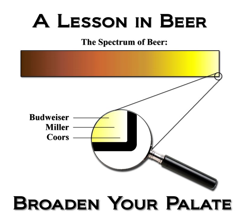
I actually prefer the original poster. I think it shows the impact of how insignificant BMC is to the rest of the beer world, not just based on a color difference, but of purpose too.
 
I think I will +1 on the orriginal poster, its not as busy and gets the point across. I do like the manifying glass though, that would me a nice touch to "magnify" the insignificance of BMC:)
 
I like the simpler concept a little better.

To make the more complex design a little more correct, there is no apostrophe in "Lagers like:," and the n in "Known World" should be lowercase. Also, BMC are post-prohibition American lagers. Pre-prohibition beer was supposed to have been more flavorful.
 
I am liking it better and better! This was my idea, if someone with better graphics skills would like to clean it up, go for it:D
poster1.JPG
 
A couple of minor graphic suggestions;

- make the corner of color bar visible in the magnifier's field (not just the bottom of color bar as currently shown)

- add vertical lines (thin) corresponding to the B,M,C styles.. and water too, very near edge!
 
Yeah, i thought of putting the corner in the magnifying glass after I posted the picture, but I didn't want to have to go back and re-open paint.... I will let someone else clean it up:D
 
poster2.jpg


If you guys are interested, I can make this available on CafePress as a t-shirt or something (with Sir Hump's permission, as soon as we're done with the critiques and editing). I always keep the markup right at the minimum.

EDIT: Guess this'll do for my #6,000...
 
Oh man, I see a t-shirt for sure! Have (is it jesters?) "I don't drink fizzy yellow water" on the front, and this on the back. I would buy it:D
 
deathweed said:
Oh man, I see a t-shirt for sure! Have (is it jesters?) "I don't drink fizzy yellow water" on the front, and this on the back. I would buy it:D
We can make that happen, I'm sure. I think Stone may have a copyright/trademark on the fizzy yellow beer tagline, but we can find something along the same lines.
 
Dude thats sweet....I'd buy for for sure!

Good work guys!!

EDIT: I kinda like the "Expand you're Horizon's" line too though...
 
Anybody else for adding "Expand your horizons" across the bottom? I could go either way on that one.

Back late tonight to read the rest of the critiques...druck, probably. For now, I'm going to the good beer store across town!
 
I can see using the "Expand your horizons" tag, but I am either way on it as well.

I know it would probably clutter the image up alot, but on the scale, have various other brands and styles written in in very small type all around, just to kind of emphisize the point. It would probably be way to busy and take too much time, but I thought I could toss the idea out there.
 
I like that idea. draw little lines to the other areas that other beers are at with lines to the names
 
Yeah, it would have to be done really well to get the point across without cluttering it up. what I had pictured was tiny type around the edges, closley spaced together so it almost looked like a thick border or background around the scale.
 
Exactly! That way it looks like a thick border from a little ways back, but inspection shows the plethora of beers that really do exist!!!
 
Back
Top