• Please visit and share your knowledge at our sister communities:
  • If you have not, please join our official Homebrewing Facebook Group!

    Homebrewing Facebook Group

A new poster idea for HBT

Homebrew Talk

Help Support Homebrew Talk:

This site may earn a commission from merchant affiliate links, including eBay, Amazon, and others.
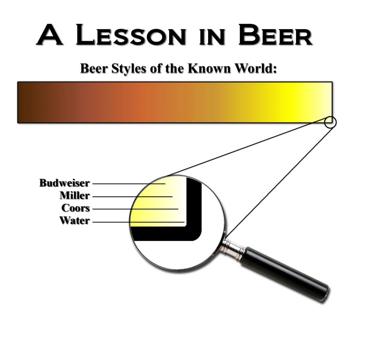
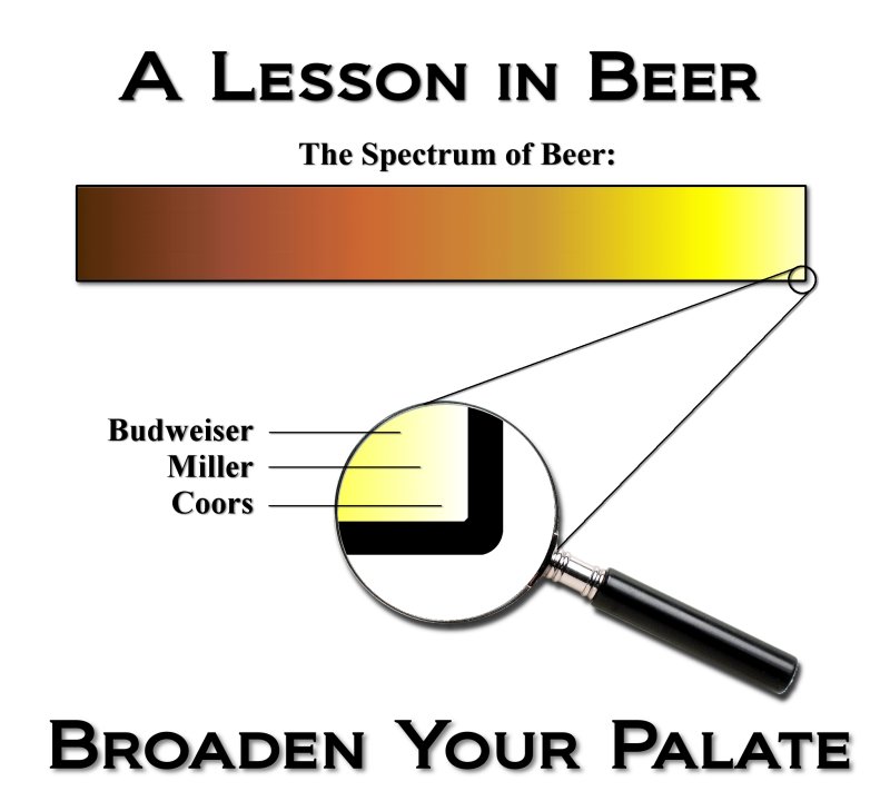
Anybody else for adding "Expand your horizons" across the bottom? I could go either way on that one.

Back late tonight to read the rest of the critiques...druck, probably. For now, I'm going to the good beer store across town!
 
I can see using the "Expand your horizons" tag, but I am either way on it as well.

I know it would probably clutter the image up alot, but on the scale, have various other brands and styles written in in very small type all around, just to kind of emphisize the point. It would probably be way to busy and take too much time, but I thought I could toss the idea out there.
 
I like that idea. draw little lines to the other areas that other beers are at with lines to the names
 
Yeah, it would have to be done really well to get the point across without cluttering it up. what I had pictured was tiny type around the edges, closley spaced together so it almost looked like a thick border or background around the scale.
 
Exactly! That way it looks like a thick border from a little ways back, but inspection shows the plethora of beers that really do exist!!!
 
I would but I have nothing on my comp to do it. Sorry. I'll deff buy a shirt though, and I know someone else who is gonna want one.
 
Yuri_Rage said:
poster2.jpg


If you guys are interested, I can make this available on CafePress as a t-shirt or something (with Sir Hump's permission, as soon as we're done with the critiques and editing). I always keep the markup right at the minimum.

EDIT: Guess this'll do for my #6,000...


I think this is near perfect. I love the addition of the corner in the magnifying glass; however, water is not beer. I think it just questions the design when you say Beer Styles of the Known World.

I think without water, and maybe making the magnifying glass smaller, you can find somewhere to add "Expand Your Horizons"
 
I love the slogan and the play on words, but I do see it going right over most peoples heads. Remember, most people can't even point out Iraq on a map :D
 
deathweed said:
I love the slogan and the play on words, but I do see it going right over most peoples heads. Remember, most people can't even point out Iraq on a map :D
So, are you suggesting we lose the tagline?

IMHO, even if they don't quite put the pun together, the line still suggests that there's a lot more to beer than BMC.
 
I don't think "Fizzy yellow beer is for wussies" is trademarked. I did a TESS search, and it didn't turn up. Still, it seems like a cheap move to steal that line for a t-shirt. Any more ideas for the shirt front?

EDIT: Jester...no offense meant. Those glasses rock!
 
Yuri thats awesome! Lookin good!

For the "broaden you're horizons" or whatever...I was thinking that could be the on the front of the T-shirt, like a small logo on the breast, and the image you've made could be on the back.

Just an idea
 
I'm with you, bird...even if you take the very last pixel in the gradient, it's still more brown than black. Lemme work on the gradient. It's kind of choppy anyway, even after some attempts at smoothing it.
 
Yuri_Rage said:
IMHO, even if they don't quite put the pun together, the line still suggests that there's a lot more to beer than BMC.


I'm with you on this. but I thought the play on words would mean that you would use palette (as in the art definition) implying palate (the mouth definition)

+1 on the color being darker, but it looks sooo damn good right now. You really doing are an awesome job.

I think fizzy yellow beer is for wussies would be perfect for the front.
 
I like having the water in it. Even though it's beer styles of the world putting water in there gives it some perspective. After all, it's meant to be funny not a serious chart.
 
poster3_smooth_grad.jpg


Better gradient, don't you think? Also, everything is perfectly centered now, and the original is 2000x2000 at 200 dpi...the recommended resolution for CafePress.

Fingers, I see where you're coming from...but for now, by majority, water is out.

I'm partial to "palate." Anybody else wanna make a pitch for "palette?"

Still seeking opinions for the shirt front - HBT logo, "Fizzy beer," "Broaden your palate/palette," etc...

I'll make some command decisions and have this available as a shirt later today or tomorrow. I just noticed that CP has a poster option, too!
 
Let's be fair.

There's Munich Helles and Pilsners, which are legit styles. Let's move the little circle about a half an inch to the left... because BMC isn't TOTALLY colorless.

Also, by moving the circle a little, we can get "water" out of the magnifying glass and, instead, place it at the far right as if the "0" on the X axis.
 
I think the HBT logo on the front would be a great cross marketing tool and maybe Tx can give shirts to those that upgrade to Lifetime Supporter or something
 
Back
Top