The "We'll fix your label for you" thread

Homebrew Talk - Beer, Wine, Mead, & Cider Brewing Discussion Forum

Help Support Homebrew Talk - Beer, Wine, Mead, & Cider Brewing Discussion Forum:

This site may earn a commission from merchant affiliate links, including eBay, Amazon, and others.
That works

Thanks again Jinks you do a lot for us that are Photoshop illiterate

Started working on the neck label tonight and am going to try to think of a way to try to try to turn this army artwork a guy did for me into a beer label...possibly for the co3c

Necklabel

Movedaround.jpg


Cameltow.jpg
 
That works

Thanks again Jinks you do a lot for us that are Photoshop illiterate

Started working on the neck label tonight and am going to try to think of a way to try to try to turn this army artwork a guy did for me into a beer label...possibly for the co3c

Threw this together in Beer Labelizer in 10 seconds.

Dromedary.jpg
 
And the obligatory can't leave well enough alone post. Courtesy of BeerLabelizer and Photoshop Elements 2.0BeerLabel copy.jpg


Tweaked a couple thingsCtow.jpg
 
Couldn't get labelizer to work on my phone that looks awesome though
 
Couldn't get labelizer to work on my phone that looks awesome though

Let me know when you get a beer ready to use the camel tow and I can arch in text at top for beer name and style or whatever.
 
WOW JINKS...so excited I left caps lock on lol...that's amazing...I have really got to learn to use Photoshop so that I can stop using your free time but I'm very impressed thank you
 
Just came across this thread. Great Idea. I was actually going to have some of my daughter's artistic friends take my current label and see if they could simplify it for me. I brew under the name Quaboag Brewing. We live along the Quaboag river in Central Massachusetts and wanted my label to reflect the mill history along the banks of the river. Wanted to use the image of an old Grist Mill with the waterwheel. Problem is the label that I put together is too detailed and I wanted something that was a bit less busy and could be etched onto glass. Love the way the folks at http://treehousebrew.com/ did their label so looking for something along those lines with regard to the design/style. I'll attach the detailed version that I have been using from my last batch of Biere de Garde. Any assistance I could get with this would be greatly appreciated. Thanks.

Here is the original for some creative person to simplify

grist-mill.jpg
 
What an awesome thread! I love this community!

This is the label for my pride and joy... A 25% Utopias-inspired brew called "Nirvana". I have this year's vintage bulk aging now. I'm doing a split batch - half on oak and half on Spanish cedar as well as a blend of the 2. Any thoughts on how to improve the labels for the 2014 vintage?

2014 Oak Aged Label.jpg


2014 Cedar Aged Label.jpg


2014 Blend Label.jpg
 
Oh, and this is the logo for my "brewery". I was thinking of doing neck labels and incorporating this as well. The bottles I used last year were cobalt wine bottles with long skinny necks (2 sizes... 500 and 750 I believe).

Shred White Background Flames_oval sticker.jpg


Shred White Background.jpg


IMG_2569[1].jpg
 
Hey guys. This one might be a bit too big to ask but why not. I recently turned 25, and on my birthday I brewed a barleywine that I plan on aging for 25 years. I wanted to do a special label for the beer, and I am really new to illustrator, and my attempts have come out looking like the old Kidpix program from the 90s haha.

So heres the idea, I wanted to use my familys coat of arms as the primary part of the label and add to it. The only pictures I have I took in an old church in Bavaria where the familys name originated in the 1300's. The earliest crest I could find was from the 1500s, still super cool. As you can see some are kind of angled, since they were painted 10 feet off the ground, so I couldnt get them straight on. Is there any way to skew them back?

I would like to add 2 wooden mash paddles (like this http://www.midwestsupplies.com/mash...ource=google&gclid=CL76xJGmkcICFS0Q7AodmEwAbg) crossed behind the crest, and a cluster of hops at the bottom.

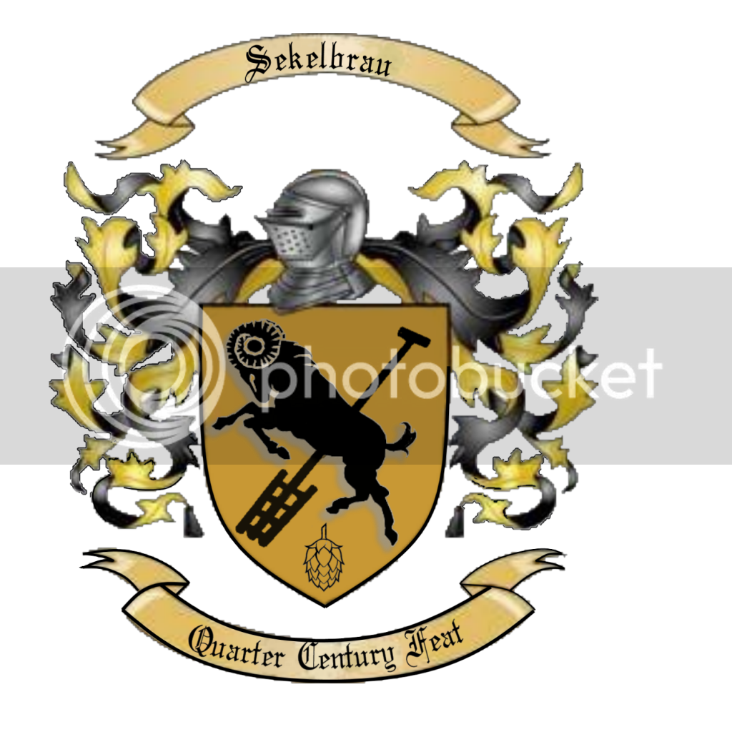
The text I would like to add: Seckelbrau (brewery name), Quarter Century Feat (beer name), Brewed on 11/6/2014, Drink by 11/6/2029

Think you guys are up to it? If its too much I totally understand. Thanks!

Crest 1.jpg


Crest 2.jpg


crest 3.jpg


crest 4.jpg
 
Oh, and this is the logo for my "brewery". I was thinking of doing neck labels and incorporating this as well. The bottles I used last year were cobalt wine bottles with long skinny necks (2 sizes... 500 and 750 I believe).

Where did you acquire the looong necks?? They are awesome!!
 
Hey guys. This one might be a bit too big to ask but why not. I recently turned 25, and on my birthday I brewed a barleywine that I plan on aging for 25 years. I wanted to do a special label for the beer, and I am really new to illustrator, and my attempts have come out looking like the old Kidpix program from the 90s haha.

So heres the idea, I wanted to use my familys coat of arms as the primary part of the label and add to it. The only pictures I have I took in an old church in Bavaria where the familys name originated in the 1300's. The earliest crest I could find was from the 1500s, still super cool. As you can see some are kind of angled, since they were painted 10 feet off the ground, so I couldnt get them straight on. Is there any way to skew them back?

I would like to add 2 wooden mash paddles (like this http://www.midwestsupplies.com/mash...ource=google&gclid=CL76xJGmkcICFS0Q7AodmEwAbg) crossed behind the crest, and a cluster of hops at the bottom.

The text I would like to add: Seckelbrau (brewery name), Quarter Century Feat (beer name), Brewed on 11/6/2014, Drink by 11/6/2029

Think you guys are up to it? If its too much I totally understand. Thanks!

Here's what I've come up with so far. Let me know if this will work.

Seckelbrau1.png


It would be awesome if someone could do a simple square or rectangle label for me, using the pic above as the main logo... just the tree.. unless it looks better with the field/grass... the logo can be made as small as needed to best fit the design.

* Altex Nursery Brewing or Altex Brewing if the shorter name looks better.. either above or below the tree (I think above would be better, but ?)

* simple white or off white background, either a forest green or dark brown border around the square or rectangle (brown might get lost in bottle?)

* space to handwrite the name of beer/type of beer opposite of the brewery name

* simple easy to read, nice looking font.. I'm a fan of clean over busy

* If turning the tree all one color looks better, feel free to try that..making it more like one of theses

*brewed in Alvin, Texas (small and wherever it looks best on the label)

You are the people with the design skills.... so if something excites you outside the parameters, try it! Worst I can do is hate it...and really does that even matter? (I probably won't hate it :))

I brew small batches... about two gallons... so I would probably just order enough for a few batches and then hand write in each batch name....

Thanks for your help. This thread is really awesome for those of us who have zero computer design skills..

(If you need me to help you with anything songwriting wise or musical... that is where my artistic skill set lies)
 
This is what Ive been working on for you. As you can see at the bottom Ive started outlining everything.If you like it I'll post the finished product for you in another week or two.

Excellent work above by the way.

brau.png
 
Here's what I've come up with so far. Let me know if this will work.

Seckelbrau1.png

This is exactly what I had in mind!!! Well done. Is there a way to brighten up the colors and make the hops a bit bigger? Awesome work man.
 
This is what Ive been working on for you. As you can see at the bottom Ive started outlining everything.If you like it I'll post the finished product for you in another week or two.

Excellent work above by the way.

brau.png

This looks great too. I was thinking more along the lines of using the actual crest as the basis. Nice work and thanks!


It would be awesome if someone could do a simple square or rectangle label for me, using the pic above as the main logo... just the tree.. unless it looks better with the field/grass... the logo can be made as small as needed to best fit the design.

* Altex Nursery Brewing or Altex Brewing if the shorter name looks better.. either above or below the tree (I think above would be better, but ?)

* simple white or off white background, either a forest green or dark brown border around the square or rectangle (brown might get lost in bottle?)

* space to handwrite the name of beer/type of beer opposite of the brewery name

* simple easy to read, nice looking font.. I'm a fan of clean over busy

* If turning the tree all one color looks better, feel free to try that..making it more like one of theses

*brewed in Alvin, Texas (small and wherever it looks best on the label)

You are the people with the design skills.... so if something excites you outside the parameters, try it! Worst I can do is hate it...and really does that even matter? (I probably won't hate it :))

I brew small batches... about two gallons... so I would probably just order enough for a few batches and then hand write in each batch name....

Thanks for your help. This thread is really awesome for those of us who have zero computer design skills..

(If you need me to help you with anything songwriting wise or musical... that is where my artistic skill set lies)

Hey man, without putting any time into it (I've got a list of requests at the moment) here is your idea simply plugged into beerlabelizer. If nobody picks this up once I'm finished with others I'll give you some options if you like.

2yonzuh.jpg
 
Ha.. I'd messed with it before, but never got my picture uploaded.... that one is pretty good. I recognize the basic label design from their website... cool.
 
Ha.. I'd messed with it before, but never got my picture uploaded.... that one is pretty good. I recognize the basic label design from their website... cool.

Yeah sorry. Just wanted to get something out there for ya since you said simple. It really doesn't look too bad, the greens are similar. I'll get back to it for ya soon.
 
Yeah sorry. Just wanted to get something out there for ya since you said simple. It really doesn't look too bad, the greens are similar. I'll get back to it for ya soon.

No worries... I just feel bad that I could have done it, but didn't! I appreciate your efforts!

I'm glad you showed me that a good label could be made there easily.
 
Whoops. Here is an attachment. Was playing on my chalkboard top Kegerator last night.

Thanks, and cheers!

Bird on shield as requested I can put words and such in there if you would like.
Pick a font you like and let me know what you want it to say.

BKbird.jpg
 
I just wanna say y'all main guys are great. I wish I had the prowess that you have to help.

Glad to see its still alive. Are there any good tutorials out there? Or what programs do you recommend. I have Photoshop, autocad, illustrator, inkscape, ms paint, and gimp and a few others I am forgetting.
 
I just wanna say y'all main guys are great. I wish I had the prowess that you have to help.

Glad to see its still alive. Are there any good tutorials out there? Or what programs do you recommend. I have Photoshop, autocad, illustrator, inkscape, ms paint, and gimp and a few others I am forgetting.

If you are somewhat proficient with photoshop or illustrator that is all you need. AutoCAD is a pain in the arse to edit existing photos and even then its more like doing a really hard cover-up tattoo. Otherwise, by using simple Copy/Paste commands in MS Paint, you can layer .PNG images on top of each other to make something decent. Photoshop & Illustrator for sure though.
 
I just wanna say y'all main guys are great. I wish I had the prowess that you have to help.

Glad to see its still alive. Are there any good tutorials out there? Or what programs do you recommend. I have Photoshop, autocad, illustrator, inkscape, ms paint, and gimp and a few others I am forgetting.

Here is one for using inkscape to customize labelizer. Same principals apply to photoshop also.

https://www.homebrewtalk.com/showthread.php?t=501889
 
Has anyone looked back through the thread to make sure we didn't forget anyone? The Millhouse is beyond my abilities as is the one with the scottish terrier.
 
I put one up 2 or 3 pages back... I don't hate my original, but if someone can do better I'd most certainly appreciate the advice and/or help!
 
I would just like to request a brief, moment of silence for the design I've worked on all day for an aerospace client...

...

She was a good design. Everyone loved her so much... I remember, a long time ago... this morning, when she was just one little line, how cute she looked. Then like a drunk driver, the terrible, horrible, no-good-very-bad-guy from sales came in and took you from us all too soon when he stepped on that little surge protector. You will be missed. Until tomorrow when I will have to make you all over again.
 
Bird on shield as requested I can put words and such in there if you would like.
Pick a font you like and let me know what you want it to say.

Thank you for help on this JLINKS. I like the neck twisted back like that. Is there a way to rotate the hop 90°? Maybe make it a touch smaller?

Here's a random thought... the shield could be made of barley on the stock. Not sure if this is possible. Just throwing around ideas

Thanks again for your time!
 
If any of you can make these dunes look more like sand that would be great. I have tried everything I could think of. Currently it a gradient with sandstone texture on it.

Also if there is something to be done with the thumper (silver-thingy) to give it a more realistic look, tryed using the chrome feature but the best I could do was with a gradient.

No rush, and if not I'm not totally unhappy with it, as it is. I will eventually work on getting the worm better too, but thats going to be quite difficult, and I really want that part to be my own work (really set on the curve and size and style and there aren't many examples online).

You guys are great.

JPEG of current version, I used inventor and can provide that file as well.

sandworm-label-colored-v2.jpg
 
Thank you for help on this JLINKS. I like the neck twisted back like that. Is there a way to rotate the hop 90°? Maybe make it a touch smaller?

Here's a random thought... the shield could be made of barley on the stock. Not sure if this is possible. Just throwing around ideas

Thanks again for your time!

Sure 90° in which direction? Sticking up or down? Here is a down although I had to shrink the hop a bit. Will work on it some more tonight. I tried putting the barley inside the sheild but way to busy and lost the bird in all the noise.

BKbird.jpg
 
I put one up 2 or 3 pages back... I don't hate my original, but if someone can do better I'd most certainly appreciate the advice and/or help!

Yours looks good what would you like changed?

Neck label copy.jpg
 
I would just like to request a brief, moment of silence for the design I've worked on all day for an aerospace client...

...

She was a good design. Everyone loved her so much... I remember, a long time ago... this morning, when she was just one little line, how cute she looked. Then like a drunk driver, the terrible, horrible, no-good-very-bad-guy from sales came in and took you from us all too soon when he stepped on that little surge protector. You will be missed. Until tomorrow when I will have to make you all over again.


Sales guys..... what can you do....:(
 
If any of you can make these dunes look more like sand that would be great. I have tried everything I could think of. Currently it a gradient with sandstone texture on it.

Also if there is something to be done with the thumper (silver-thingy) to give it a more realistic look, tryed using the chrome feature but the best I could do was with a gradient.

No rush, and if not I'm not totally unhappy with it, as it is. I will eventually work on getting the worm better too, but thats going to be quite difficult, and I really want that part to be my own work (really set on the curve and size and style and there aren't many examples online).

You guys are great.

JPEG of current version, I used inventor and can provide that file as well.


Here is my shot at it. You will have to put the text back in, or tell me the font and I can redo the text. If you like it that is.

sandworm-label-colored-v2 copy.jpg
 
Yours looks good what would you like changed?

Thanks for that! Nothing in particular. Just looking for criticism and/or help from those more talented than me. I've seen your work and if it's good enough for you, I'll keep it as is! :mug:
 
Thank you for help on this JLINKS. I like the neck twisted back like that. Is there a way to rotate the hop 90°? Maybe make it a touch smaller?

Here's a random thought... the shield could be made of barley on the stock. Not sure if this is possible. Just throwing around ideas

Thanks again for your time!

Just another attempt.

BKbird.jpg
 
Thanks for that! Nothing in particular. Just looking for criticism and/or help from those more talented than me. I've seen your work and if it's good enough for you, I'll keep it as is! :mug:

So your problem is your an artist. Artists are never satisfied with the work they have done.
Here is an Idea although the catch phrase is used here in Montana by a local brewery.2014%20Blend%20Label.jpg
I use a brewers warning on one of my labels.Dark Fae Red Ale copy.jpg
 
Thanks for that! Nothing in particular. Just looking for criticism and/or help from those more talented than me. I've seen your work and if it's good enough for you, I'll keep it as is! :mug:


Just because I like playing around with ideasshred flames.jpg
 
Here is my shot at it. You will have to put the text back in, or tell me the font and I can redo the text. If you like it that is.

Thanks that's great. I can put the text back in, don't remember what it was called. Now I just have to fix the worm so it doesnt stick out so much. Or maybe thats the point. :)
 
Back
Top