The "We'll fix your label for you" thread

Homebrew Talk - Beer, Wine, Mead, & Cider Brewing Discussion Forum

Help Support Homebrew Talk - Beer, Wine, Mead, & Cider Brewing Discussion Forum:

This site may earn a commission from merchant affiliate links, including eBay, Amazon, and others.
OK... maybe I'm just being anal... but the terminology here is bugging me!

It's not Indian Pale Ale... It's India Pale Ale. (Unless you're inventing an entirely new style... Curry beer anyone?)

And changing "India" to "American" completely changes the style.

Maybe use "American IPA"?
 
Getting second and third thoughts about this one. Does this need something on the top? And what? Hmm...

24180689521_2cf4bc7dea_c.jpg
 
Yeah. Its a beer inspired by Trump. Its a joke. A damn good joke. I actually love that it is an "Indian" pale ale. Subtle, but hilarious to anyone who knows beer and politics.

@jubuttib
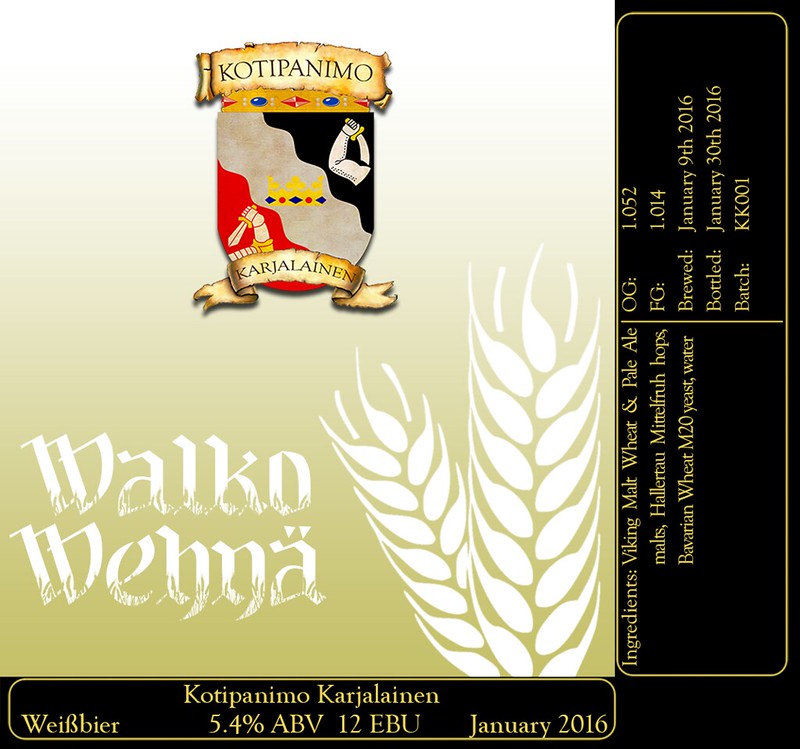
I don't know what is going on with your label. Which is name of the brewery and which is the name of the beer?
Also, be careful with white text on a yellow background (or vise-versa). It might look ok on a computer screen, but yellow has a very high lrv and can be very hard to distinguish from white in a well-lit environment.
Kotipanimo Karjalainen is the brewery name (Homebrewery Karjalainen in Finnish), Walko Wehnä (stylized way to write Valko Vehnä, kind of like "Vhite Vheat" instead of white wheat). I'm not too worried about the color, I work with calibrated monitors which gives some confidence for repeatability, and know from experience that the printers I have access to print yellows and browns darker than they should (which I compensate by going lighter in the design), and I'll also be making a test print beforehand to make sure it works out. It's also kinda supposed to be slightly hard to see. =)
 
Thought about this a little, and decided to call my latest frankenbrew "Weird Alice Rye Ale" (Rye Pale Ale?) & came up with this as a base for a label. Mess with it however you may.

I was thinking the name would be in an arch across the top, over her head, but anything that looks good to you, show it, please!

*EDIT* What about making the grey border a 60's-style, psychedelic rainbow effect? IDK...

weirdalice01.jpg
 
The first one would have to have additional info added later, as I don't know the ABV and such yet.

The last one, the white area could be left blank and I could put that info in myself.

That's about all I could see changing either of them!

Hmm...
 
If you could do me a favor - on that last one, where it just ways "Weird Alice", could you make it say "Weird Alice Brewing"?

I think I have a new "brewery" name, and I might just use that label for all beers, just change the beer style, ABV, and IBUs myself in the white areas!

But I still might want the first one you did for this rye pale ale...

;)
 
OK, I'm brewing a series of IPAs with a different featured hop and identifying them by color, but the name of the beer is SHIFT. So, "SHIFT-GREEN" for citra focused, "SHIFT_BLUE" for mosaic, etc. I think I'm going to just change the color value in pixlr for the variations. Have any cool ideas for SHIFT? I was going to use something like the attached. Also need text "SHIFT" on the label.

Cheers!

shifter.jpg
 
Oh, I definitely like the border & the "texture" the original had.

Okay, good to know. I'm not very imaginative, just have a lot of time on my hands. I started using the "no border" labels myself, I found they come out kind of unique by just ripping the paper. I didn't have the patience to cut out 30+ labels perfectly along a border. I'll do a few more bordered ones.

Any color preferences? More, less, specific color?
 
Here is a base one.. I'm going to try to refine/tweak this one a bit into a few more options for you to choose from, if you like.

Weird1.jpg

I like this, but with the words all on her dress like in the very first example. The empty white spaces work for me.

:D

*EDIT* Also, the texture from the first one was nice & weird...
 
Last edited:
Just looking into some other options for you until I hear back.

DWA1.jpg

Just a bump - this label & "texture", but with "Weird Alice Brewing" on it, all on her dress front like they are here. No other words preferred.

Thanks again, CAD!
 
Thanks again, CAD!

Alright man.. here's what I've got:

The Base Art

DWA.jpg


Final Revision

WAFinal.jpg


I've attached the base art for you. If this is in fact an image you're going to use more often in the future, you can easily tweak it to fit your needs and I'll give you a few quick steps on how to do so from any computer.

- Go to www.pixlr.com
- Launch web app
- Click browse > Select the base art

From here, you can use simple tools to alter your label. It's a very easy program to use, there is nothing magical about it. The only thing that really holds you back is imagination, which is why most of my labels have the same feel. I'm working on it.

Some info for you, if you decide to tweak the label on your own:

- Your font = Type > Handwritten > DJ GROSS
- The texture = Overlay > Grunge > Stringy
- The border = Borders > Grunge > Cleaner

Let me know if there's anything else I can help you with.
 
Nice!!! That's it, man. You nailed it! I figure I can print off a bunch of those at Kinko's and just write in the other info. That's why the white space was preferred blank.

Maybe I will play around with that pixlr program, too...

:)

Thanks again!
 
Nice!!! That's it, man. You nailed it! I figure I can print off a bunch of those at Kinko's and just write in the other info.

If you've got access to a printer and don't need ultra high quality... I just open up a blank word document, insert picture, adjust the size so I can fit 4-6 per page and print a bunch. Cut them out and be done with it.
 
Yeah, I have a prog that I can put 9 on a page and they fit bottles pretty dang nice. I print one off at home at high quality then go to Kinkos to use the laser-printer.

Thanks again! I might ask for one more favor once the rye ale gets done, on that very first pic I liked, but that will be a little ways away.

:)
 
This is our logo. Thinking of some labels to go with the brews after we finalize the names and finish tweaking the recipes.

Some beers to label: Aegean Blue Lager, Double D-coc Lager,

We have a sea view and there is an underground spring/river that bubbles up in three places in the sea. The areas are famous for fishing.

Any feedback on the logo or recommended adjustments are welcome.

Would like to fit it into top label templates as seen on this thread.

Cheers,
Dan
AlfA01

Salty RiverJPG LOGO.jpg
 
Wow. That looks really teal and greenish when I post it on HBT. As I'm looking at it in my preview and Adobe Ai, it looks more blue. Its supposed to be a light sea colored blue, not green.
 
I have been kicking around the idea of a new label.

The name of the brewery is Equilibrium, so was thinking that something similar
to Yin/Yang, Work/Life Balance. That type of thing. Attached is my first pass
at it, but it's not quite there yet.

Any thoughts/suggestions would be appreciated.

View attachment eqlabel.bmp
 
I have been kicking around the idea of a new label.

The name of the brewery is Equilibrium, so was thinking that something similar
to Yin/Yang, Work/Life Balance. That type of thing. Attached is my first pass
at it, but it's not quite there yet.

Any thoughts/suggestions would be appreciated.

I made a few minor adjustments, and think it looks better overall now. Let me know what you think.

taco.jpg
 
Wow. That looks really teal and greenish when I post it on HBT. As I'm looking at it in my preview and Adobe Ai, it looks more blue. Its supposed to be a light sea colored blue, not green.

Calibrated the monitor and it looks normal now.
 
Back
Top