Some Critiquing on my Labels Please? Thanks

Homebrew Talk - Beer, Wine, Mead, & Cider Brewing Discussion Forum

Help Support Homebrew Talk - Beer, Wine, Mead, & Cider Brewing Discussion Forum:

This site may earn a commission from merchant affiliate links, including eBay, Amazon, and others.

Recusit8m

Well-Known Member
Joined
Jun 1, 2009
Messages
255
Reaction score
4
Location
Jeffersonville, Indiana
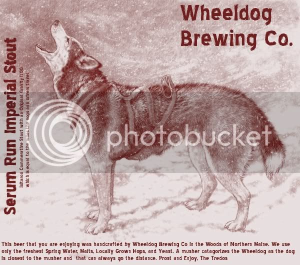
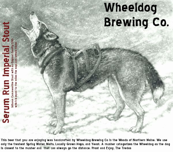
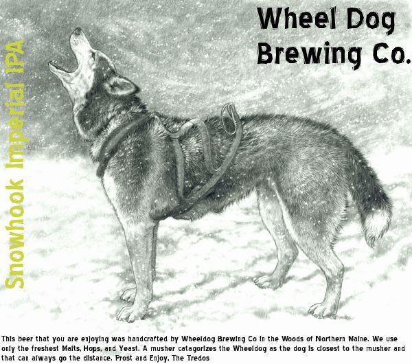
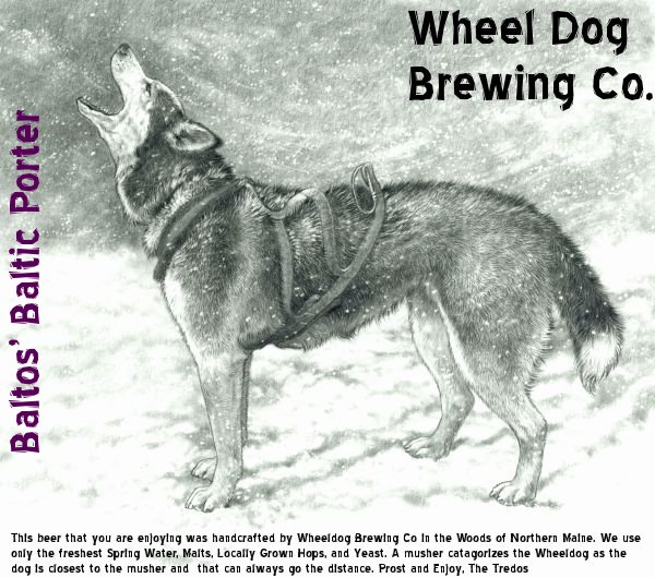
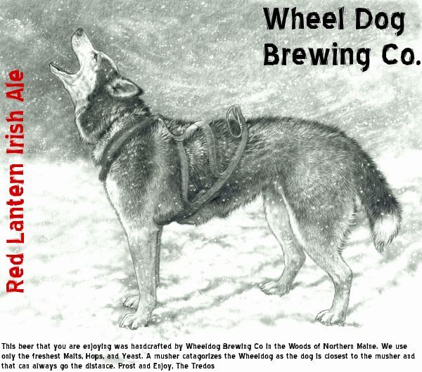
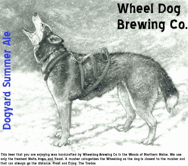
Well I had a bit of time and was playing around with the GIMP program and I came up with these labels...Let me know what ya think? As a former musher and when when we move back to up North we will be tring to open up a small get together style brewpub...Working on business plans with a few friends now...I will be putting some small information regarding the brew in the print as I move to that stage...Thanks for the input
Iditarod Commerative Stout
Stout4.jpg

Double IPA
IPA10.jpg

Baltic Porter
wheeldogbrewingporter.jpg

Irish Red
WheeldogbrewingIrish.jpg

and Summertime Ale
WheeldogSummer.jpg
 
I'm not a label guy or much of an artsy person to be honest, but here's my two cents:

The Double IPA label is hard to read.

Also, since the only difference between the labels is the name of each beer, it seems like making the font bigger might make it easier to recognize each beer. If you've tried it and it looks bad, nevermind, I can't visualize it too well, but just a thought.
 
I appreciate the comments...Thanks...I kinda wanted to stay with the same graphic for familiarity at this point...Similar to Deschutes and maybe changing up the borders...Im pretty much a graphic art noob and unfamilair with any of these programs for the most part...Thanks Ill continue to work on it
 
Looks nice, and I agree with slowbie's comment on the legability of the yellow text.

Here's an idea, take it for what it's worth. Why not color code the entire labels since you're using the same graphic? For example, replace the "black" in the black-and-white with maroon, purple, and blue. For yellow, replace the "white". Something like below.

Just a thought.

stout.jpg
 
Just to clarify, I like the idea of the same label art from beer to beer, I just think that it should be obvious from a glance which is which. Changing borders would be an excellent way to distinguish the beers.
 
I like the idea of adding the tint to help distinguish between the beers.
 
+1 on the tinting.

Also, maybe I'm misreading the fine print, but I think you've got a typo in all of them: "A musher categorizes the Wheeldog as the dog is closest to the musher..."

Shouldn't it read either "the dog that is closest to the musher" or "the dog closest to the musher"?
 
+1 on the tinting.

Also, maybe I'm misreading the fine print, but I think you've got a typo in all of them: "A musher categorizes the Wheeldog as the dog is closest to the musher..."

Shouldn't it read either "the dog that is closest to the musher" or "the dog closest to the musher"?

Beat me to it! That's what I noticed first.

Also +1 on the tinting...

-Tripod
 
I'd like bigger text, personally, at least on the brewery name. Looks like you have some room to expand the type, though! The sketch might not lend itself to it, but maybe plainer or bigger text might look more attractive on a bottle. Still, though, great picture and concept! Let us know what you settle on, the graphic you chose is incredible!
 
How about switching the beer name with the company name? May be better use of space, since you have more in the upper right corner. You already have the dog for brand recognition.
 
i'd switch the beer name with the brewery name. it feels a bit uncomfortable to cock your head to read what you'd be drinking.
 
whoops, somebody beat me. and as far as the tint, i like it, but if you could leave the dog untinted, i think it would be a better image for brand recognition.
 
+1 to swapping the beer name and the brewery name. You might also want to add a 1px black outline to the text for the beer/brewery name, to make it pop out a bit more from the BG.
 
Back
Top