Ok I Really Need Advice On My Labels...Whatdya Think?

Homebrew Talk - Beer, Wine, Mead, & Cider Brewing Discussion Forum

Help Support Homebrew Talk - Beer, Wine, Mead, & Cider Brewing Discussion Forum:

This site may earn a commission from merchant affiliate links, including eBay, Amazon, and others.

cshrode21

Well-Known Member
Joined
Oct 9, 2010
Messages
58
Reaction score
0
Location
Oklahoma
These are the first labels I've ever designed and I'm needing some honest feedback. What changes need to be made?

FrontPorchLabel.jpg

BackPatioPicture.jpg

pictureversionoflabel.jpg

CaptainsWheelPicture.jpg
 
1) Whitespace is your friend. Give the objects on your label a little more room to breath.

2) Try not to use more than one or two fonts, it looks like you've got four.

3) The mini-boom rock logo looks impossibly small.

4) The Captain's Wheel font is different than the others, don't do that keep it consistent.


Good work, they look like a solid start. What I've said are mainly personal suggestions, except for the whitespace issue. The design police will show up at your house and take your Photoshop away if you don't get more whitespace.
 
The font is the same for all four labels, the Captain's Wheel is just condensed and possibly a slightly smaller point size...

I would give more breathing room to the design too.

A couple of the labels I've fully designed myself:
3489-uk-brunette-ale-label.jpg


3455-double-tap-esb-label.jpg


and
3454-wee-honey-ale-label.jpg


I'm using 16oz flip-top/Grolsch style bottles... These labels fit them well. Figure out how wide, and tall, you can make the label and have it work on your bottles. Design the labels around those parameters... I would try to follow the KISS school of design though. :D

BTW, I am keeping with just two fonts for my labels... One for the standard info, and a different one for the name of the brew, and maybe one other bit of info (such as with Double Tap)...
 
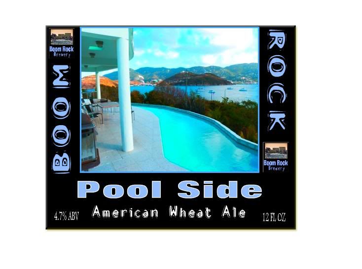
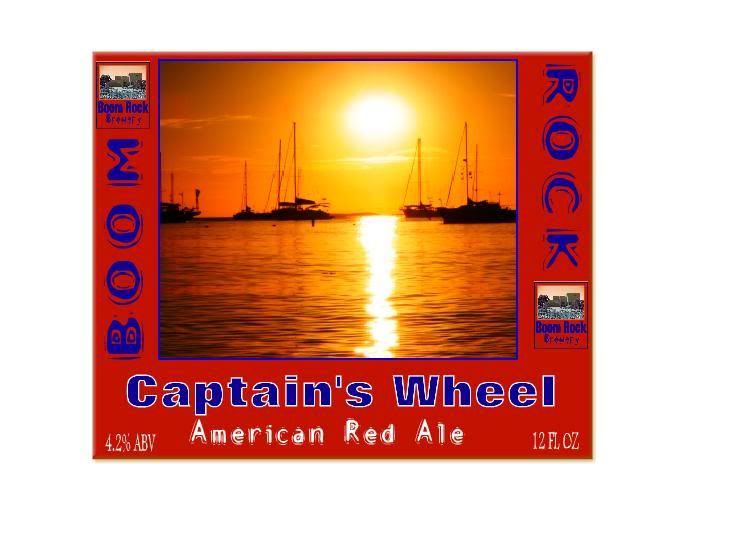
Not bad, at all, for first label designs... Of course, I have a BFA in graphic design and still remember enough to do occasional good jobs... I'm in the IT field now, and have been since 2000...

I posted my labels in the general thread, but haven't seen anyone comment on them yet... Maybe I should put them in their own thread to get some feedback...
 
Thanks...

Used .45 Cal because that's what I own, and used in competitions for years. I don't have anything that uses .50 BMG yet... Besides, .50 BMG might go on my old ale mkII label... Not sure about the barley wine when I brew that...

:off:
The bullets I use are .452" diameter, which is about as big as you can get into .45 cal ACP cases... They're 255gr (grain) full jacket (copper) rounds... I would load them so that they'd move at about 725-750fps... The other guys would joke with me about how I was using artillery rounds, since they were heavier than what anyone else used, and moved slower than pretty much what anyone else used. Still, knocked down steel plates real good. :D I wish I could get back into the competitions up here (did it more while living in FL), but I just don't see it happening. Where I had at least three clubs within an hour drive of me in FL, the concentration where I am now isn't even close. Plus, the season is much shorter up here (it was IPSC, so done outside)...
 
Whatever font is being used for the name and boom rock is conflicting with the rest of the image. Seems like your text layer has an emboss effect or something on it. I would suggest combining Boom Rock to one side as well. Other than that they look good. Nice simple and clean. Good work
 
Thanks for all the feedback. I'm currently working on changing some of the things you guys have mentioned.
 
Back
Top