You are using an out of date browser. It may not display this or other websites correctly.
You should upgrade or use an alternative browser.
You should upgrade or use an alternative browser.
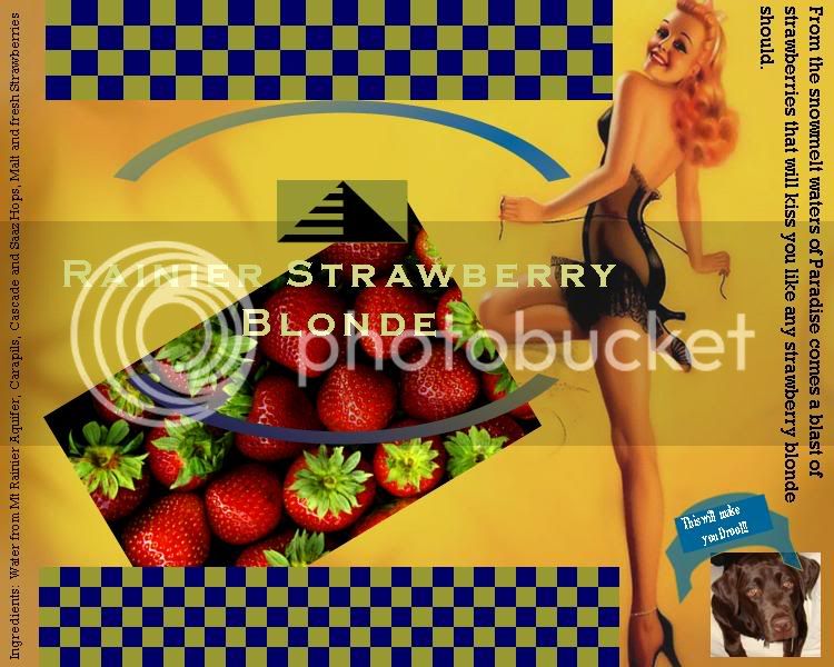
My Strawberry Blonde Label
- Thread starter Turisops
- Start date

Help Support Homebrew Talk - Beer, Wine, Mead, & Cider Brewing Discussion Forum:
This site may earn a commission from merchant affiliate
links, including eBay, Amazon, and others.
Well it's important to make the most important bit of text stand out, but you've chosen to write "rainier strawberry blonde" in a very similar color to your background gradient, so it's really hard to read. I would also use a different font for the vertical text on the left and by the dog. Generally it's good to have two font styles in one design - one for the "main" text and one for the smaller subtext. So I would use the same font for everything except the name of the beer. The background picture was a great place to start though, especially with her hair color and everything.
not bad w/ your first attempt. It's a little busy but alot of labels end up that way.
I agree to a point w/ coldsep about the text but can see why you went with it. Maybe try a pink or light blue so it stands out agains the strawberries and the background a bit. Also agree about keeping it to just two font's maximum.
I'd also loose the dog unless you can edit out the white background.. just put your text there. "it'll make you drool"
Similar threads
- Replies
- 2
- Views
- 713
- Replies
- 2
- Views
- 639
- Replies
- 1
- Views
- 266
- Replies
- 8
- Views
- 611


