You are using an out of date browser. It may not display this or other websites correctly.
You should upgrade or use an alternative browser.
You should upgrade or use an alternative browser.
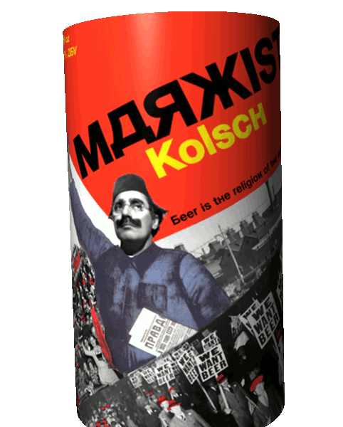
Marxist Kolsch - new label
- Thread starter riromero
- Start date

Help Support Homebrew Talk - Beer, Wine, Mead, & Cider Brewing Discussion Forum:
This site may earn a commission from merchant affiliate
links, including eBay, Amazon, and others.
android
Well-Known Member
that's a great label. i love it and the only thing i could think of is to add more of the black and white on the top and box off the name. then again, why change something that is as cool as that.
throwbookatface
Well-Known Member
I do like the contrast in colors! There seems to be a lot of empty red space near the top - maybe fool around with your title and have it take up some more of it? Then again, it could look great unbalanced like it is on a bottle. I say print it out and stick on some draft copies on a bottle and see what it looks like, and let us know!
Gfei
Well-Known Member
that's a very cool label, I don't think I would change anything.
Panagiotis
Well-Known Member
I like your sense of humour. GJ!
Hmmm. since you have so much of this beer and the rest of us have none it only makes sense that you redistribute some of your beer to the other members of the forum. Yes, I understand that we neither brewed, bottled, or contributed to the grain bill, but surely you've produced enough to share, right?
Hmmm. since you have so much of this beer and the rest of us have none it only makes sense that you redistribute some of your beer to the other members of the forum. Yes, I understand that we neither brewed, bottled, or contributed to the grain bill, but surely you've produced enough to share, right?
That's exactly what went through my head when I saw that label
That's exactly what went through my head when I saw that label.
You guys are confusing the mainstream Groucho School of Marxist thought with some other obscure fringe type evidently.
BargainMugs
Well-Known Member
- Joined
- May 17, 2010
- Messages
- 361
- Reaction score
- 12
Very Soviet constructivist.
Great label. I think you nailed the look you were going for.
Great label. I think you nailed the look you were going for.
BargainMugs
Well-Known Member
- Joined
- May 17, 2010
- Messages
- 361
- Reaction score
- 12
I think your first label was stronger. The previous design utilized negative space in a very dynamic way.
The plane additions are a bit too distracting in my opinion.
The plane additions are a bit too distracting in my opinion.
brbecker87
Member
First of all +1 to DrDirt.
As for the beer label, I really like it. Makes me think of "1984" (wish I could remember what they called the beer in the book). Looks good. Love the ABV, and the quote.
As for the beer label, I really like it. Makes me think of "1984" (wish I could remember what they called the beer in the book). Looks good. Love the ABV, and the quote.
Gfei
Well-Known Member
I have to agree with BargainMugs, the first label just works better visually.
I have to agree with BargainMugs, the first label just works better visually.
Okay, thanks guys. That's why I ask...
Noontime
Well-Known Member
I actually like the second one better...I like the planes. It gives it more power, just like the original propaganda posters it illustrates the military might of your beer. I don't think it contributes (exceedingly) to the "busy-ness" of the label...I mean it's a very busy design as is.
If you like it and you want to try something else, maybe orient the planes horizontal instead of at an angle. They would be the only horizontal element.
If you like it and you want to try something else, maybe orient the planes horizontal instead of at an angle. They would be the only horizontal element.
I'm loving the first label, minus the spelling of marxist in english/russian. I think it might look better if you replace the Russian D with the letter A, and the russian Ж with an X. My brain for some reason won't let me read the Russian D as an A. Same case goes for the ABV. I keep reading it as DBV.
Similar threads
- Replies
- 57
- Views
- 2K
- Replies
- 0
- Views
- 217
- Replies
- 7
- Views
- 754


