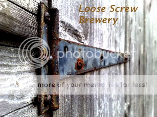
I really like it. I think you may want to try and make your brewery name jump out a little more with a color change. I love the pic, did you take it yourself?
What color would you suggest? I was sort of going for a rust color and that was the closest that I could find without losing the text in the picture. As for the picture itself, I snagged it off a google image search. I'll probably take my own eventually, but I've got to find a spot that would come out as good as that.
On second thought, pull a reddish hue from the only screw holding the hinge to the gate. Something like #7C2511 (you can type that into the "HTML notation" section of GIMP's color chooser). Definitely use a drop shadow to make the text stand out (Filters -> Light and Shadow -> Drop Shadow).
...but I couldn't figure out how to get the reddish hue on the screw holding the hinge to the gate. I selected the ellipse tool, selected the screw and entered 7c2511 in the HTML notation section but it didn't seem to do the trick.
For me, I think the "perspective" of the shot doesn't draw the eye to the loose screw in the picture. I read the text, and then my eye is left searching for the actual loose screw. Maybe try cropping the picture and/or playing with the hinge on the gate to soften it and draw the eye more toward the loose screw.
IMHO I don't like how small your lettering is relative to the picture. It seems like the hinge is the focus instead of your brewery name. I'd try to put your name more out front. But then again I'm not in advertising or anything like that, I'm a musician.
To make a 'drop shadow' just use the same text with a black color and then make another one in brown (your preferred color) and offset the brown one step up and one step over (depending on where your light source is in the pic), in this case one up and one to right for the brown should do nicely.. You can go overboard with this too (using italics for shadowing can give some pretty unique effects). Look at the label I made yesterday to see what I mean.
You can see how I went overboard with the lighter copies to show highlighting and the lower part illustrates the italics I mentioned. HTH!