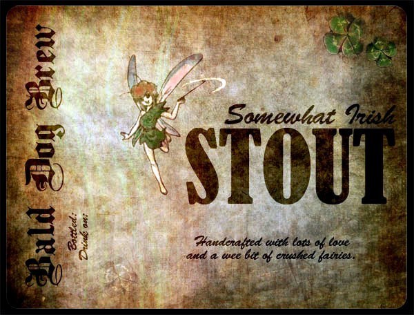
First Label - OPINIONS PLEASE!

Homebrew Talk - Beer, Wine, Mead, & Cider Brewing Discussion Forum

Help Support Homebrew Talk - Beer, Wine, Mead, & Cider Brewing Discussion Forum:

This site may earn a commission from merchant affiliate links, including eBay, Amazon, and others.

corvax13

Well-Known Member
Joined
Jul 21, 2009
Messages
294
Reaction score
1
Location
Savannah, GA, US
BDB_LABEL.jpg


First beer label for a stout currently in primary.

Any comments and suggestions are welcomed and encouraged!
 
I really like it, although I don't know about the placement of everything. I think it might look weird on a bottle. Or it may just be that I like things centered.
 
Thanks for the comments!

All done in photoshop - the old paper is a picture of an old paper found online, then dodging and burning with a couple layers.

I was actually trying to stay away from everything centered, just because thats the way all labels are done. Havent tried it on a bottle yet, but I am curious as to whether it will actually work or not... guess Ill put a picture of a bottle up once they are done.
 
Nice. I would lighten up the excellent paper texture a couple of steps though.
 
I love it! but towards the edges it gets a little hard to read. Like riromero said a little lighter and it would be perfect.
 
As a designer, I'd say is that it's a bit monochromatic. Introduce a subtle hint of colour. Also, certainly lighten it up - that's gonna get lost on a dark brown bottle. Finally, and this is (probably) just me, Brush Script makes me want to punch people. (almost as bad as Comic Sans!)

As an Irishman, I resent the use of crushed fairies. They're an endangered species!!
 
Thanks for the input everyone!

As a designer, I'd say is that it's a bit monochromatic. Introduce a subtle hint of colour. Also, certainly lighten it up - that's gonna get lost on a dark brown bottle. Finally, and this is (probably) just me, Brush Script makes me want to punch people. (almost as bad as Comic Sans!)

As an Irishman, I resent the use of crushed fairies. They're an endangered species!!

Ha ha ha. I was aiming for small hint of comedy, and so far I think it works.

I agree with yours and everyone else's suggestion to lighten it up a little. Not sure if I want to add too much color, I like the monochromatic feel, but perhaps I can resaturate the fairy a little bit.

Brush Script was a quick fix, as this is a first draft... I'm not crazy about it either, but it was the first one I could find that had close to the right feel. Do you have any suggestions? I am looking for something that has a somewhat cheeky feel, and is more legible.

Thanks again for the input!
 
I just downloaded GIMP. Interesting little program.

Here is my idea for adding just the smallest bit of colour, what do you think?

BDB_LABEL_colour.jpg
 
These colors are actually very close to the original colors of the image, I just desaturated them a little too much.

Ill add the color back in - I like what you did a lot, so I'll explore that area a little more.

Thanks a lot for the feedback - this has given me some good ideas for the next label Im going to make, for a brown ale.
 
Just a thought, but instead of having a defined, black border on the label, you could tint the "burned" edges more towards the color of an amber bottle, so that it looks like the label is part of the bottle, as opposed to two separate entities. I think it'll age the bottle with the aged look of the paper.

BTW, I think the label looks great. I like the color addition as well.
 
My mistake - the black border is not actually a part of the label, its just how I cropped it. The label itself has rounded off edges, if you look closely at the corners...

I do like the idea of burning the edges a little more, Ill experiment once I get closer to bottling.
 
Nice logo, just make sure to print it on something with great print quality and it'll be awesome!
 
Back
Top