You are using an out of date browser. It may not display this or other websites correctly.
You should upgrade or use an alternative browser.
You should upgrade or use an alternative browser.
New Logo
- Thread starter CromBrew
- Start date

Help Support Homebrew Talk - Beer, Wine, Mead, & Cider Brewing Discussion Forum:
This site may earn a commission from merchant affiliate
links, including eBay, Amazon, and others.
Boerderij_Kabouter
Well-Known Member
Looks great! I really like the concept


janzik
Well-Known Member
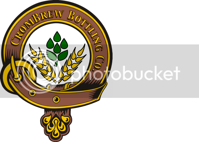
Looks great! I love the center of it. I was thinking about something similar, with the concept of it being like a skull and cross bones, but a hop and grain bones  Great work.. off to go download inkscape for me...
davesrose
Well-Known Member
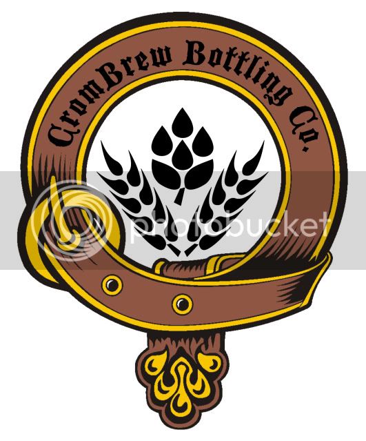
Graphic looks great, but maybe spend more time on the text. The typefont is a bit too serif I think....and I would use a bright color (maybe white with a dark brown drop shadow). Right now, I think the brown color of the ribbon is too close of a value to the black text that you're losing too much contrast. Oh, and you'll continue to hate that all my design classes (where I got sick of type) are rearing up now
 I see that the arc of the text is not aligned with the arc of the ribbon. Since the text itself is not going for a full semi-circle, I would rotate it more clockwise so that it's equally distributed with the shading lines.
Another suggestion is maybe playing around with some more colors in the center. With there being a white center, with just straight black malt/hops, it seems like that's just receeding in space. I would probably have a color fill that white space and either have different colors for your malt/hops... or better: keep a heavy black outline with colored centers (that should let them pop the way your border is). Right now I'm thinking the black silhouette is too recessive. It's also not quite aligned: because of the buckle, it should get shifted to the right just slightly. One good pointer I've learned about judging contrast is to squint your eyes....if it's good, things will still be readable. Another way of judging balanced composition is to turn an artwork upside down so that you're seeing it a new way.
Another suggestion is maybe playing around with some more colors in the center. With there being a white center, with just straight black malt/hops, it seems like that's just receeding in space. I would probably have a color fill that white space and either have different colors for your malt/hops... or better: keep a heavy black outline with colored centers (that should let them pop the way your border is). Right now I'm thinking the black silhouette is too recessive. It's also not quite aligned: because of the buckle, it should get shifted to the right just slightly. One good pointer I've learned about judging contrast is to squint your eyes....if it's good, things will still be readable. Another way of judging balanced composition is to turn an artwork upside down so that you're seeing it a new way.
NorthWoods
Active Member
- Joined
- Apr 19, 2009
- Messages
- 29
- Reaction score
- 0
Very nice. What program did you use?
Similar threads
- Replies
- 1
- Views
- 559


