Well, this is my first reply and I have never homebrewed yet so...
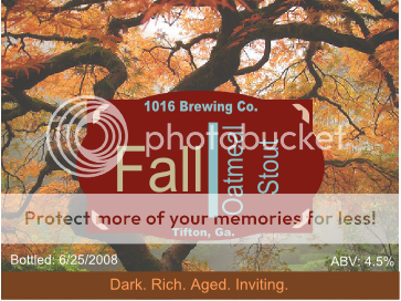
Nice label. I like the concept, any "earthy" is cool by me. However, the "fall oatmeal stout" red part kinda competes with the tree in the background too much. This makes the label seem busier than you might think. The fact the red section covers the middle part of the tree makes the whole design a bit awkward, the tree seems like it needs to be revealed more. Give me more tree!
I like the colors but I'm a little concerned the red is a little too bright (althought that section alone looks really cool). Have you considered changing the red to the same color as the brown strip at the bottom? Or picking a red in the tree picture? (there are some cooler colored red leaves above the "Co." that might work). This would further simplify the whole composition.
Despite my nitpicking, your label makes me wanna buy your beer so good job!

")
