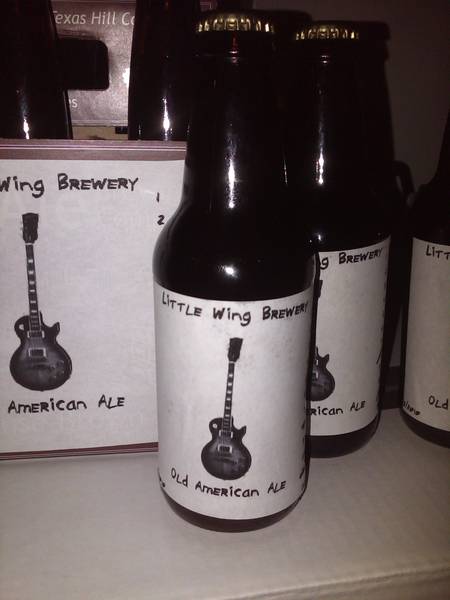
funkapottomous Well-Known Member Joined Feb 1, 2010 Messages 628 Reaction score 11 Location Houston Mar 30, 2010 #1 first time bottling in real bottles and labeling. check it out:
C coy Well-Known Member Joined Feb 22, 2010 Messages 294 Reaction score 0 Location WA Mar 30, 2010 #2 I like it. I'm a fan of white space and simplicity. i.e. less is more. even though the font doesn't say classy the overal appierance does. nice work.
I like it. I'm a fan of white space and simplicity. i.e. less is more. even though the font doesn't say classy the overal appierance does. nice work.
OP OP funkapottomous Well-Known Member Joined Feb 1, 2010 Messages 628 Reaction score 11 Location Houston Mar 30, 2010 #3 the font is meant to resemble handwritten sharpie.
JetSmooth Well-Known Member Joined Feb 2, 2010 Messages 1,869 Reaction score 47 Location Baltimore, MD Mar 30, 2010 #4 I dig. Makes me sad I sold my guitar to fund the AG rig. *sniff*
lustreking Well-Known Member Joined Aug 11, 2006 Messages 778 Reaction score 35 Location Bethlehem, PA Mar 30, 2010 #5 I really like the simplicity, but wonder if the guitar should be a Strat...
OP OP funkapottomous Well-Known Member Joined Feb 1, 2010 Messages 628 Reaction score 11 Location Houston Mar 30, 2010 #6 yeah I've gotten that a few times. the problem was that I couldn't find a decent strat brush that was simple and vertical. the only vertical strats I could find were HSS and not anything like lenny, or just a texas blues strat. so I settled.
yeah I've gotten that a few times. the problem was that I couldn't find a decent strat brush that was simple and vertical. the only vertical strats I could find were HSS and not anything like lenny, or just a texas blues strat. so I settled.
B Burgs Well-Known Member Joined Feb 5, 2010 Messages 937 Reaction score 11 Location Decatur, IL Mar 31, 2010 #7 Reminds me of Dark Horse Brewing labels, I like 'em. Your motto in the sig line made me laugh too, haha.
Reminds me of Dark Horse Brewing labels, I like 'em. Your motto in the sig line made me laugh too, haha.
mavandeh Well-Known Member Joined Oct 31, 2009 Messages 133 Reaction score 2 Location Chicago Mar 31, 2010 #8 Looks great! Next step for me, boxes! I agree with coy, the "less is more" really works for your design. Keep it up!
Looks great! Next step for me, boxes! I agree with coy, the "less is more" really works for your design. Keep it up!