ballzac
Well-Known Member
Newest version:

Just created this label for my pilsener. Beersnob's is my fictional brewery. The caracature on the label was found on google. I will get my dad to draw me a new one as he is an artist, but I guess it doesn't really matter as it is only for personal use.
First version:
I'd love some feedback from you guys. I think a lot of people here are right on the money when it comes to evaluating a good label. I know it's only for me and my friends, but I actually believe that the look of a bottle greatly influences the percieved flavour of the poured drink, particularly for those who didn't make it. Like I think if I pull a bottle out without a label and say, "here, try my homebrew," the general consensus will not be as positive as if the bottle looks a little professional.
EDIT: I just realised there is a member here called beer snob. Hope my brewery name isn't off limits. Also. I have been working on the label a bit more. I'm stretching it horizontally because I found it looked too narrow as it curved around the bottle. Also have gotten rid of the multicoloured name and replaced it with one bronze color. Will work on it a bit more and post what I have done when I think it's right.
Just created this label for my pilsener. Beersnob's is my fictional brewery. The caracature on the label was found on google. I will get my dad to draw me a new one as he is an artist, but I guess it doesn't really matter as it is only for personal use.
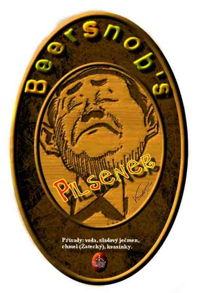
First version:
I'd love some feedback from you guys. I think a lot of people here are right on the money when it comes to evaluating a good label. I know it's only for me and my friends, but I actually believe that the look of a bottle greatly influences the percieved flavour of the poured drink, particularly for those who didn't make it. Like I think if I pull a bottle out without a label and say, "here, try my homebrew," the general consensus will not be as positive as if the bottle looks a little professional.
EDIT: I just realised there is a member here called beer snob. Hope my brewery name isn't off limits. Also. I have been working on the label a bit more. I'm stretching it horizontally because I found it looked too narrow as it curved around the bottle. Also have gotten rid of the multicoloured name and replaced it with one bronze color. Will work on it a bit more and post what I have done when I think it's right.
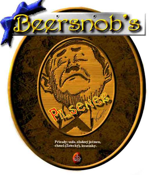

") I think I will still alter the silver background slightly though. Something about it bothers me.
I think I will still alter the silver background slightly though. Something about it bothers me.