I like the feel of the labe, it reminds me of a homegrown brewery - it feels like it could be a brew pub in my neighborhood that all the peole go to who would never be caught drinking a BMC but at the same time don't drink obscure belgians JUST BECAUSE they are not BMC (I like Belgian beer, just not people who drink it as a status symbol) ANYWHO I digress:
It feels homegrown, not sure if that is bad, or good, or really matter at all.
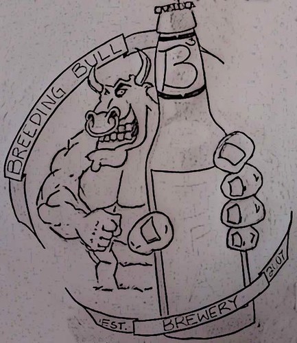
part of the perspective could be worked on, but again I'm just an art nerd - the hand and the bottle are just floating there, and are not anchored to the Bull's Body, it may not seem like that big a deal but if you think about how the Bull's body is positioned, some of the arm on the side would be showing (mostly on the veiwers left side of the hand).
also I think it would be interesting if there was a picture within the picture. You have this extremly present beer bottle in the viewers attention, but what about what is on the bottle...there is nothing. Something that peev'es me is when people do that - no offence just a slight OCD. but if your putting a bottle in the viewers face, why not make it worth it. Rahter than us trying to look at whats behind the bottle (the bull and words) why not put this label on the label on the bottle sort of like when you go to the store to try something on and the mirrors reflect each other and you have yourself with a picture of yourself within a picture of your self...that sort of thing, I think you could get away with just shrinking and copy pasting (and rotating to the correct angle of the bottle of course) and it would look so much more thought out (it would look like it has a purpose other than to block the viewers viewpoint) plus the bull should be drinking his own beer right?
I would clean up the lines and loose the hand-drawn look, unless your going to go overboard with the hand-drawn look which (even in commerical uses, is hit or miss - be aware of how it looks) People have posted on here some links to free software to take files and smooth them out...its out there (I use illustrator and just make it smooth in the first place, but I also have many years experience creating curved lines that don't look drawn)
Lastly this may be WAY out of reach, but have you thought of etching it in to the bottles. I saw on the BYO label contest months ago (saw it on the website) a label that was etched into the bottle - it wasn't a label but rather a photo and some text...not sure how to do it, but I do know it can be done - I doubt sandblasting would work, but I'm not the one to tell you how to do that ask around there are people out there that have much more experience in that sort of stuff than me. If you do this, I would stick to a lighter color maybe etch it in and then wipe ink into the grooves and buff the surface like an old etching plate but how to etch the glass I do not know. and then just do outlines I think that would look stellar.
I hope I didn't offend you, I'm just a artist/designer by trade and you asked for my thoughts so I shared...just my .02
cheers


")