Looking for logo design critique!

Homebrew Talk - Beer, Wine, Mead, & Cider Brewing Discussion Forum

Help Support Homebrew Talk - Beer, Wine, Mead, & Cider Brewing Discussion Forum:

This site may earn a commission from merchant affiliate links, including eBay, Amazon, and others.

RockTheGoodAg

Member
Joined
Mar 10, 2015
Messages
19
Reaction score
7
Location
Bryan
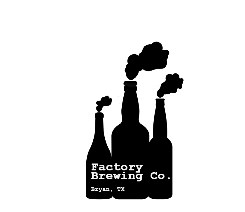
Okay, folks. I'm trying to design a logo for my home brewing efforts. This is my first attempt, using my (incredibly) rudimentary Photoshop skills, and I'd like some feedback. My roommates, friends, and I call my house "The Factory," hence the name and the bottles as smokestacks. Any and all critique is welcome. This is by no means meant to be a final version, as I know it's pretty rough.
Factory Brewing Label.jpg
 
Pretty nice. I would work on the clouds a little (there are literally hundreds of free cloud brushes out there for free) and maybe a different font...but it's YOUR brewery so it should be what you want.
 
Might seem odd. But try putting a delivery truck silhouette backed up against the left side. For some reason when I think of a factory i always picture a delivery truck loading or unloading supplies.
 
Okay, folks. I'm trying to design a logo for my home brewing efforts. This is my first attempt, using my (incredibly) rudimentary Photoshop skills, and I'd like some feedback. My roommates, friends, and I call my house "The Factory," hence the name and the bottles as smokestacks. Any and all critique is welcome. This is by no means meant to be a final version, as I know it's pretty rough.

Looks awesome so far very creative.
 
Not sure if I like the black and white. Can you do brown (amber) bottles, a color gradient for the background, blue sky, greens and brown for the earth with the horizon somewhere around the neck of the bottles and white smoke?
Its a clever visual idea. My first impression though about drinking something from a dark factory with smoke belching is not positive, not really negative either, somewhere in between.
 
I love the concept.
Try centering the text and see how that looks.
Different font.
Clean up smoke.
 
Make the smoke from the big bottle form into beer (like a waterfall) pouring into a glass that formed from the smoke on the right.

stress it out a little too
 
Okay, folks. I'm trying to design a logo for my home brewing efforts. This is my first attempt, using my (incredibly) rudimentary Photoshop skills, and I'd like some feedback. My roommates, friends, and I call my house "The Factory," hence the name and the bottles as smokestacks. Any and all critique is welcome. This is by no means meant to be a final version, as I know it's pretty rough.

Looks great, cool idea, Nice work!!
 
Back
Top