Logo critique

Homebrew Talk - Beer, Wine, Mead, & Cider Brewing Discussion Forum

Help Support Homebrew Talk - Beer, Wine, Mead, & Cider Brewing Discussion Forum:

This site may earn a commission from merchant affiliate links, including eBay, Amazon, and others.

MTtoAZ

Supporting Member
HBT Supporter
Joined
Apr 26, 2009
Messages
66
Reaction score
5
Location
Goodyear AZ
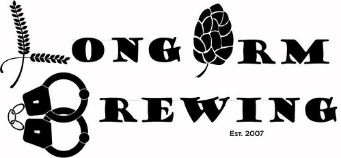
So I'm making one of Kal's snazzy electric setups and I am to the point of putting on the lovely black and white logo.

So what do you all think. Suggestions etc are welcome. Ofcourse the colors will be reversed at printing so suggestions or comments besides that.

http://www.flickr.com/photos/50763644@N08/5371556993

Try that. For what ever reason I cannot get the damn links to work tonight.
 
Here ya go.

5371556993_533e5e29ee.jpg
 
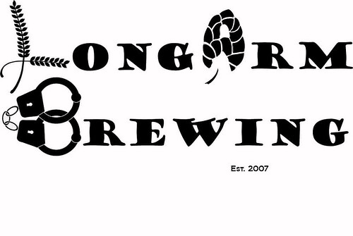
I think its a good basic idea. IMO, there are too many illustrations in place of words. The barley makes sense. What is the hop for. Longlrm, Longorm, Longarm...I can't figure out what its supposed to say. I think the handcuffs are a little out of place too. You have the brewing thing going on, buy why handcuffs? I think is a little busy and doesnt have a very clear messge.
 
I would simplify it. If you're going for the "Long Arm of the Law" theme maybe remove the barley and hops graphics and just use the handcuffs. Or replace all of the graphics with normal letters and integrate the handcuffs (or a sheriff's badge?) in the background somehow.
 
I agree that the hop is a little hard to figure out. To keep the hop have you tried whiting out the black spot above the stem and the two below the top row to make it look more like an "A"?
 
I'm kind of new to the forums (and brewing!) but I went to school for visual design so I'm going to give my 2 cents. I think it's a really cool idea, but from a design standpoint it is a bit of a mixed message and too busy. Have you thought about leaving the barley and hops out and just having the handcuffs?

I think the handcuff "B" is really cool.

You might be able to do a handgun or something for the "L" if you want to put something else in there in place of the barley.

The trick is to make sure people can read it without having to pause and think about it. In the end though, it's your brew, make sure you're happy with it!
 
I think the handcuff "B" is really cool.

You might be able to do a handgun or something for the "L" if you want to put something else in there in place of the barley.

I like that idea. It would also give you the option of making a "small" logo for pint glasses or the breast of a shirt that includes JUST the gun (L) and handcuffs (B).
 

Latest posts

Back
Top